- the unaltered original magazine spread layout
- text giving attribution to the designer
- https://www.behance.net/aligini
- and a link to where the original design was found.
- https://www.behance.net/gallery/55323997/Magazine-Spread-Layout-Design/modules/326206725
- other relevant information about the designer, design, or general appeal.
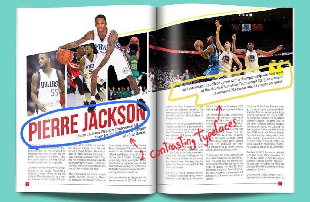
The 2 types of typeface used here are Morden (Blue circle) and slab serif (yellow circle). The modern serif was identified due to the font having thin, long horizontal serifs, and clear-cut thick/thin transitions in the strokes. The slab serif font on the other hand was identified due to the presence of y the “feet” or “stubs” on each character.
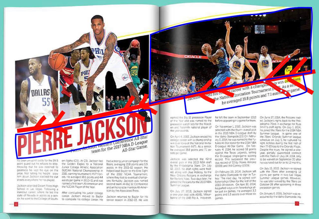
Leading Lines
Leading lines can be seen here by the photographer because the 4 images direct the attention to the title “Pierre Jackson” and the focal attention to the photograph of him. The use of leading lines in the photograph also shapes the text boxes around it.
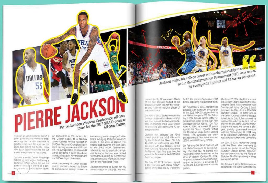
Depth of Field
Depth of field can be seen here as highlighted by the yellow outlines as it focuses the focal attention of the photograph[ph on the players. This is an excellent use of contrast as the background blur (bokeh) further moves the attention towards the players instead of the ground and other elements in the background.
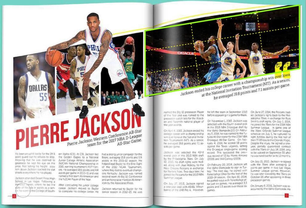
The rule of thirds can be seen clearly in the photograph with the green outline and identified with the yellow dotted lines. This clear use of the rule of thirds hilights guides the viewer’s visual attention to the 3 players in the photograph.
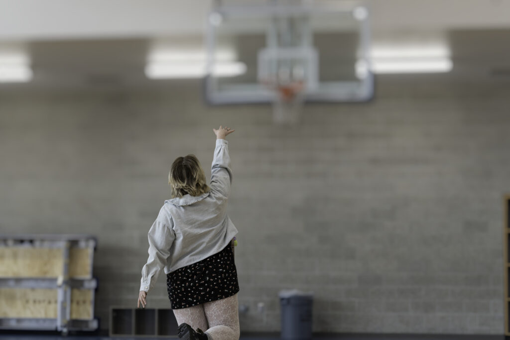
I mimicked the NBA player shooting the basketball with the photo of a normal pedestrian looking girl with everyday clothes shooting a basket. This signifies that basketball is for everyone and it is a very inclusive sport. My photograph’s focus is on the girl shooting , therefore I choose to use depth of field by focusing on her while the background is blurred. I did this by using a 70-200mm lens so there was a lot of background compression. I later edited the background bokeh asm well.
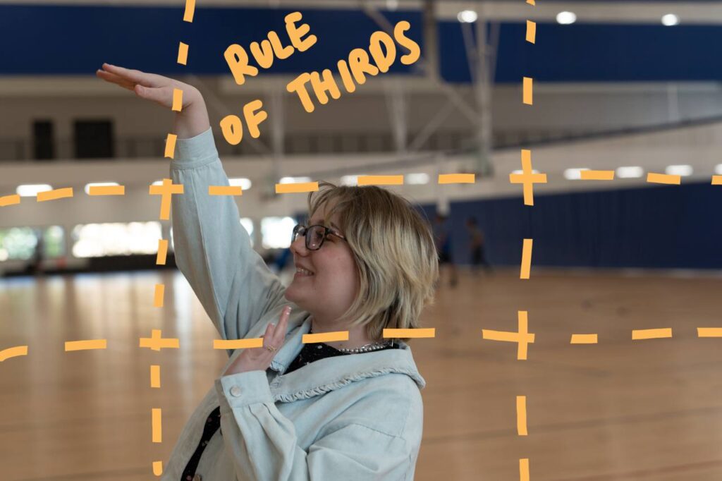
I mimicked the NBA player shooting the basketball with the photo of a normal pedestrian looking girl with everyday clothes shooting a basket. This signifies that basketball is for everyone and it is a very inclusive sport. My photograph’s focus is on the girl shooting , therefore I choose to use rule of thirds by keeping her head and ger shooting hand on the lines. To create this shot I use the rule of thirds mode on the camera and a 24-70mm lens so I can get closer to her.
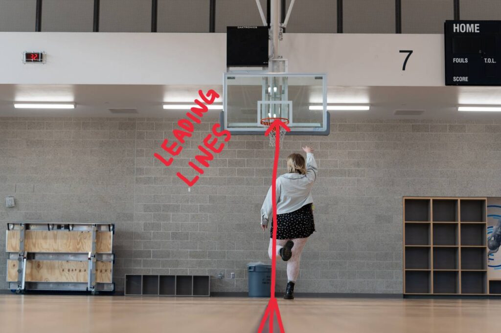
I mimicked the NBA player shooting the basketball with the photo of a normal pedestrian looking girl with everyday clothes shooting a basket. This signifies that basketball is for everyone and it is a very inclusive sport. My photograph’s focus is on the girl shooting , therefore I choose to use leading lines by focusing on her while she is standing on the markings on the floor leading up to the basket as she attempts to shoot a basket. The lines lead the visual attention to her and the basket in front of her. I did this by using a 70-200m lens so that I can be far away while showing her on the leading line on the floor.
Conclusion
Overall these 3 rules (Rule of thirds,leading lines,depth of field) are very good principals of design as they add contrast to the visual storytelling of a deign/photograph.
In a photograph there can be a lot of elements , by relying on these rules of design it helps lead the viewer’s eye to the story we are trying to tell by contrasting the important elements with the background ones.
In a photograph , just like design we need white space to get the viewer’s eye’s a place to rest and the use of these 3 rules help do that.