Categories
Blog Design Digital Imaging Photography

Conceptual Challenge

Conceptual photography is a unique art form that involves transforming an idea or concept into a powerful visual statement. It allows artists to challenge their creativity and imagination while pushing the boundaries of their medium.

In today’s post, I decided to pull inspiration from the spooky essence of Halloween using American eagles as my subject. The possibilities are endless in the world of conceptual photography!

The ultimate goal of conceptual photography is to create an image that speaks to the viewer on a deeper level, conveying a message or idea that goes beyond the surface-level aesthetics of the photo itself.

All images are sized to 1024 on the long side to protect my photographs

Inspiration Words

Spooky , Movement , Freedom , Autumn , Midnight

Sketches

Final Blended Image

Original Image

Artifacts Used

Categories
Blog Design Digital Imaging Photography

Cultural Night Winter’23

The world is a diverse and beautiful place, full of unique cultures, traditions, and ways of life. As a journalist, I am lucky enough to be able to learn about and appreciate these differences through various forms of art, music, and dance.

Recently, I had the opportunity to photograph an incredible event that celebrated just that – the beauty of diversity. This event, called “See the World in One Night,” featured a wide variety of acts showcasing songs and dances from cultures around the world.

Students and groups from all corners of campus came together to audition for this one-of-a-kind event, and the result was a truly unforgettable night of entertainment and education.

In this blog post, I will share with you my experience capturing the beauty and energy of this amazing event through my lens.

All images were downsized to 1024 on the short side to protect my work.

Individual Side Composition

Unedited
Edited

Individual Head and Shoulders

Unedited
Edited

Individual Full Body

Unedited
Edited

Group Activity

Unedited
Edited

Group Posed

Unedited
Edited

Group Environmental

Unedited
Edited

Portrait Enhancement

Unedited
Edited (List of edits: Iris Visibility, Iris Flare, Enlarge Eyes, Eye Whitening, Dark eye circle removed, Eyebrow darken, Light up face, Slim face)
Unedited
Edited (List of edits: Iris Visibility, Iris Flare, Enlarge Eyes, Eye Whitening, Red-eye removed, Dark eye circle removed, Eyebrow darken, Light up face, Slim face)

Portrait Color Match

Unedited
Edited (List of edits: Iris Visibility, Iris Flare, Enlarge Eyes, Eye Whitening, Red-eye removed, Dark eye circle removed, Eyebrow darken, Light up face, Slim face)

Color Match Edited
Categories
Blog Design Digital Imaging Photography

New Media Project Final

The process for my new media project, which involved fashion portrait photography and making Instagram reels, began with brainstorming ideas for the project.

I researched popular fashion photography techniques and styles, as well as current trends on Instagram, to develop a concept for my project. Once I had a solid concept, I began planning the shoot.

After the shoot was complete, I selected the best images to edit and post on Instagram and also created a series of reels showcasing the behind-the-scenes process of the shoot.

Throughout the project, I learned a lot about the importance of communication and collaboration when working on a creative project.

I also gained a deeper understanding of the technical aspects of photography, including lighting, composition, and editing. Finally, I developed a greater appreciation for the power of social media to showcase and promote creative work and learned how to leverage Instagram as a platform for sharing my work with a wider audience.

Movie Poster

Fashion Magazine

CD Design

Instagram Reels

Proposal

Categories
Blog Design Digital Imaging Photography

Navajo Chic: A Winter Fashion Shoot at Rexburg Gardens

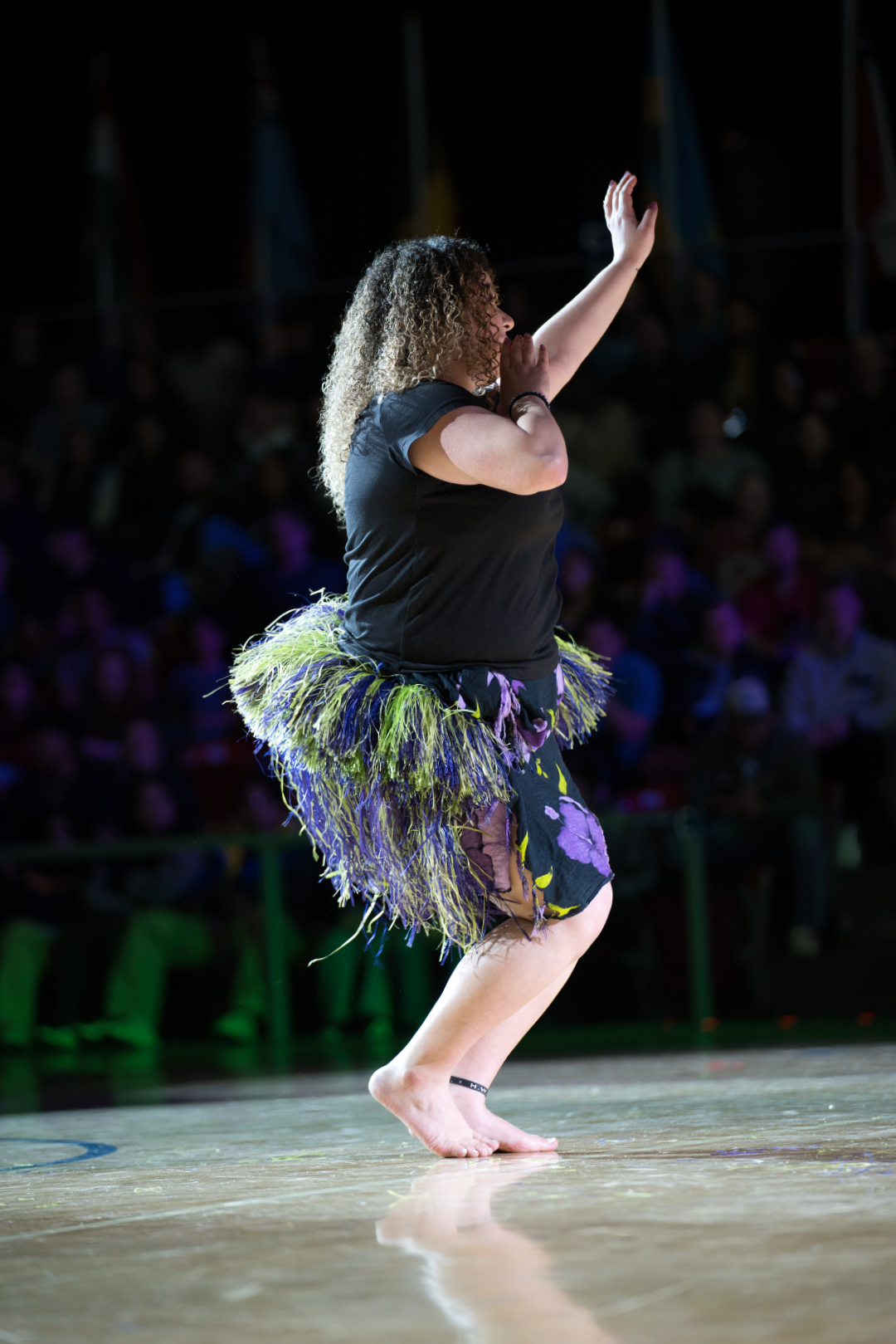
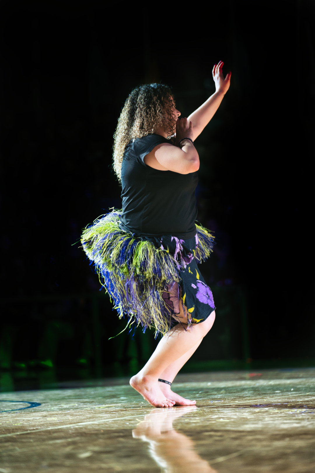
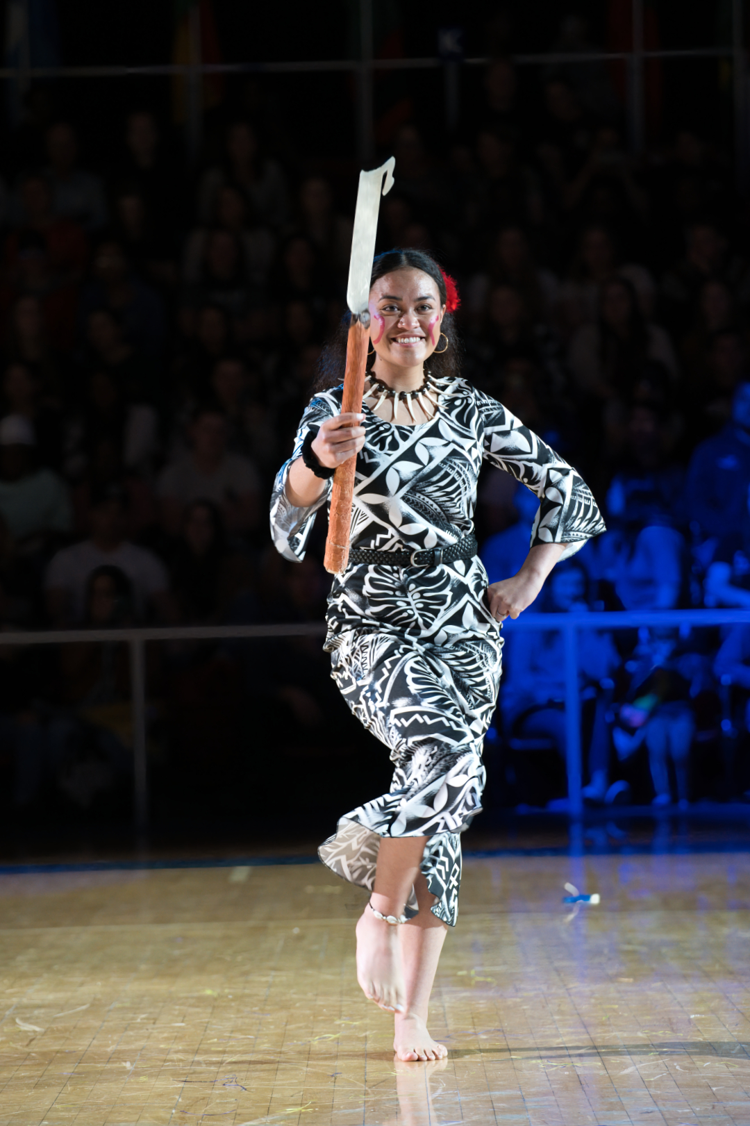
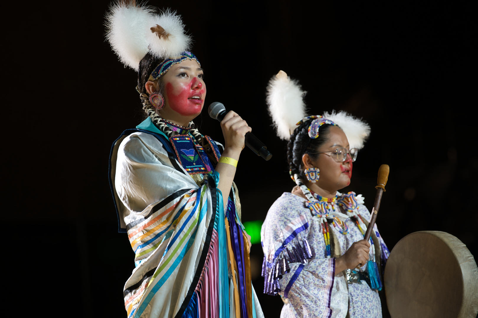
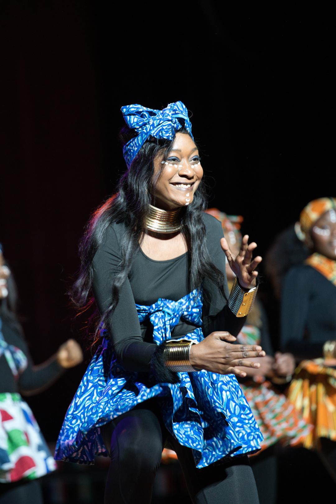
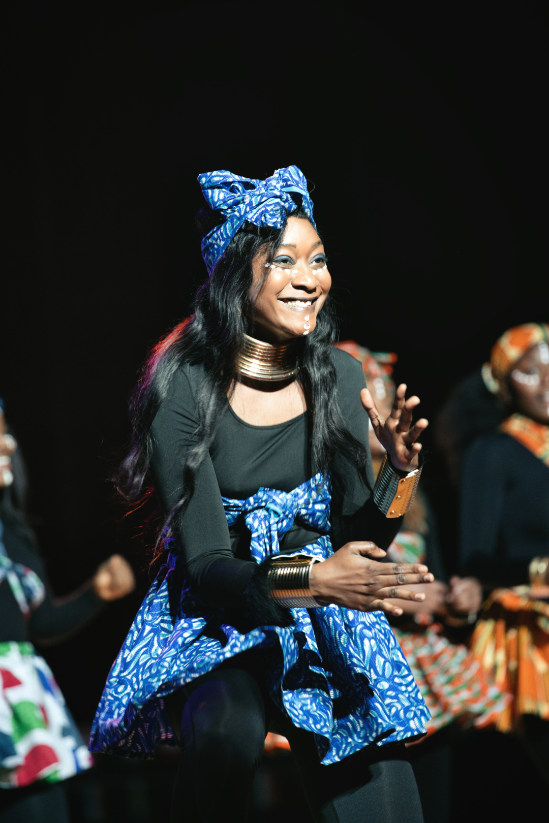
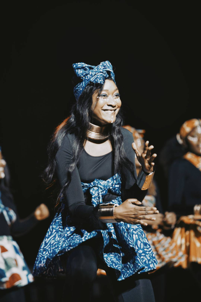
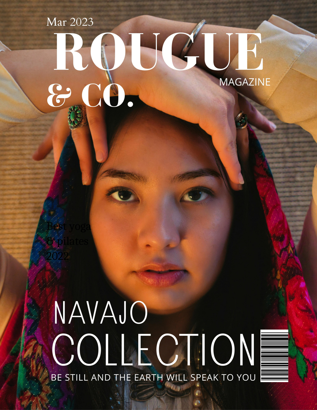
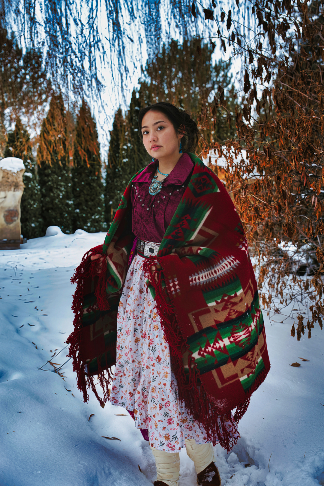
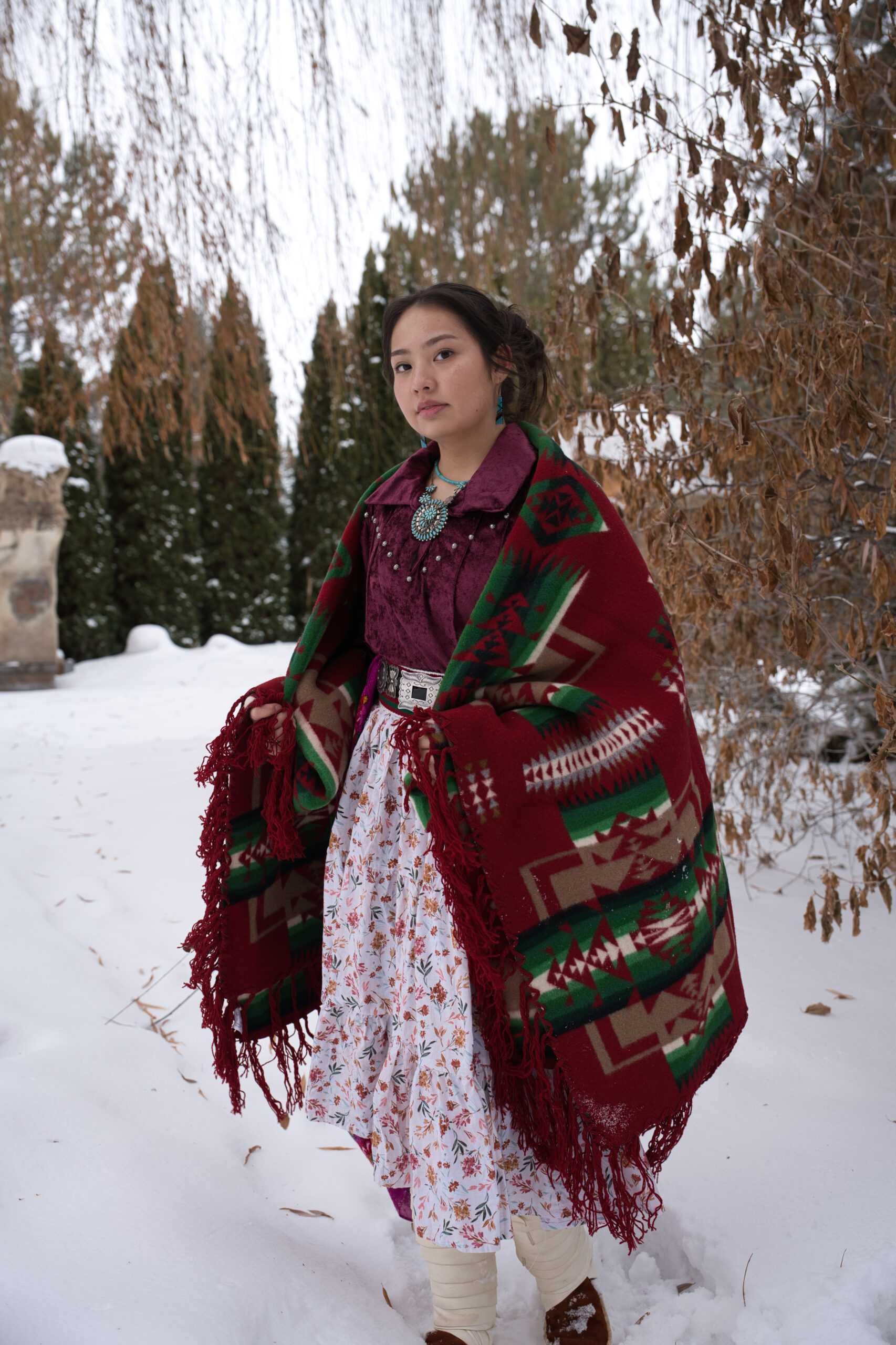
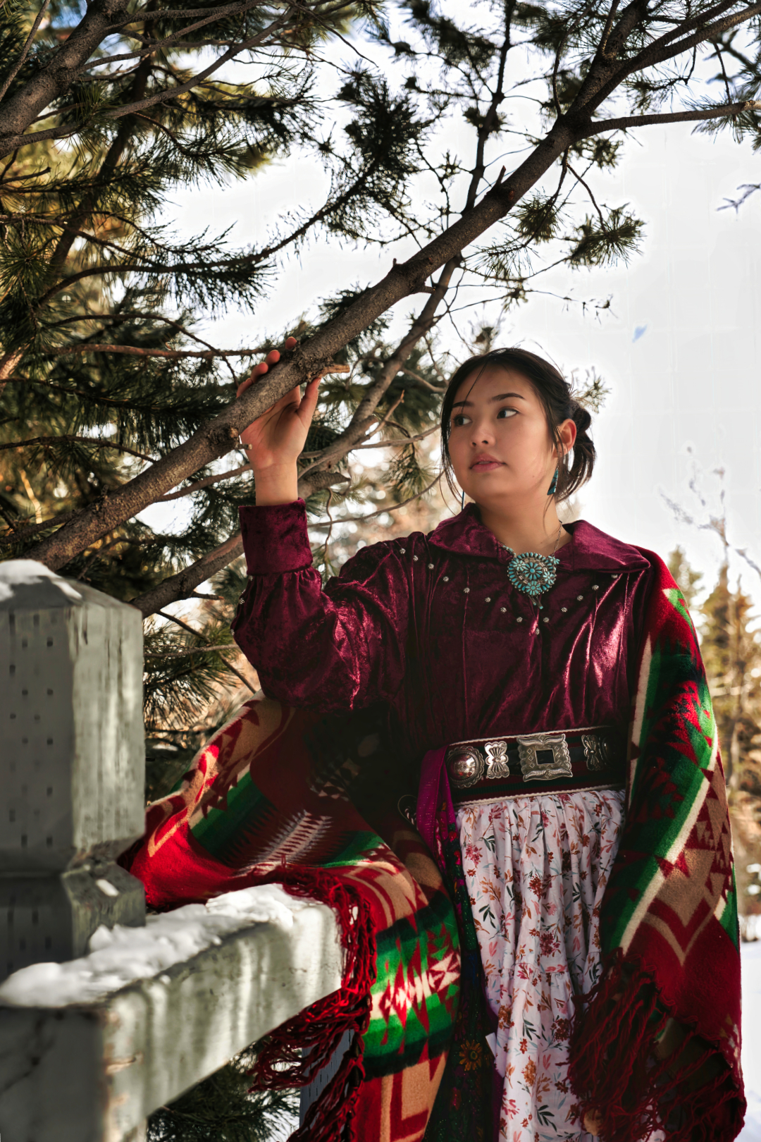
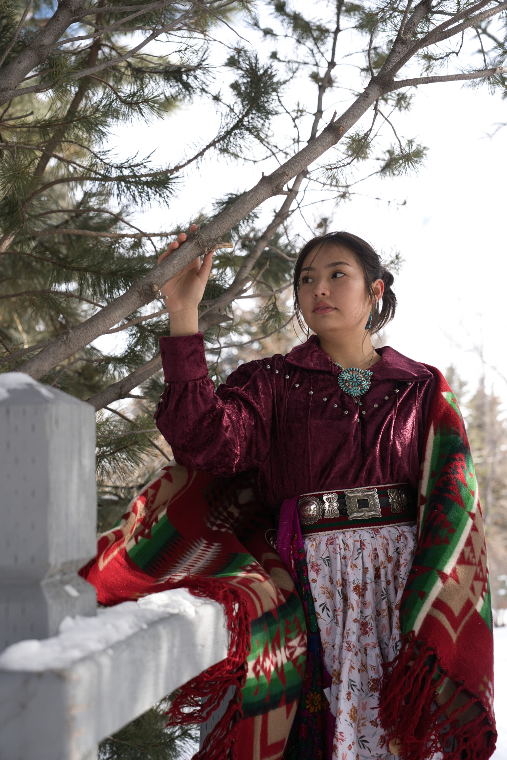
In this blog post, I will be discussing my recent fashion shoot that showcases Native American Navajo culture. I decided to use a fashion shoot as a way to showcase this beautiful culture in a modern and stylish way that appeals to a broader audience.

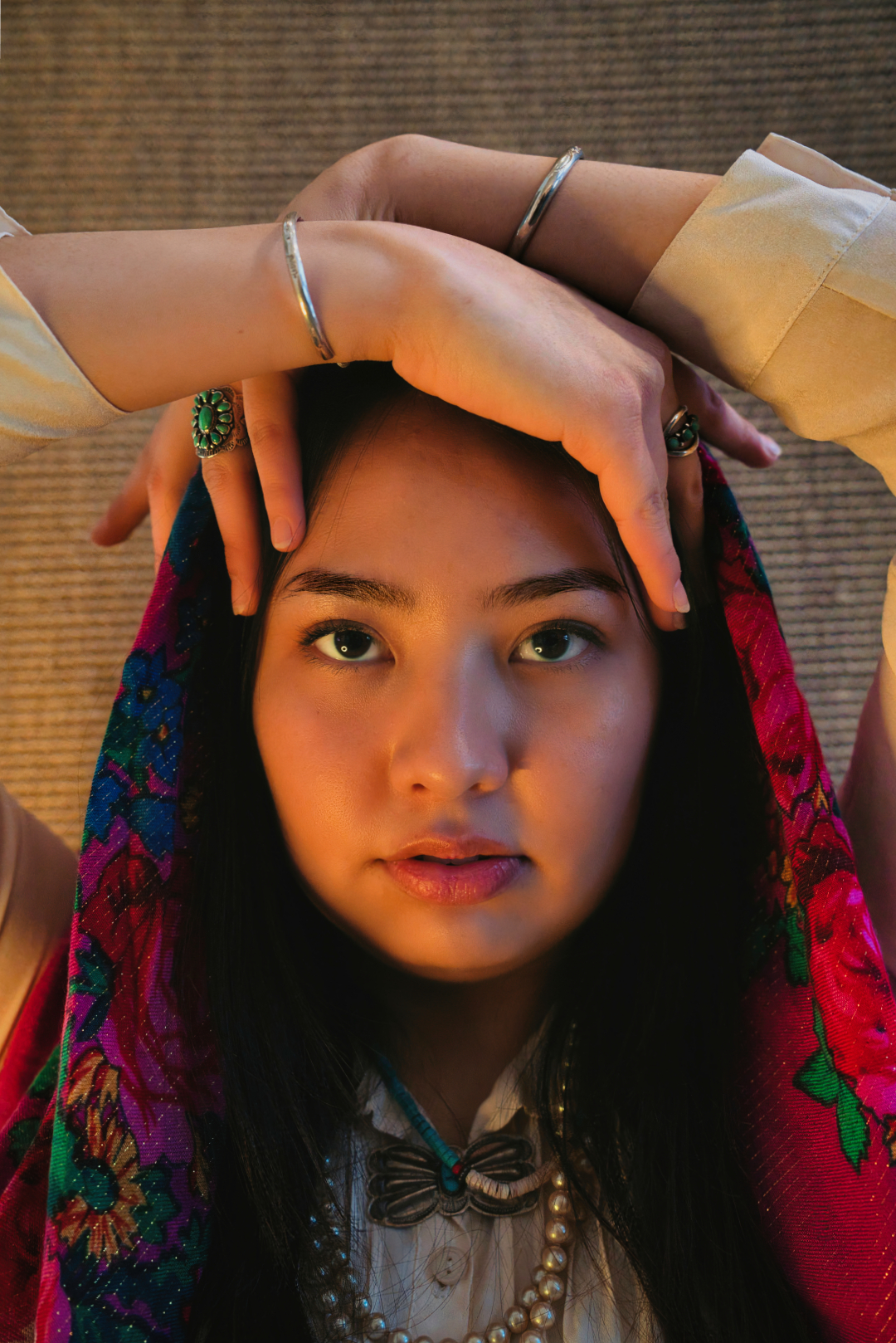
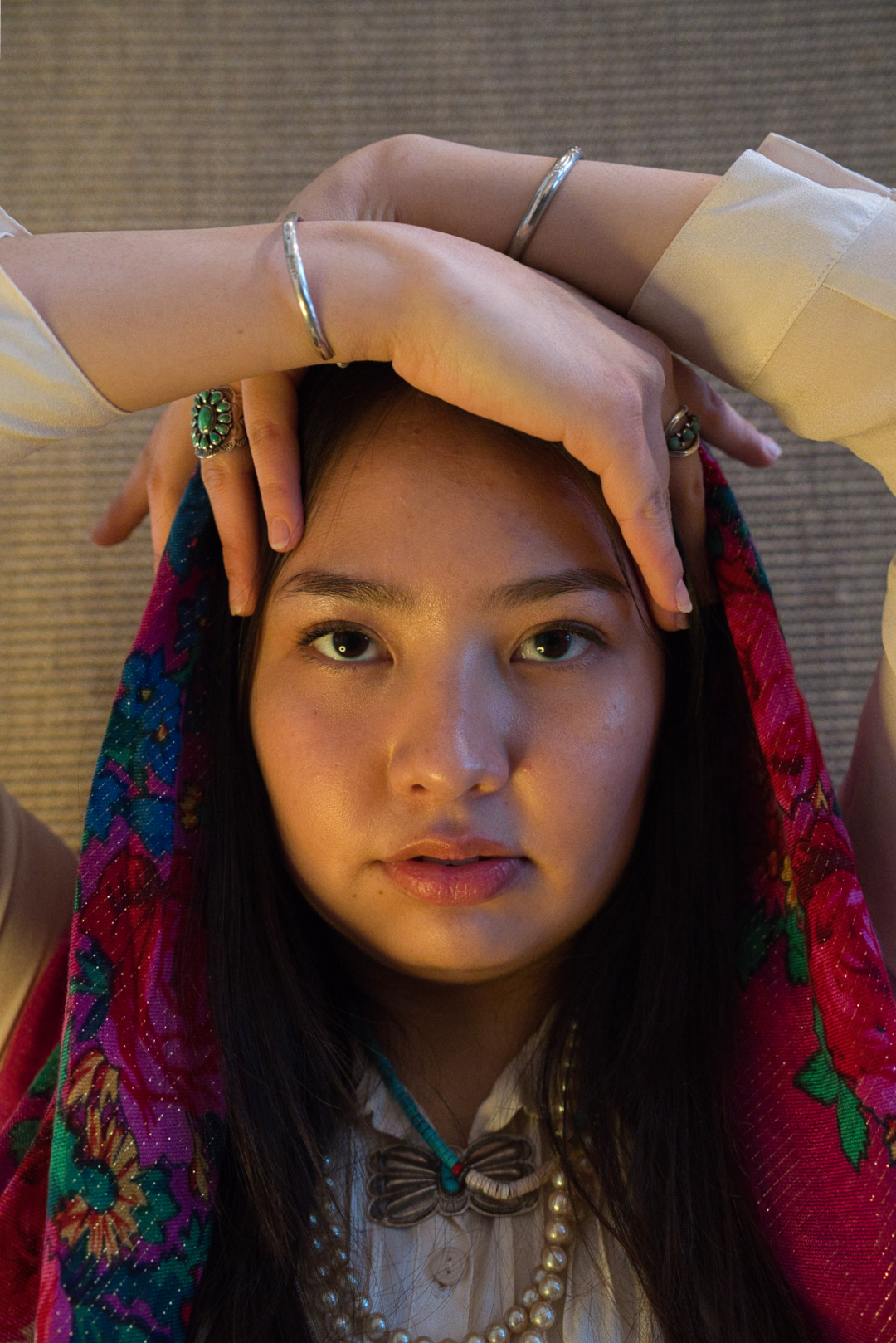
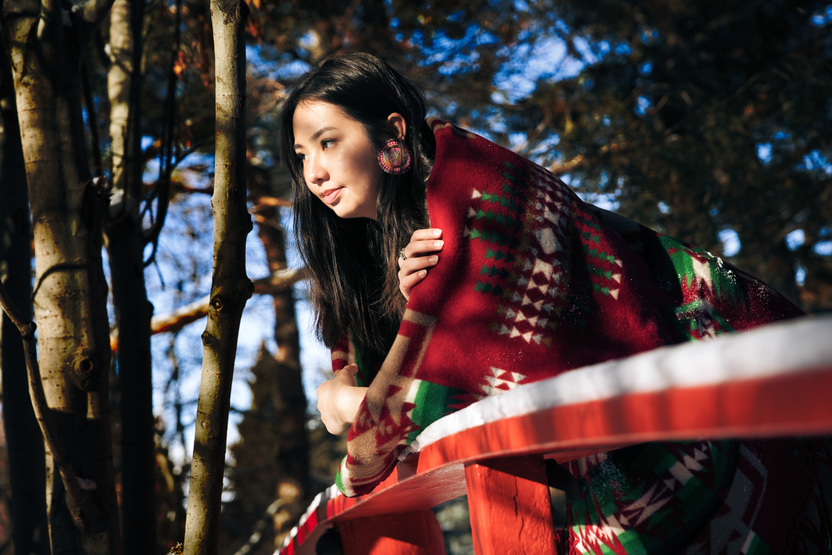
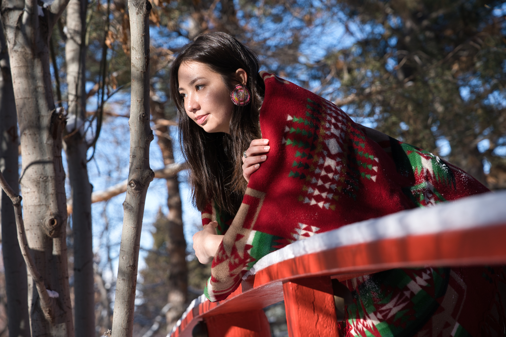
One of the primary reasons why I chose to use a fashion shoot is that it allows me to highlight the intricate and vibrant designs and patterns that are prevalent in Navajo culture. These designs are not only stunning but also carry significant cultural and historical meaning. By incorporating these designs into a fashion shoot, I can showcase them in a fresh and contemporary way that will resonate with a modern audience.

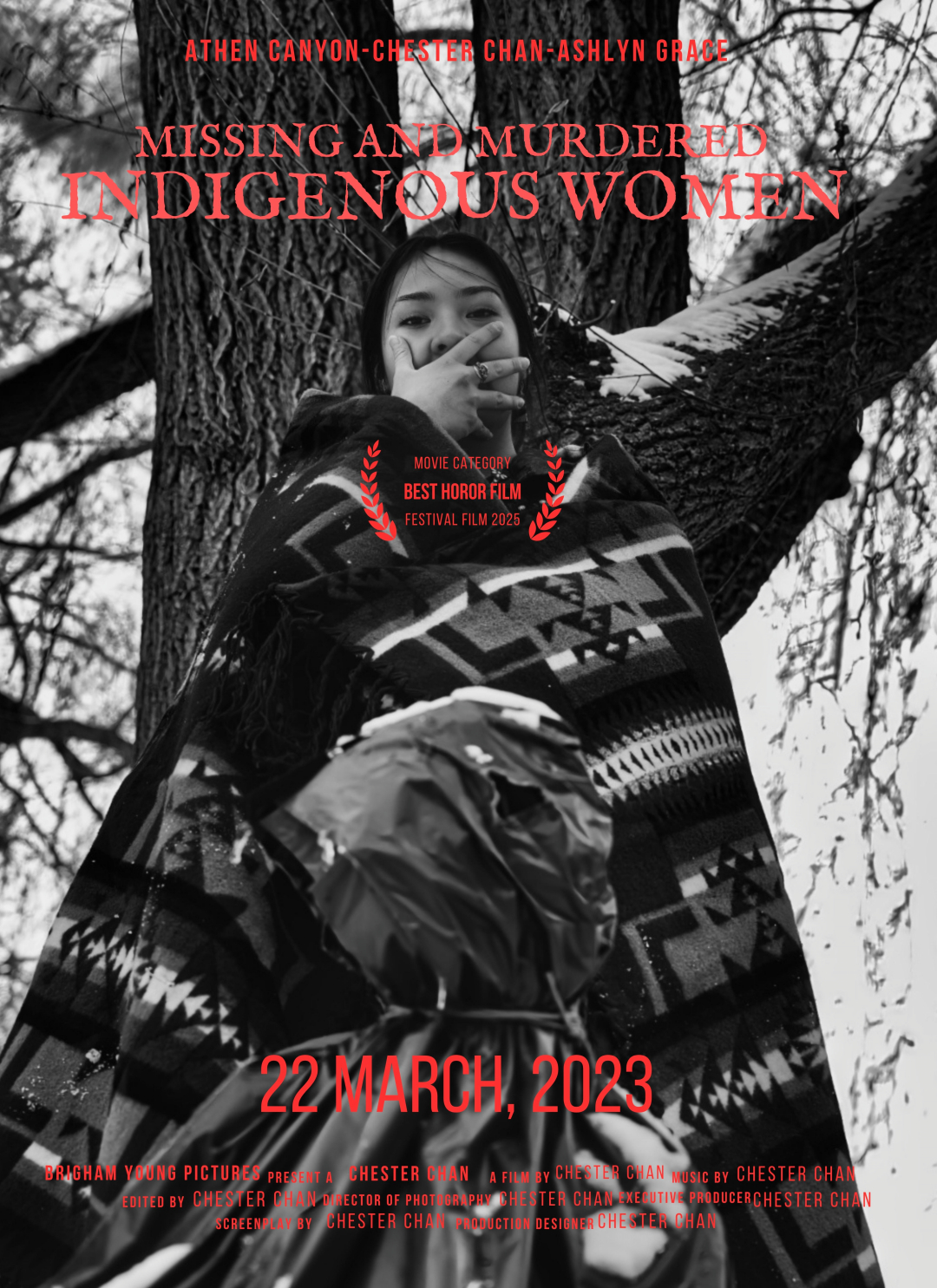
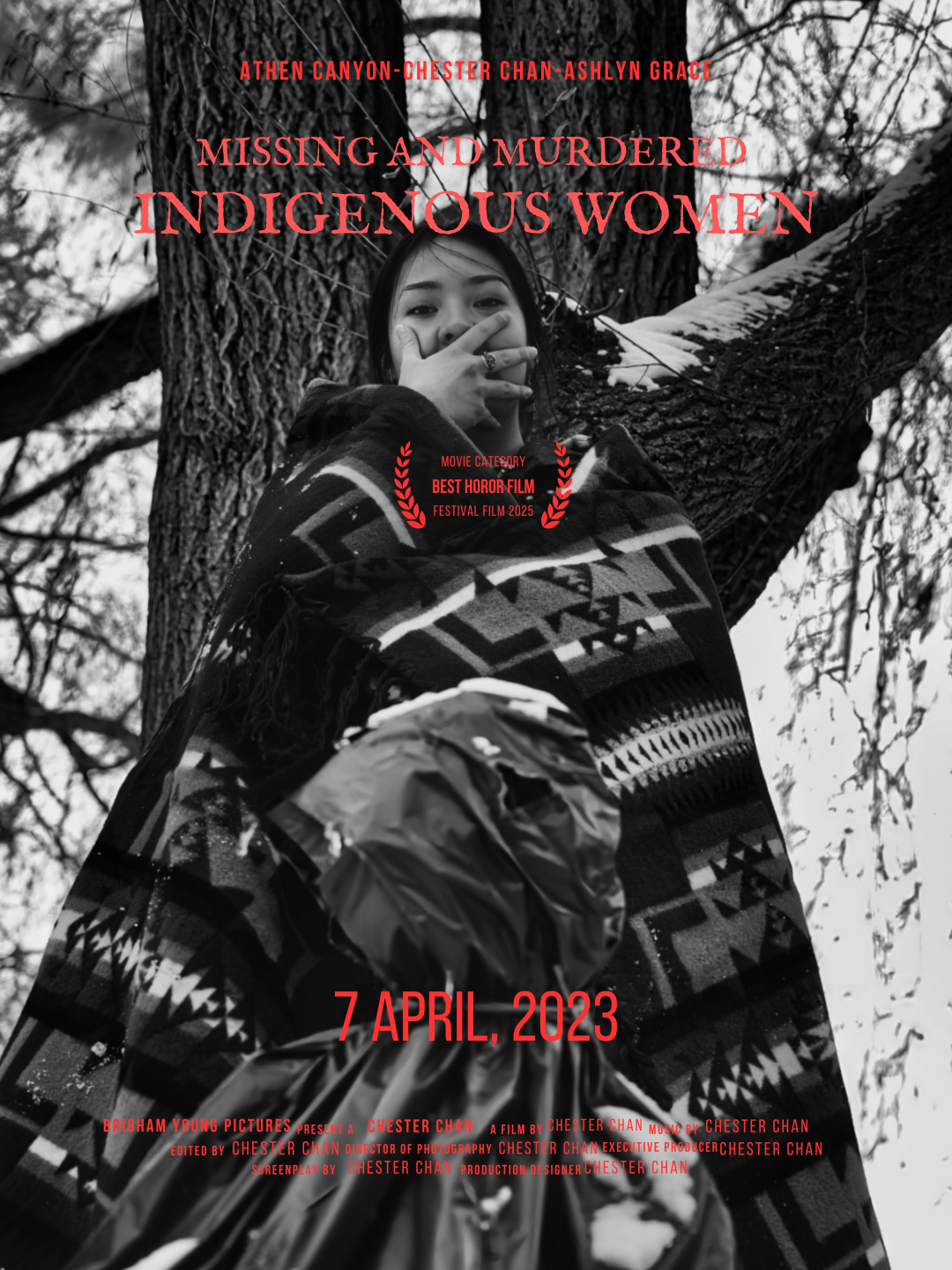
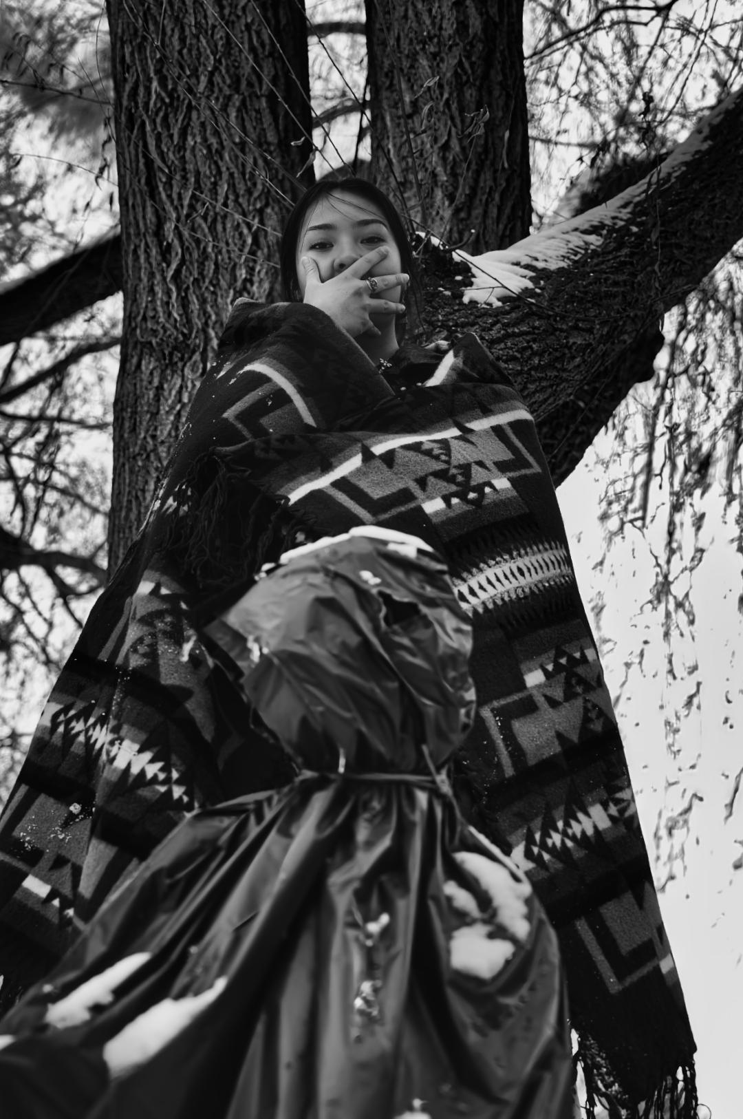
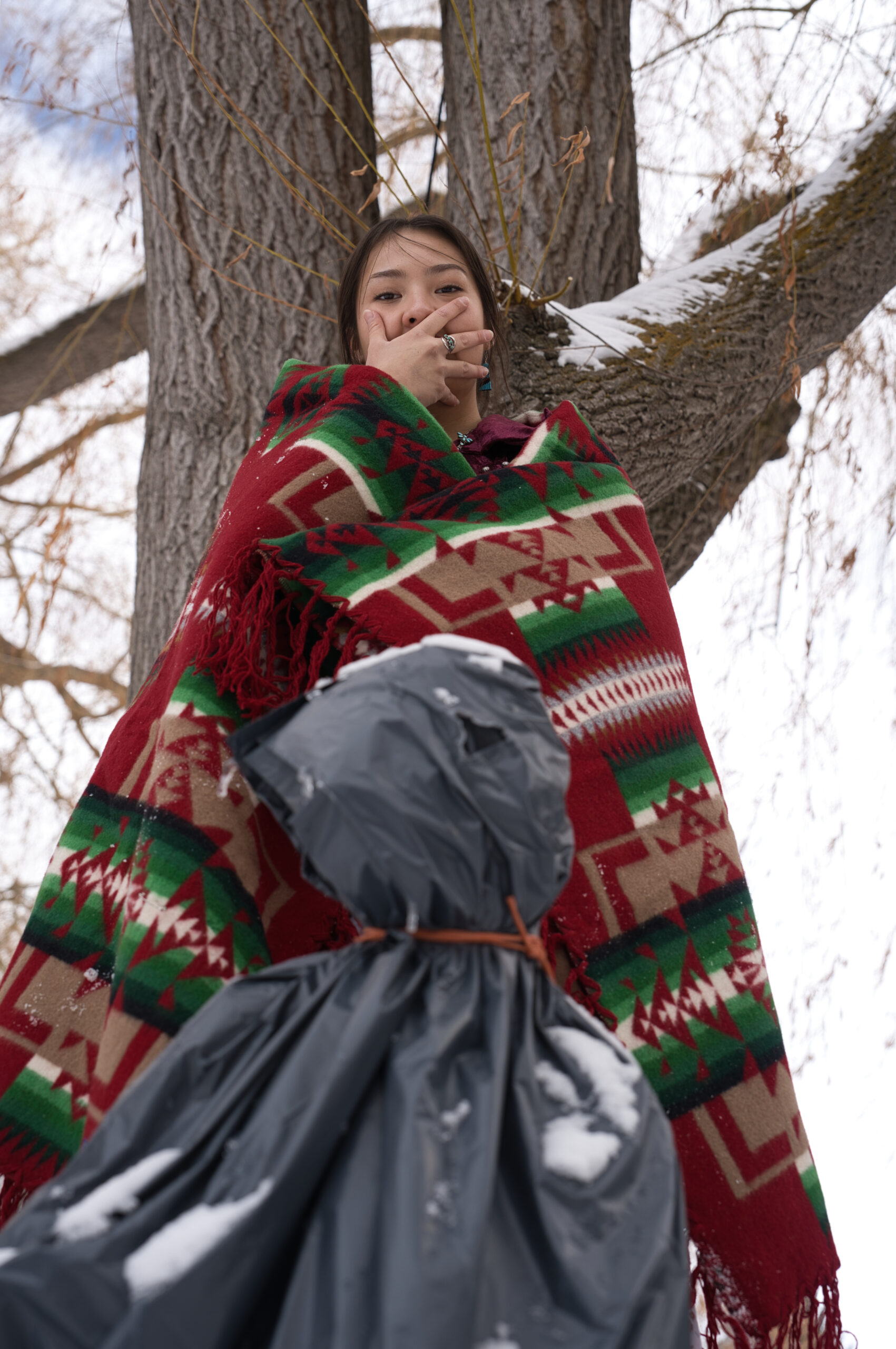
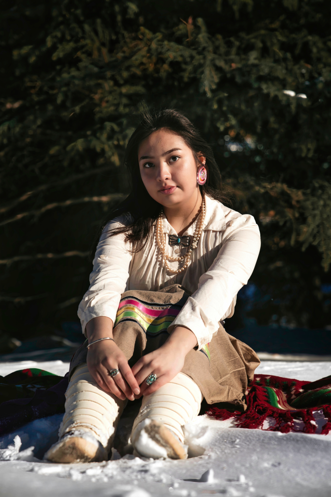
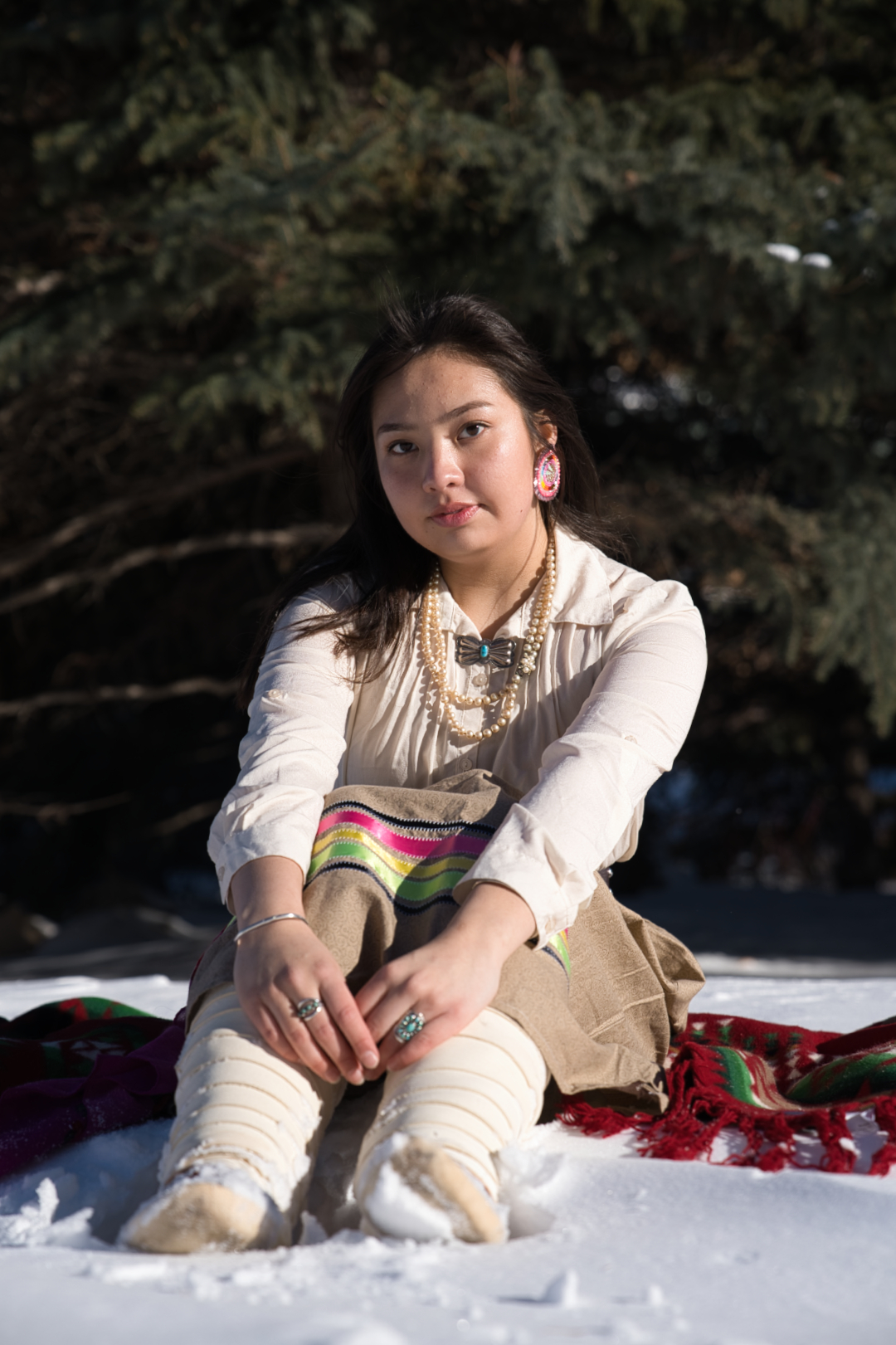
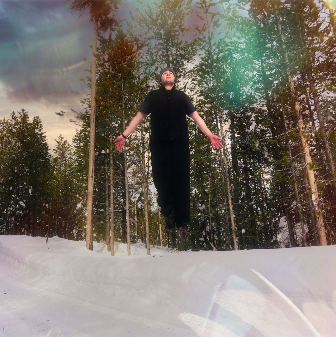
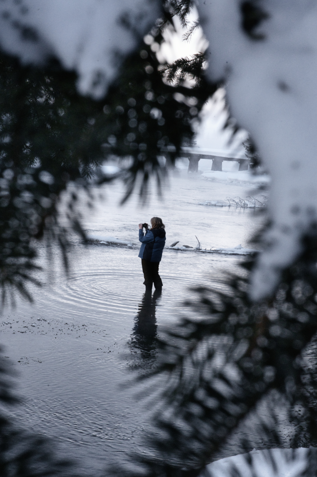
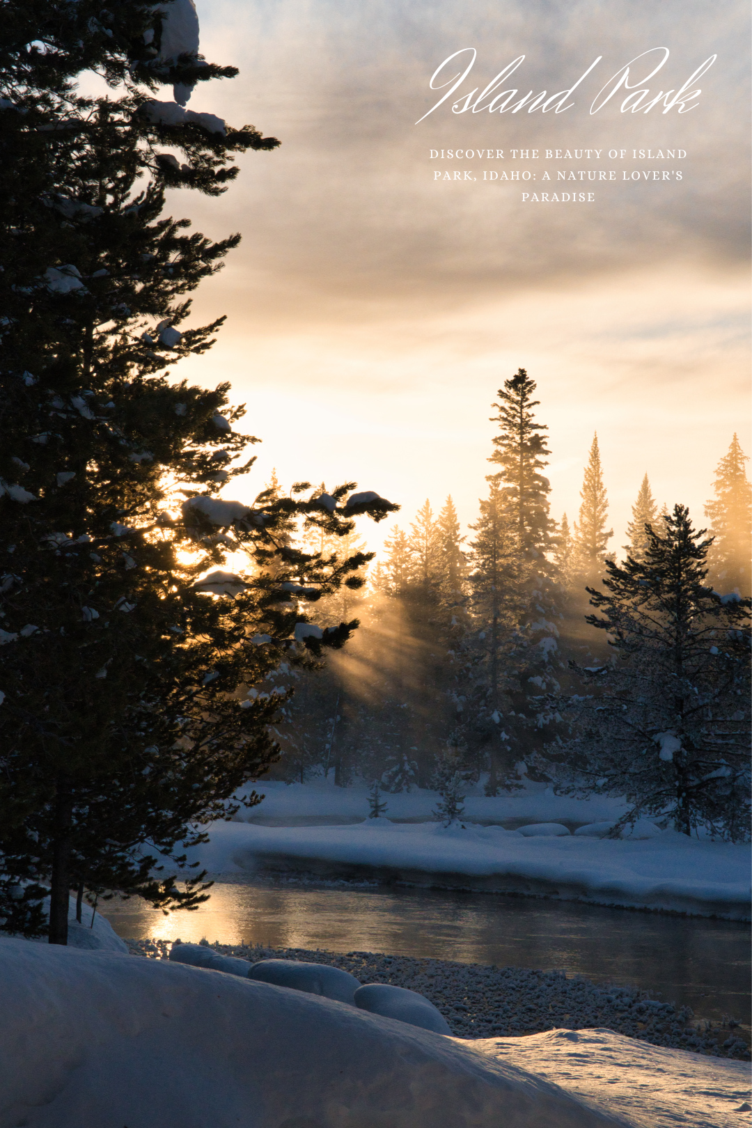
Additionally, I chose to shoot this fashion editorial in the winter at the Rexburg Gardens for several reasons. First and foremost, the winter landscape provided a beautiful and stark contrast to the bold and colorful Navajo designs. The snow-covered grounds and leafless trees served as a perfect backdrop for the shoot, allowing the models and the garments to pop against the wintry landscape.

Furthermore, the Rexburg Gardens provided a peaceful and serene location that allowed us to capture the essence of Navajo culture. The gardens’ natural beauty and tranquility allowed us to create a sense of harmony between the models, the garments, and the environment, resulting in stunning images that truly capture the essence of Navajo culture.

Overall, I believe that this fashion shoot provides a fresh and contemporary perspective on Navajo culture, while also celebrating the culture’s rich history and traditions. By incorporating modern fashion and styling into the shoot, we were able to create something that appeals to a broad audience, while still staying true to the cultural roots of Navajo design.

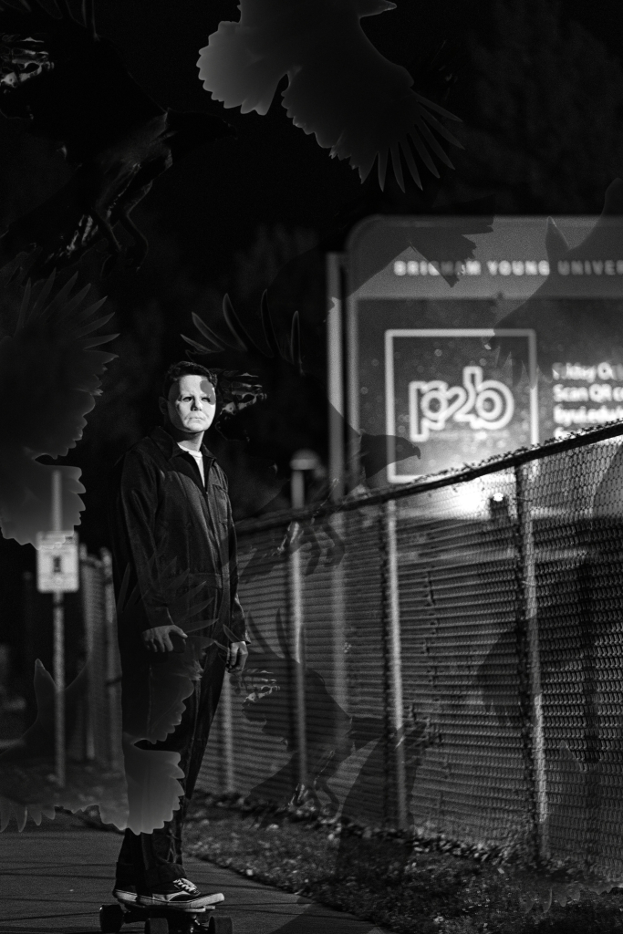
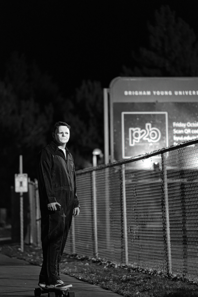
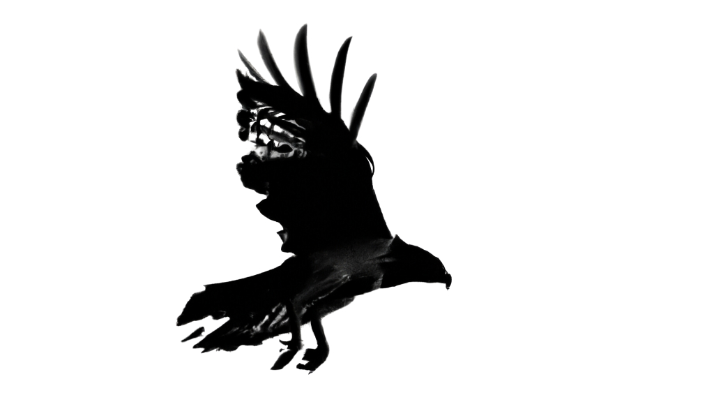
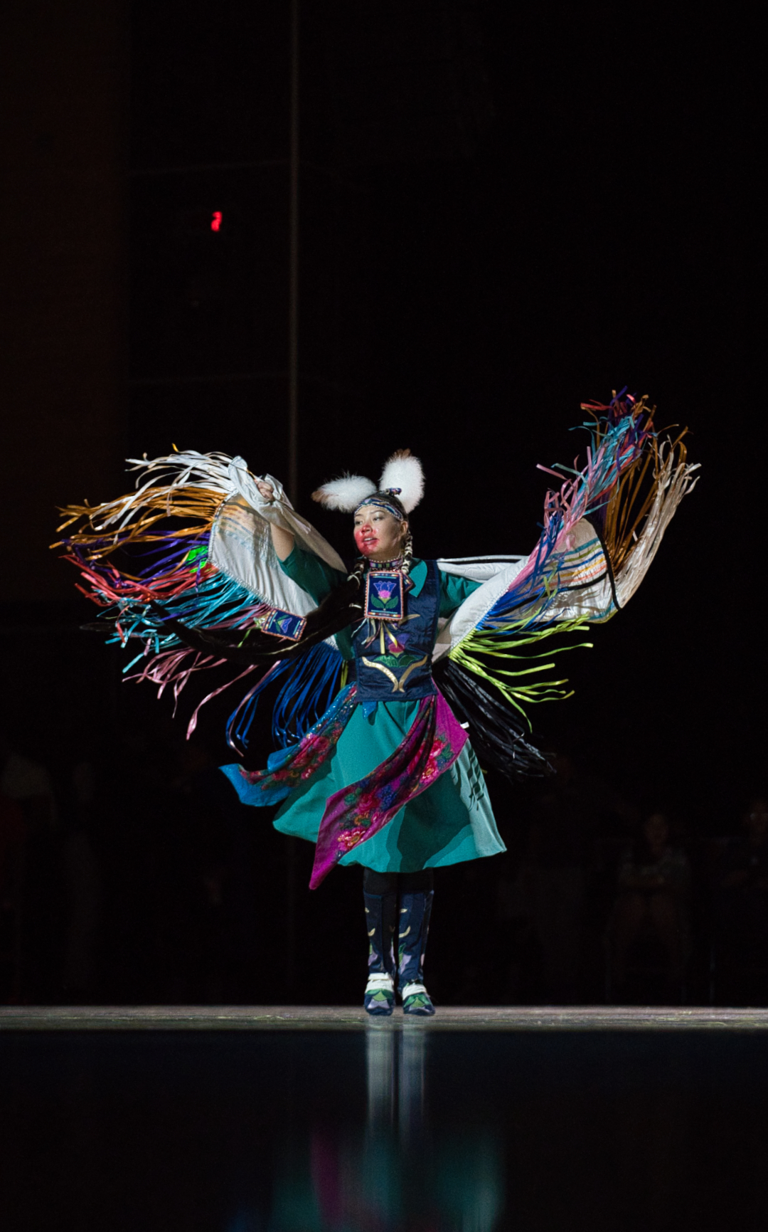
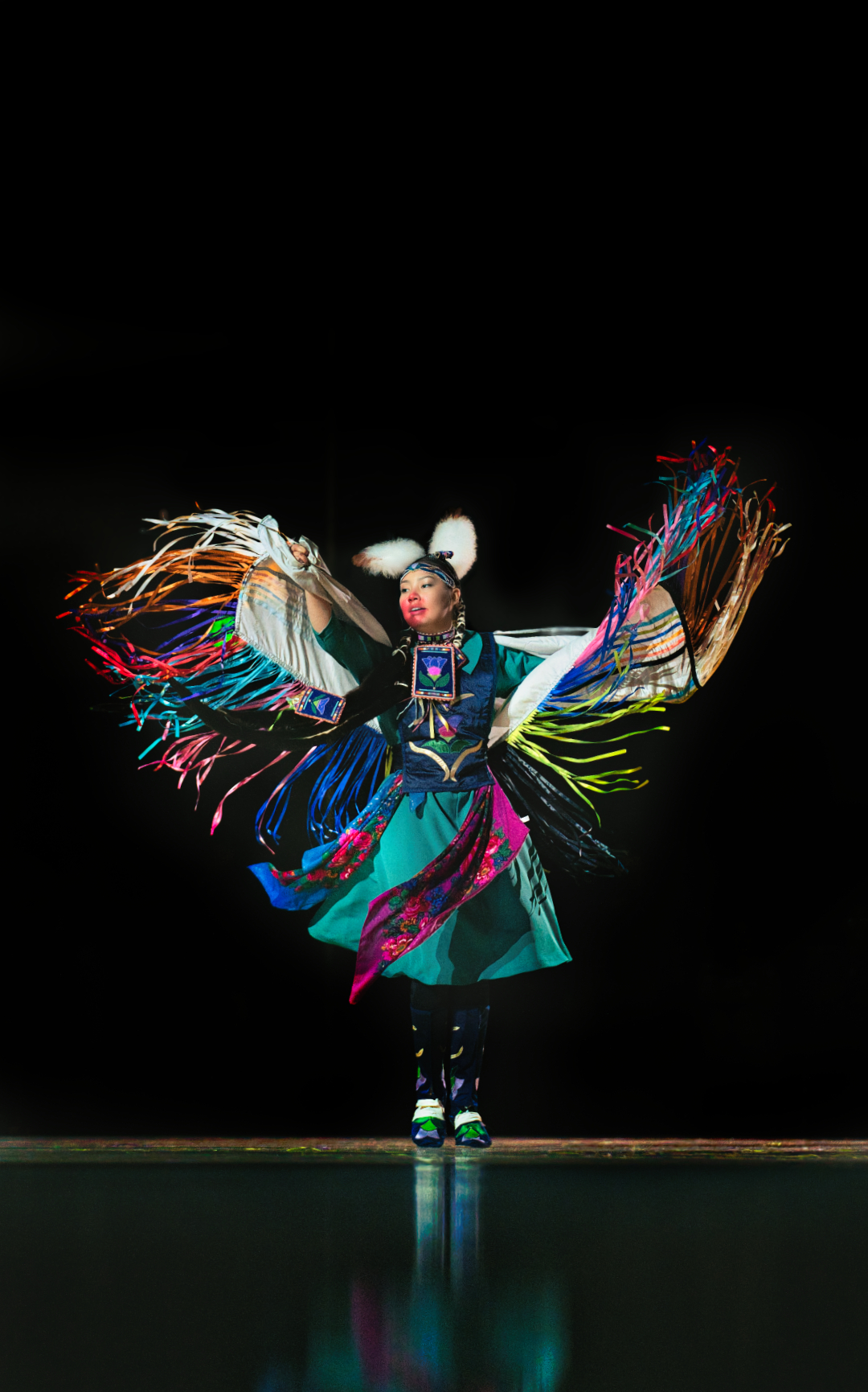
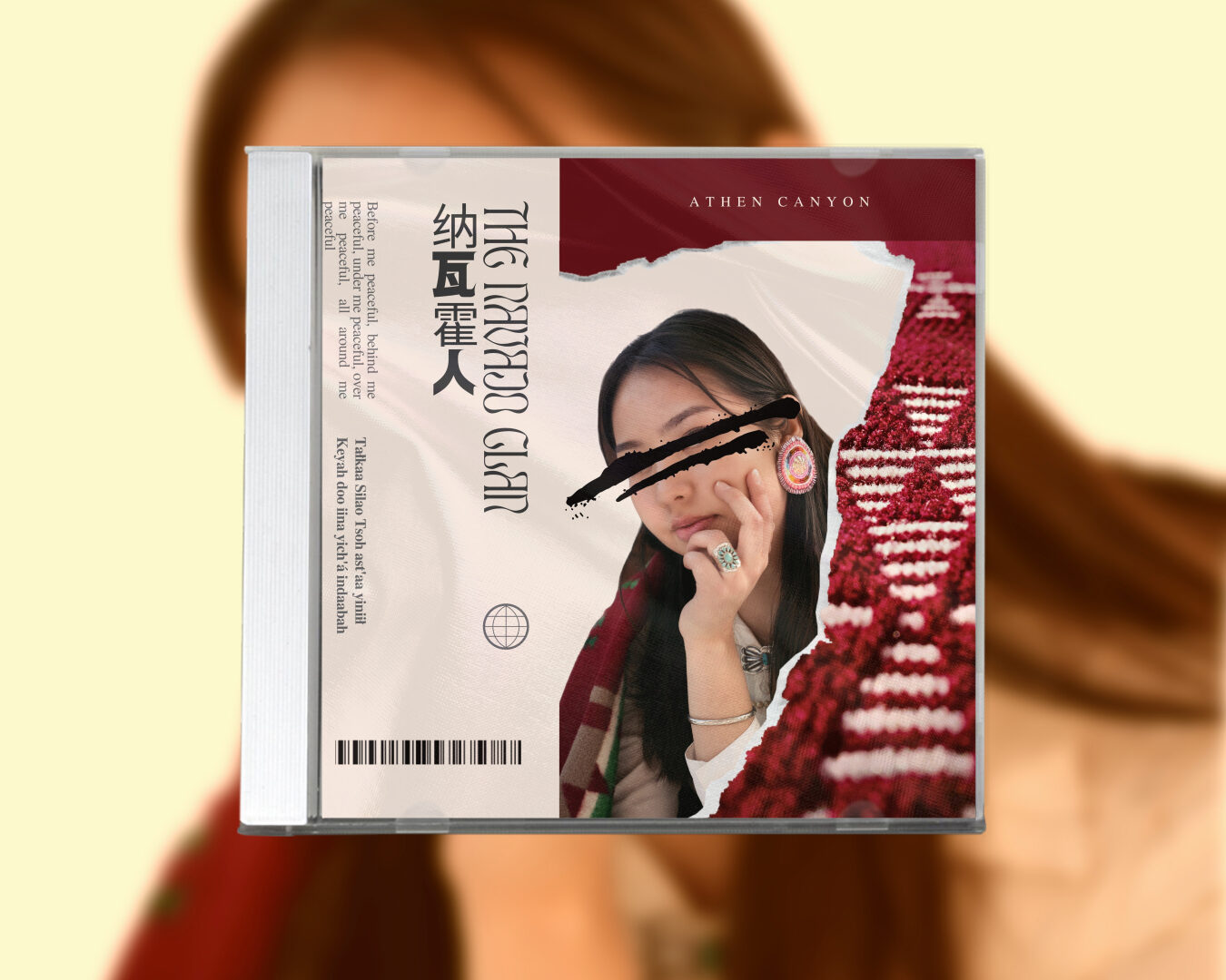
Anthen Canyon – Navajo Tribe (Magazine&Movie Poster)

PORTRAITS & ORIGINALS

Learning and Thoughts

Firstly, I developed a clear concept for the shoot that would showcase Navajo culture in a modern and stylish way that would appeal to a broad audience. I researched Navajo culture and identified the intricate and vibrant designs and patterns that are prevalent in Navajo culture and the cultural and historical meanings they carry.

Secondly, I selected the appropriate location for the shoot. In this case, I chose the Rexburg Gardens in winter because the snow-covered grounds and leafless trees provided a beautiful and stark contrast to the bold and colorful Navajo designs. The location also provided a peaceful and serene backdrop that allowed me to capture the essence of Navajo culture.

Throughout the process, I learned several things, such as the importance of research in developing a clear concept and the need to select an appropriate location that complements the theme of the photoshoot. I also learned the importance of selecting models and garments that can effectively showcase Navajo culture while incorporating modern fashion and styling.

Overall, the photoshoot provided me with a valuable learning experience in terms of creative direction, photography, and cultural awareness
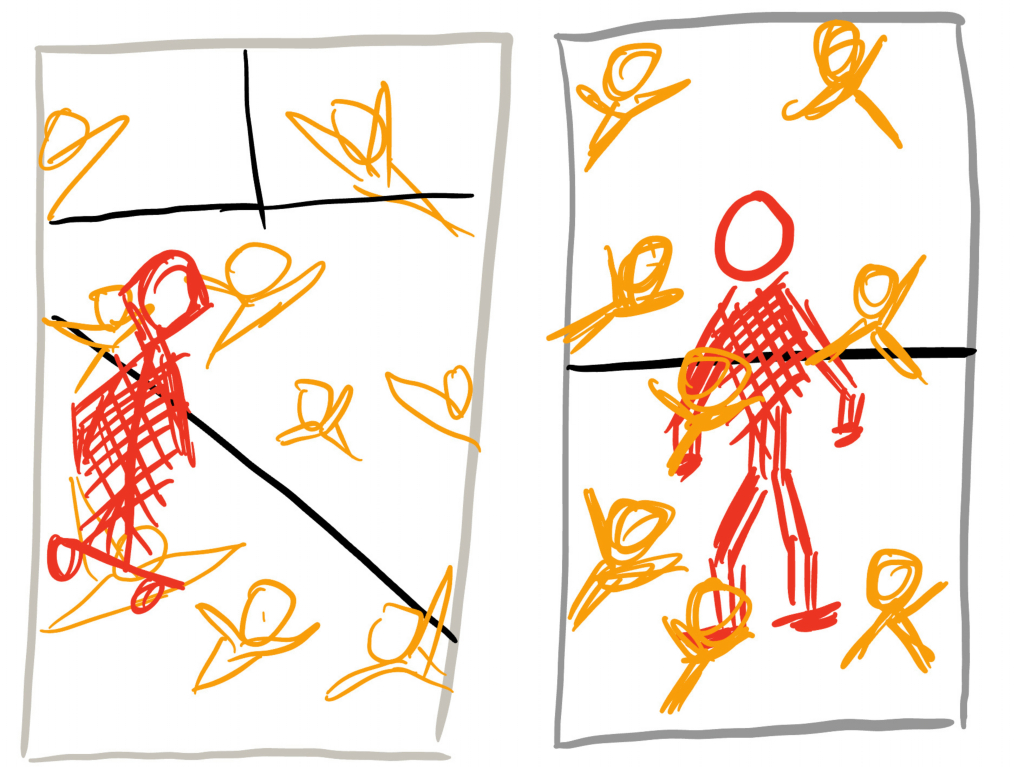
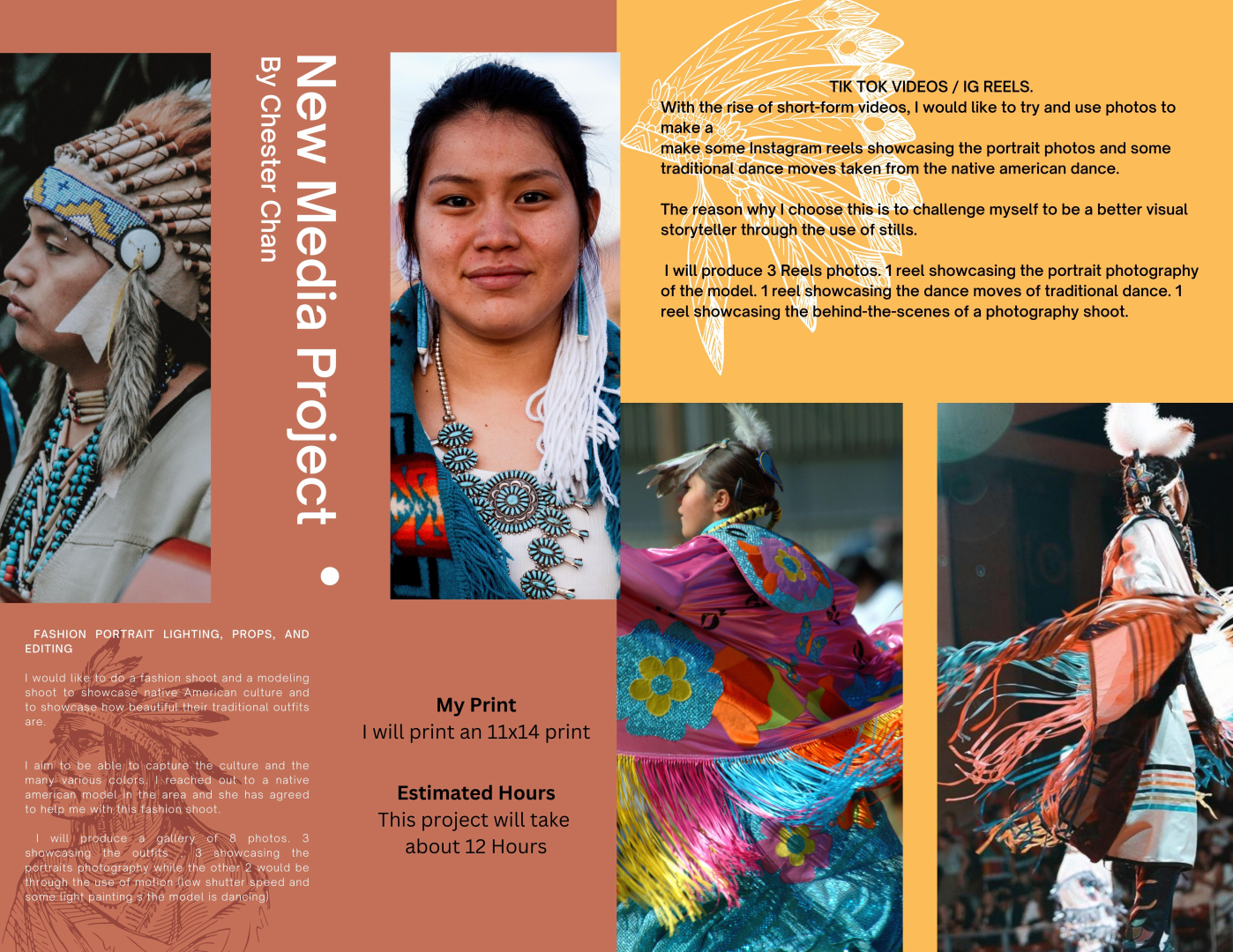
Project Proposal

Check out my Reeeel !

https://www.instagram.com/reel/CpPRYR2tUW5/?utm_source=ig_web_copy_link

Facebook Post

https://www.facebook.com/media/set/?set=oa.927783751574422&type=3

Categories
Blog Design Digital Imaging Photography typeface

Island Park Shenanigans

Discover the hidden gem of Island Park, Idaho, where nature takes center stage in my latest photoshoot. Situated amidst the breathtaking Teton Mountain Range and the vast expanse of Yellowstone National Park, Island Park offers a breathtaking escape from the hustle and bustle of everyday life.

From the majestic peaks of the surrounding mountains to the rolling hills and crystal-clear streams, every aspect of this idyllic destination is a feast for the eyes.

Whether you’re a seasoned outdoor enthusiast or just looking for a peaceful getaway, Island Park offers something for everyone. With its diverse range of landscapes, including forests, meadows, and lakes, there is no shortage of stunning vistas to admire.

Join me as we take a journey through Island Park, Idaho, and experience the breathtaking beauty of this stunning destination. From stunning panoramic views to intimate landscapes, each shot captures a unique perspective of the region’s unparalleled beauty.

So sit back, relax, and let my images transport you to the heart of Island Park. I hope that you’ll be inspired by the stunning scenery and will consider visiting this breathtaking destination for yourself

Levitation

Abstract

Product

Light Painting

Commercial

Categories
Blog Design Photography Reverse engineer post typeface

I like your AD, but I can do it better.

The Ad I decided to reverse engineer is WWF ( World Wildlife Fund) Ad on the Plastic diet. The Ad was launched in 2019 for Australian and South-East Asian audiences to educate the public on plastics pollution in wildlife, water consumption, and air. The Ad hoped to prevent the use of single-use plastics and the over-reliance on plastics in our society. The Ad was created by Grey
Graham Drew and Andrew Fong.

Credits:
Client: WWF
Campaign: Your plastic diet
Advertising agency: Grey
Graham Drew, Executive Creative Director
Andrew Fong, Creative Director
Heng Thang Wei, Creative Director
Selva Ganapathy, Copywriter
Kevin Wong, Art Director
Ralve Khor, Art Director
Suzy Chiang, Producer
Jo Yau, General Manager
Marcus SK, Brand Director
Vivian Khoo, Account Executive
Huma Qureshi, Regional Director PR & Corp Comms AMEA
Production Team: MFX Sdn. Bhd.
Post Production: Glass Fin (KL)
Sound Production: Maverick AV Sdn. Bhd.

Original Ad

Design Analysis (Color)

The use of colors can be seen here with the blue elements found in the card that is being eaten and the “1 week” sign. The use of black can be seen on the color of the logo , soy sauce and “Your plastic diet”

Design Analysis (Typography)

The use of typography can be seen here with the use of 2 different types of fonts. The first is the decorative font used on the credit card. Its fonts are mimicked in the 2 signs reading “1 week” and “Your Plastic Diet.org”. The other font used in the ad is a sans serif font.

Design Analysis (Repetition)

The use of repetition can be seen with the use of colors and typography. The colors are repeated with blue elements while the use of typography can be seen with the “1 week” and “your plastic diet.org” replicating the font on the blue credit card.

Design Analysis (Proximity)

The use of proximity can be seen as white space created by separating the visual elements from the body of the texts and the logo. By doing so it allows the reader a place for their eyes to rest as they read the ad.

Design Analysis (Contrast)

The use of contrast can be identified with the use of the separation of colors like a blue credit card on black soy sauce. The visual elements are then contrasted on the white sauce bowl and the white background that further contrasts with the black logo and text.

New Ad

Design Analysis (Color)

I choose to use a blue bowl and a blue comb to mimic the color scheme used in the text. I kept the design to have a cool color aesthetic.

Design Analysis (Typography)

I used the same typography from the original design. I choose not to alter it as I felt that my updated design is very well suited to the existing typography.

Design Analysis (Repetition)

Elements of repetition can be seen with the repeated use of fonts in “3 weeks” and “your plastic diet.org” and the repetition in the use of colors like the blue color scheme used in the bowl and the “3 weeks” text.

Design Analysis (Alignment)

Elements of Alignment can be seen throughout the design. With the slanted alignment of the text, I choose to mimic it with the slanted bowl. I used the align the comb to be tilted on the bowl similar to the chopstick being slanted to the credit card found on the original design.

Design Analysis (Proximity)

The elements of proximity can be found in this design with the visual elements and the text being spaced apart making room for white space. With the white space, my viewer is able to rest their eyes while reading the advertisement.

Design Analysis (Contrast)

The elements of contrast can be seen as the dark blue bowl contrasts with the bright blue comb. The visual contrast with the white background with the use of dark colors , similar to the black logo of the panda contrasting with the white background.

Categories
Blog Design Photography Reverse engineer post typeface

Check out the dopest use of photography and typeface yet!

  • the unaltered original magazine spread layout
  • text giving attribution to the designer
  • https://www.behance.net/aligini
  • and a link to where the original design was found.
  • https://www.behance.net/gallery/55323997/Magazine-Spread-Layout-Design/modules/326206725
  • other relevant information about the designer, design, or general appeal.
Contrasting Typefaces

The 2 types of typeface used here are Morden (Blue circle) and slab serif (yellow circle). The modern serif was identified due to the font having thin, long horizontal serifs, and clear-cut thick/thin transitions in the strokes. The slab serif font on the other hand was identified due to the presence of y the “feet” or “stubs” on each character.

Leading Lines

Leading lines can be seen here by the photographer because the 4 images direct the attention to the title “Pierre Jackson” and the focal attention to the photograph of him. The use of leading lines in the photograph also shapes the text boxes around it.

Depth of Field

Depth of field can be seen here as highlighted by the yellow outlines as it focuses the focal attention of the photograph[ph on the players. This is an excellent use of contrast as the background blur (bokeh) further moves the attention towards the players instead of the ground and other elements in the background.

Rule of Thirds

The rule of thirds can be seen clearly in the photograph with the green outline and identified with the yellow dotted lines. This clear use of the rule of thirds hilights guides the viewer’s visual attention to the 3 players in the photograph.

Depth of Field

I mimicked the NBA player shooting the basketball with the photo of a normal pedestrian looking girl with everyday clothes shooting a basket. This signifies that basketball is for everyone and it is a very inclusive sport. My photograph’s focus is on the girl shooting , therefore I choose to use depth of field by focusing on her while the background is blurred. I did this by using a 70-200mm lens so there was a lot of background compression. I later edited the background bokeh asm well.

Rule of Thirds

I mimicked the NBA player shooting the basketball with the photo of a normal pedestrian looking girl with everyday clothes shooting a basket. This signifies that basketball is for everyone and it is a very inclusive sport. My photograph’s focus is on the girl shooting , therefore I choose to use rule of thirds by keeping her head and ger shooting hand on the lines. To create this shot I use the rule of thirds mode on the camera and a 24-70mm lens so I can get closer to her.

Leading Lines

I mimicked the NBA player shooting the basketball with the photo of a normal pedestrian looking girl with everyday clothes shooting a basket. This signifies that basketball is for everyone and it is a very inclusive sport. My photograph’s focus is on the girl shooting , therefore I choose to use leading lines by focusing on her while she is standing on the markings on the floor leading up to the basket as she attempts to shoot a basket. The lines lead the visual attention to her and the basket in front of her. I did this by using a 70-200m lens so that I can be far away while showing her on the leading line on the floor.

Conclusion

Overall these 3 rules (Rule of thirds,leading lines,depth of field) are very good principals of design as they add contrast to the visual storytelling of a deign/photograph.

In a photograph there can be a lot of elements , by relying on these rules of design it helps lead the viewer’s eye to the story we are trying to tell by contrasting the important elements with the background ones.

In a photograph , just like design we need white space to get the viewer’s eye’s a place to rest and the use of these 3 rules help do that.