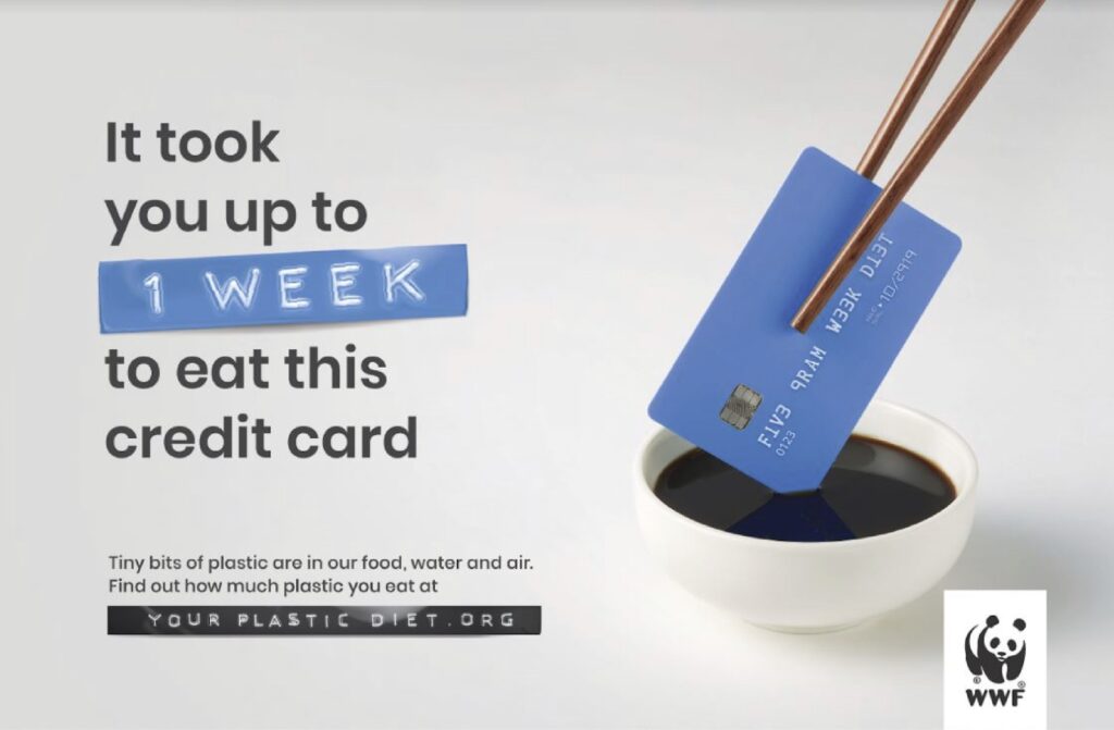
The Ad I decided to reverse engineer is WWF ( World Wildlife Fund) Ad on the Plastic diet. The Ad was launched in 2019 for Australian and South-East Asian audiences to educate the public on plastics pollution in wildlife, water consumption, and air. The Ad hoped to prevent the use of single-use plastics and the over-reliance on plastics in our society. The Ad was created by Grey
Graham Drew and Andrew Fong.
Credits:
Client: WWF
Campaign: Your plastic diet
Advertising agency: Grey
Graham Drew, Executive Creative Director
Andrew Fong, Creative Director
Heng Thang Wei, Creative Director
Selva Ganapathy, Copywriter
Kevin Wong, Art Director
Ralve Khor, Art Director
Suzy Chiang, Producer
Jo Yau, General Manager
Marcus SK, Brand Director
Vivian Khoo, Account Executive
Huma Qureshi, Regional Director PR & Corp Comms AMEA
Production Team: MFX Sdn. Bhd.
Post Production: Glass Fin (KL)
Sound Production: Maverick AV Sdn. Bhd.
Original Ad
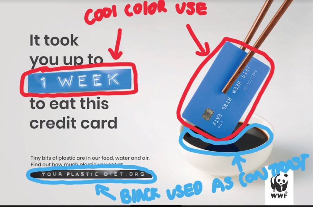
Design Analysis (Color)
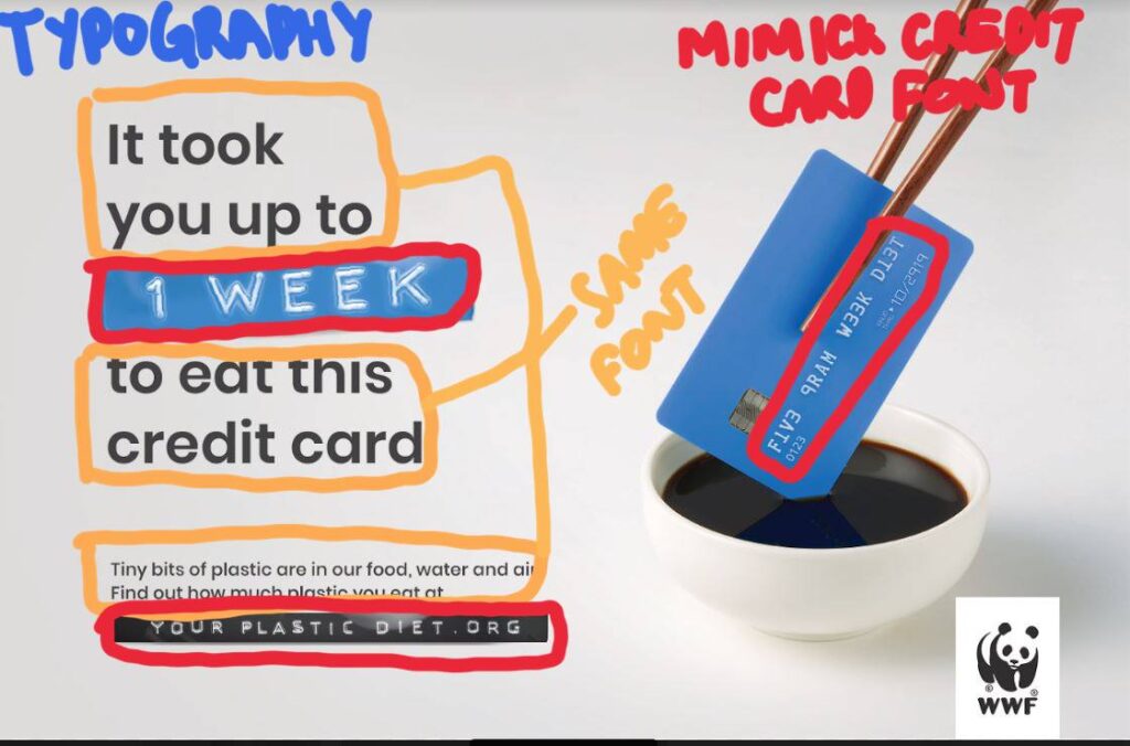
Design Analysis (Typography)
Design Analysis (Repetition)
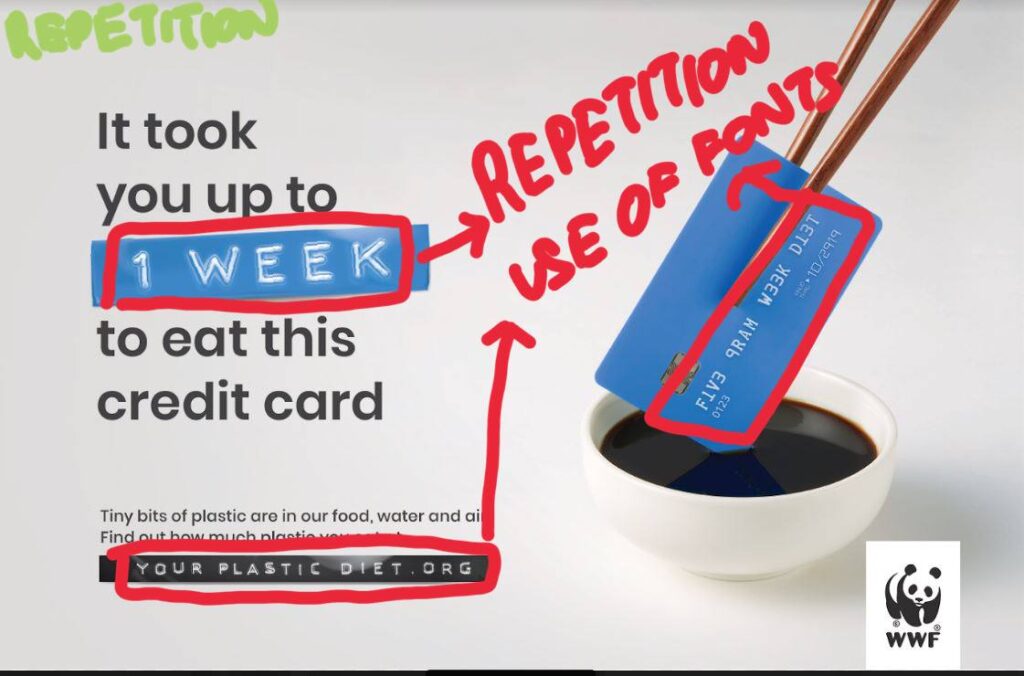
The use of repetition can be seen with the use of colors and typography. The colors are repeated with blue elements while the use of typography can be seen with the “1 week” and “your plastic diet.org” replicating the font on the blue credit card.
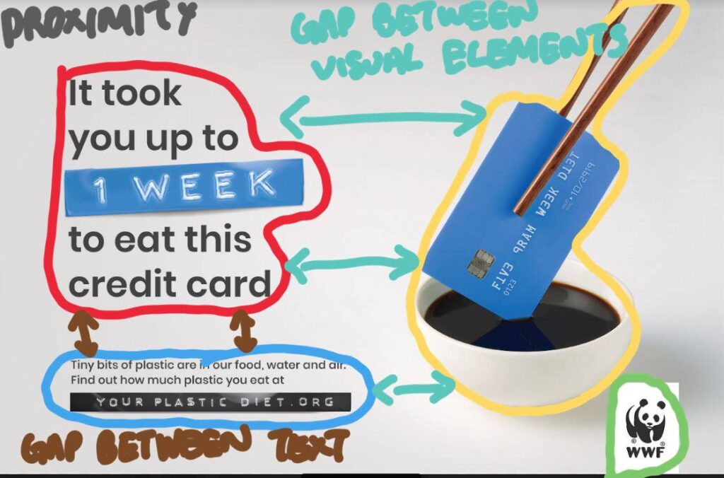
Design Analysis (Proximity)
Design Analysis (Contrast)
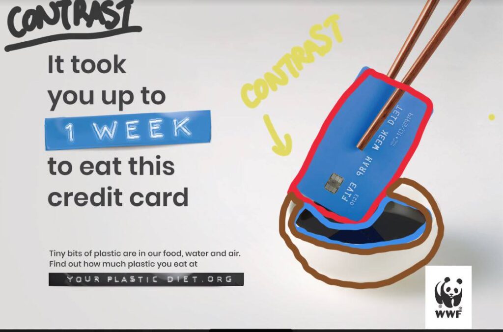
The use of contrast can be identified with the use of the separation of colors like a blue credit card on black soy sauce. The visual elements are then contrasted on the white sauce bowl and the white background that further contrasts with the black logo and text.
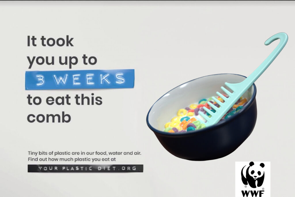
New Ad
Design Analysis (Color)
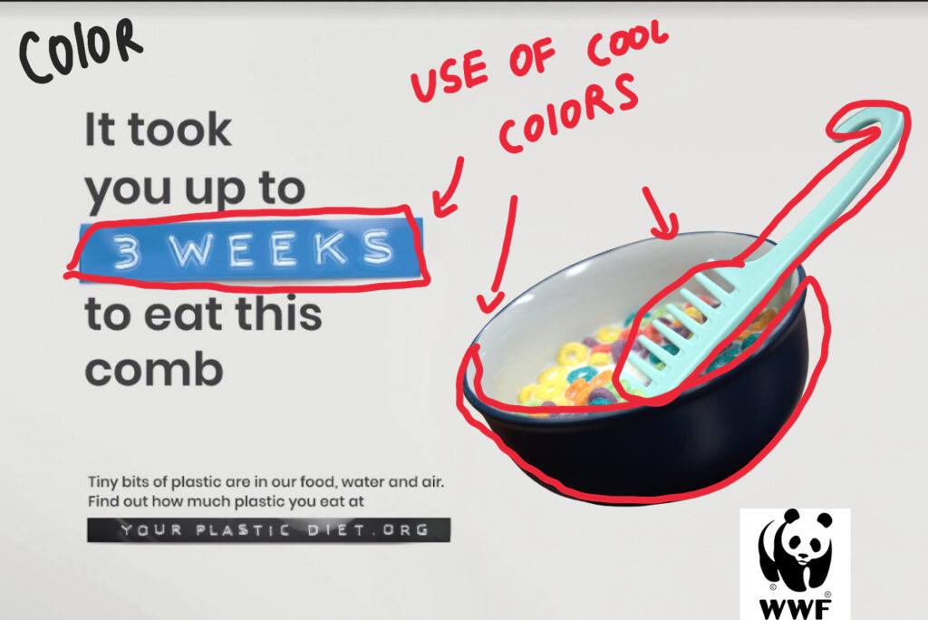
I choose to use a blue bowl and a blue comb to mimic the color scheme used in the text. I kept the design to have a cool color aesthetic.
Design Analysis (Typography)
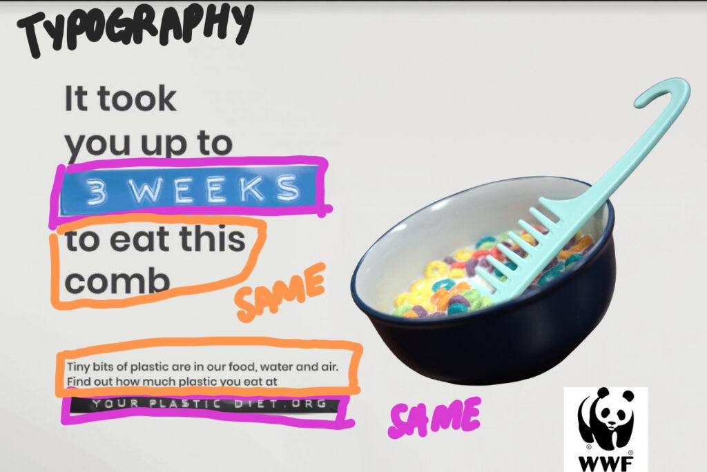
I used the same typography from the original design. I choose not to alter it as I felt that my updated design is very well suited to the existing typography.
Design Analysis (Repetition)

Elements of repetition can be seen with the repeated use of fonts in “3 weeks” and “your plastic diet.org” and the repetition in the use of colors like the blue color scheme used in the bowl and the “3 weeks” text.
Design Analysis (Alignment)
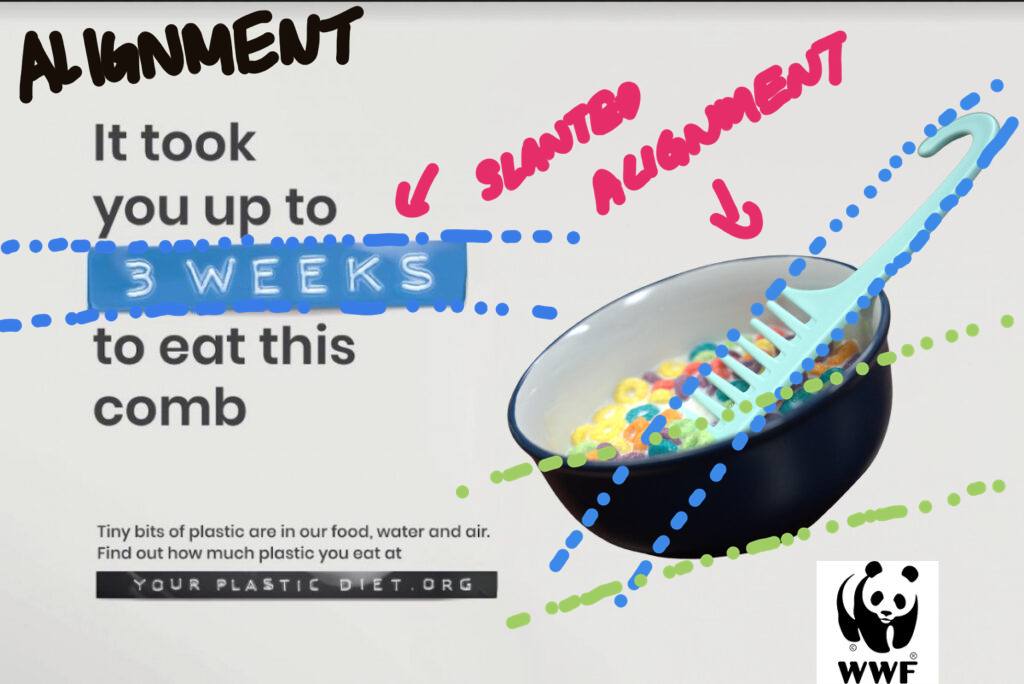
Elements of Alignment can be seen throughout the design. With the slanted alignment of the text, I choose to mimic it with the slanted bowl. I used the align the comb to be tilted on the bowl similar to the chopstick being slanted to the credit card found on the original design.
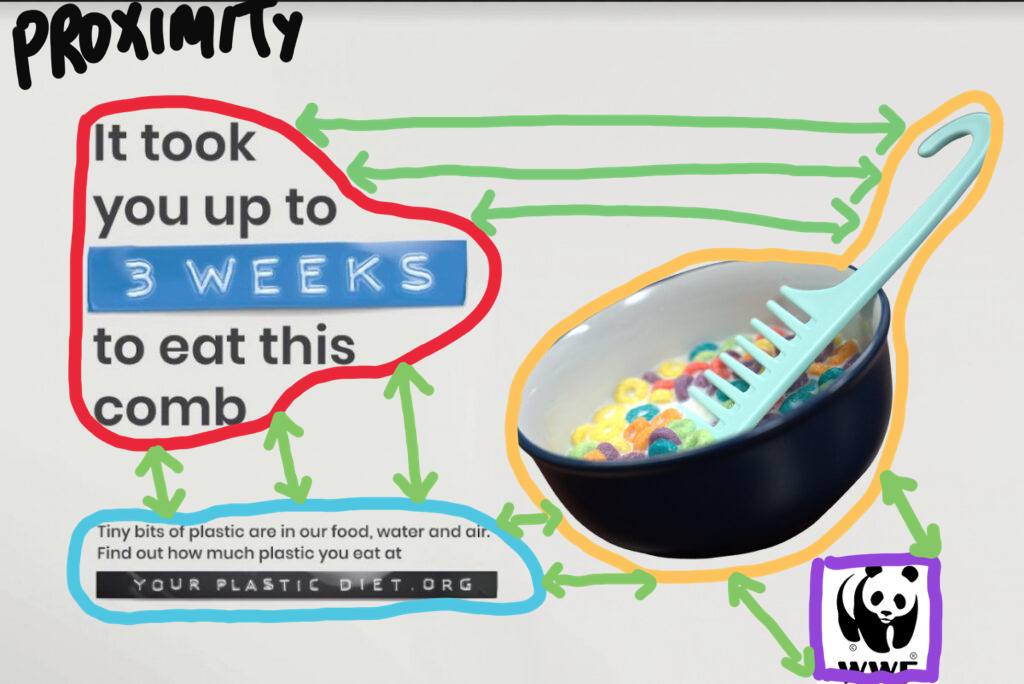
Design Analysis (Proximity)
Design Analysis (Contrast)
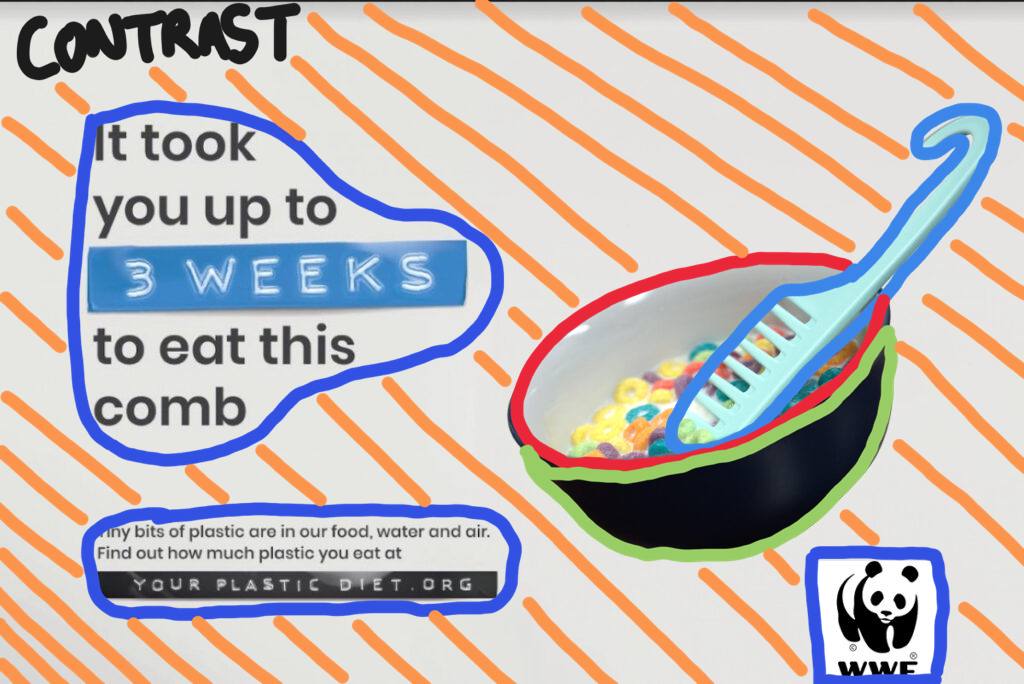
The elements of contrast can be seen as the dark blue bowl contrasts with the bright blue comb. The visual contrast with the white background with the use of dark colors , similar to the black logo of the panda contrasting with the white background.