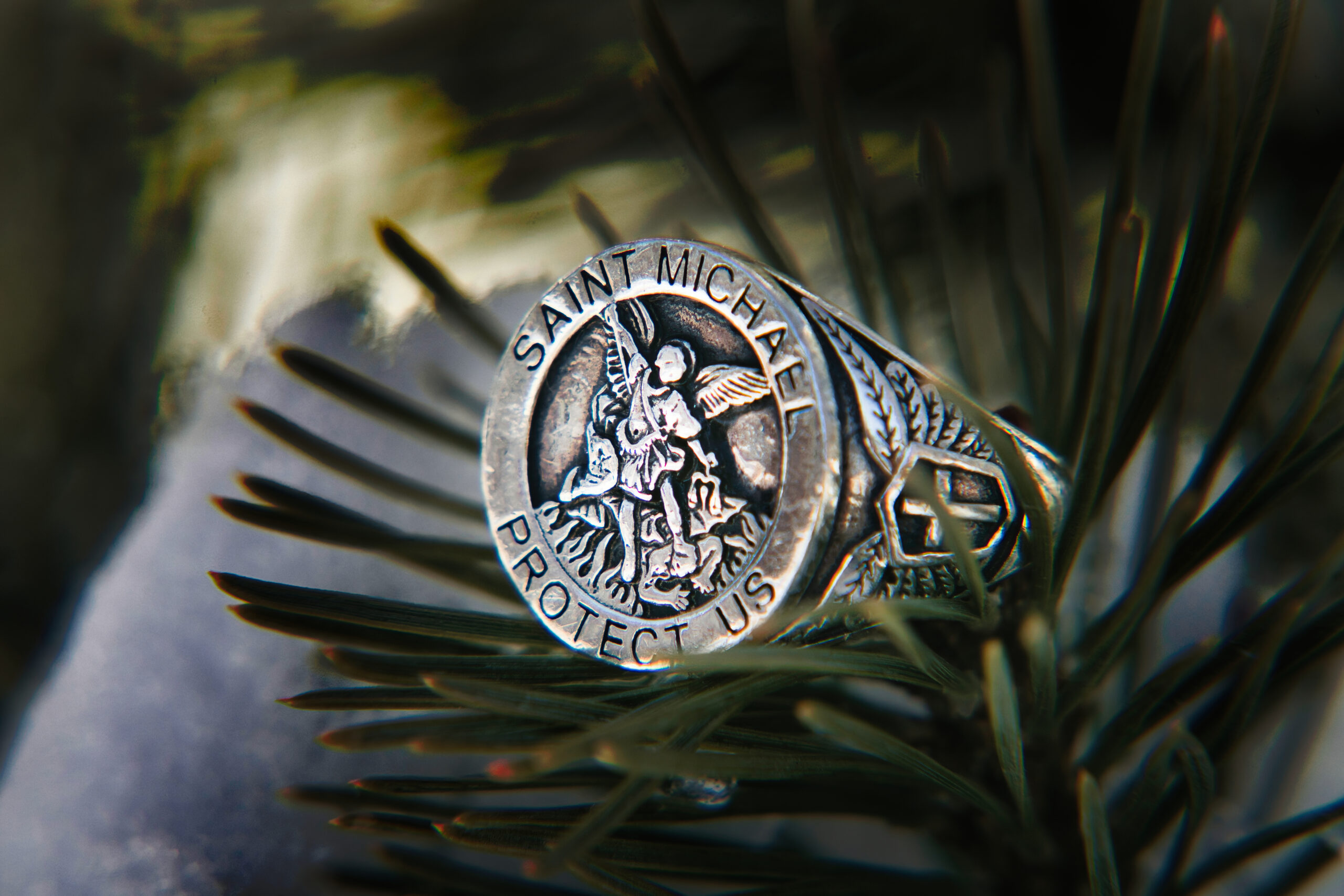
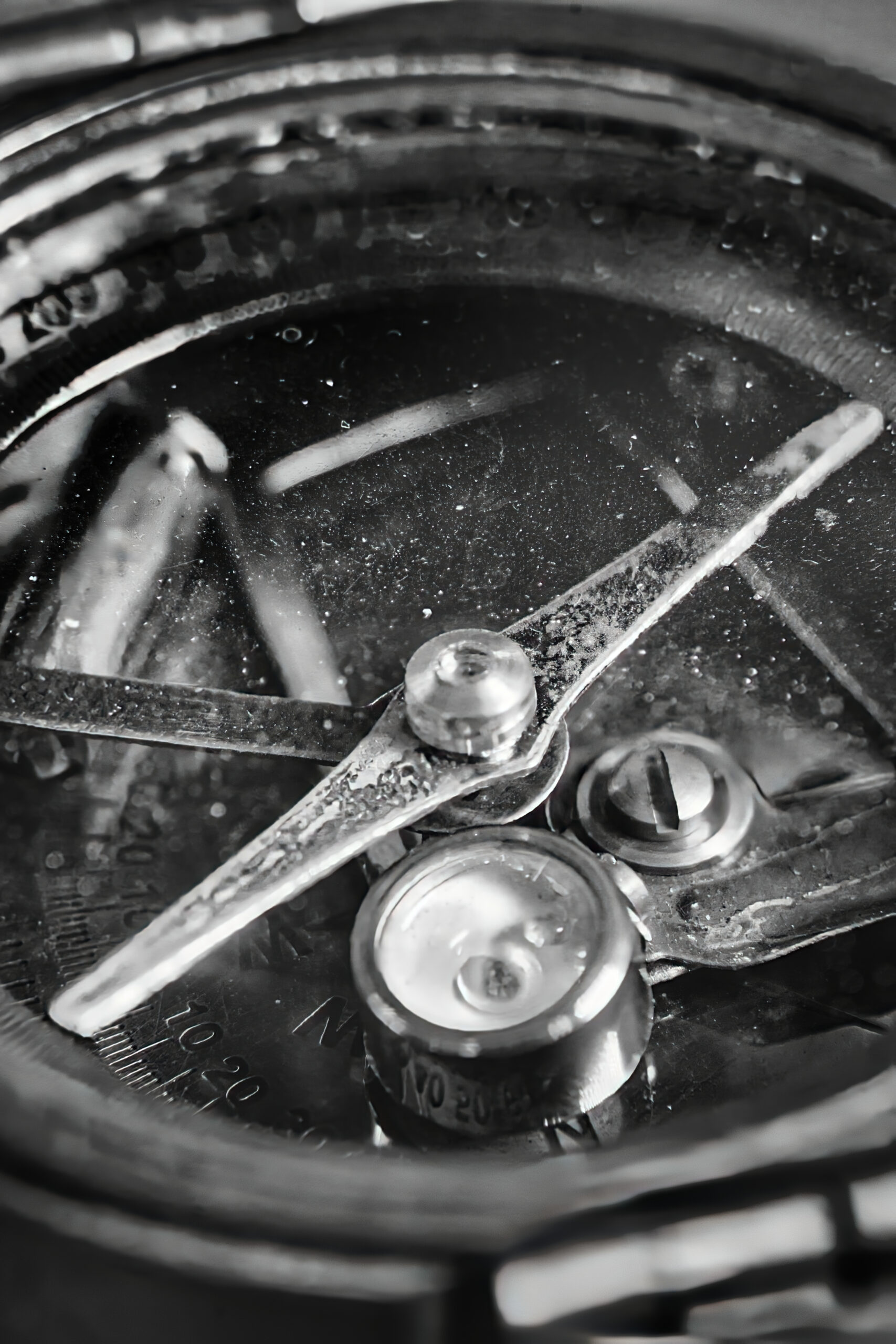
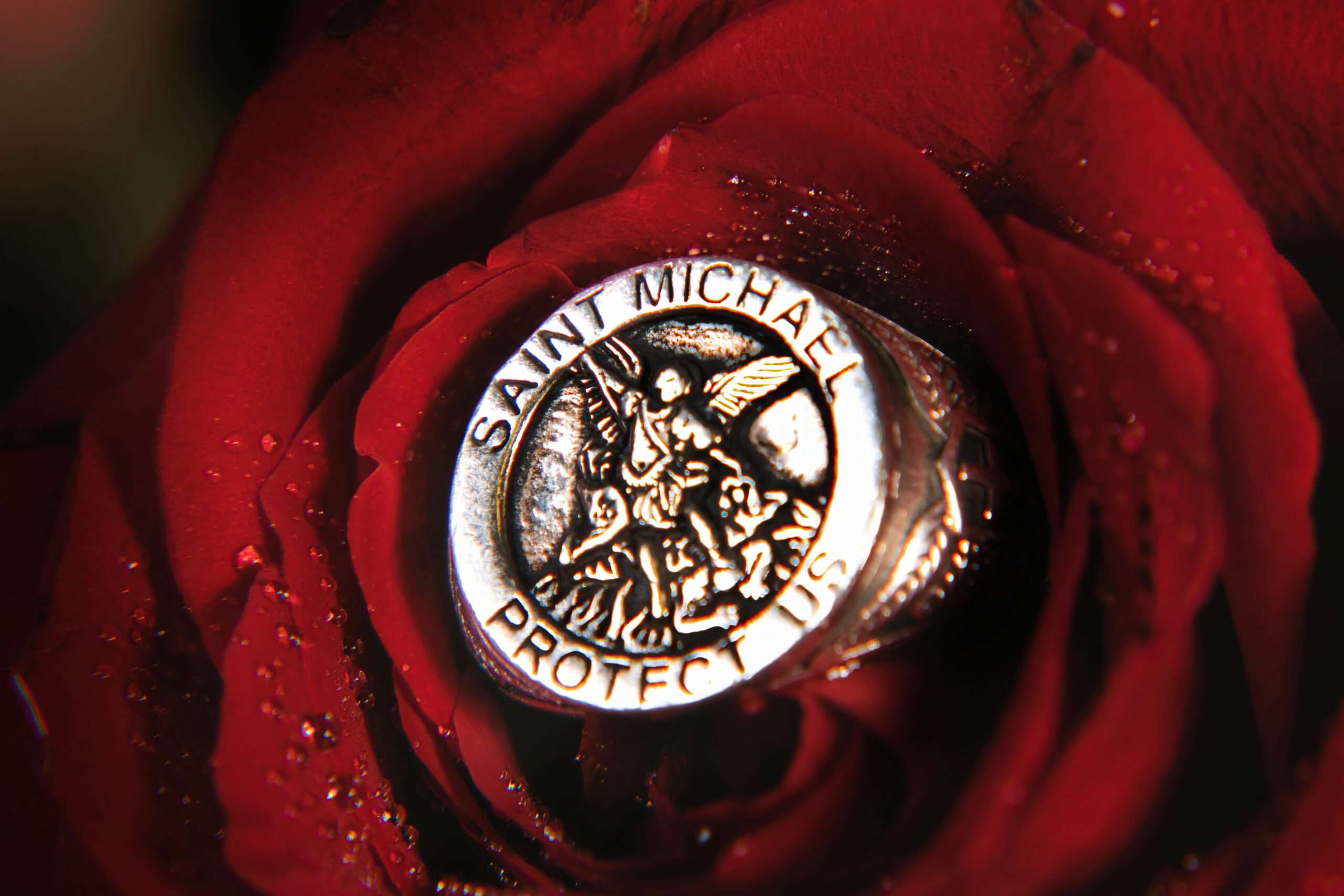
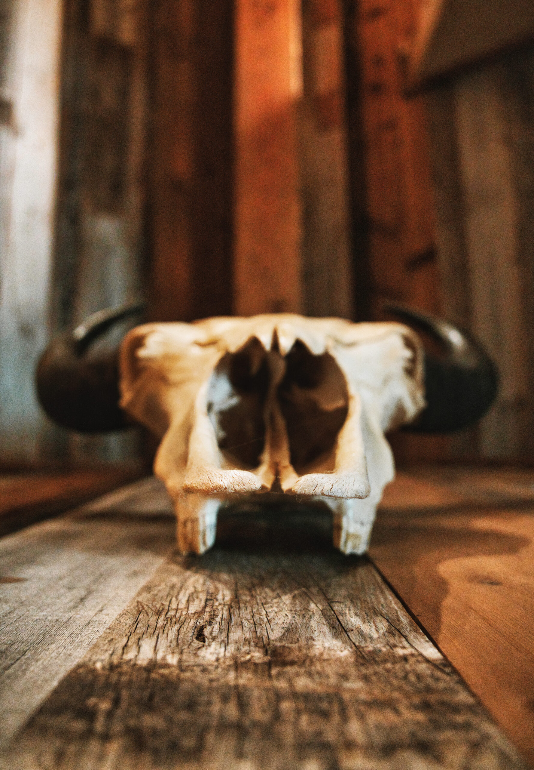
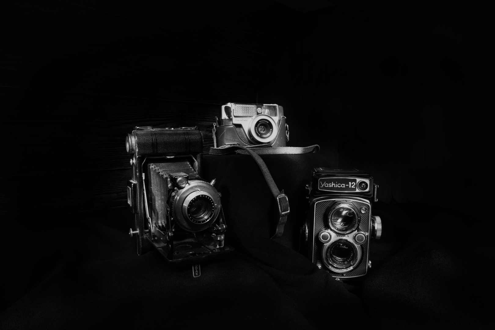
Have you ever looked at something small, like a flower or an insect, and wondered what it would look like up close? Macro photography allows us to explore the micro world around us and capture the intricate details of tiny subjects in stunning detail.
Macro photography requires specialized equipment such as a macro lens, extension tubes, or close-up filters to achieve the desired level of magnification.
In this week’s post, we’ll be diving into the world of macro photography! I’ll also be showcasing some incredible examples of macro photography, highlighting the beauty and complexity of the micro world around us.
Get ready to discover the hidden wonders of the micro-world through the lens of macro photography.
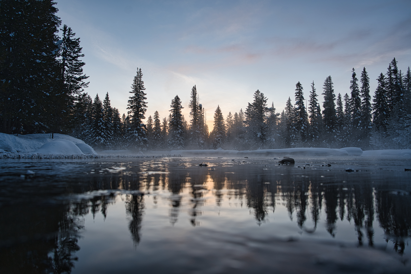
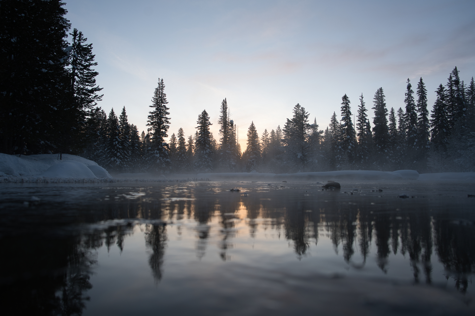
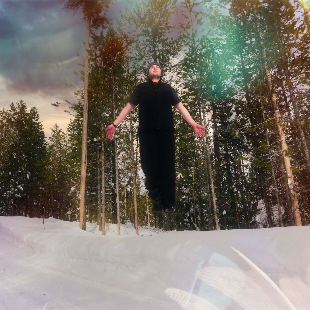
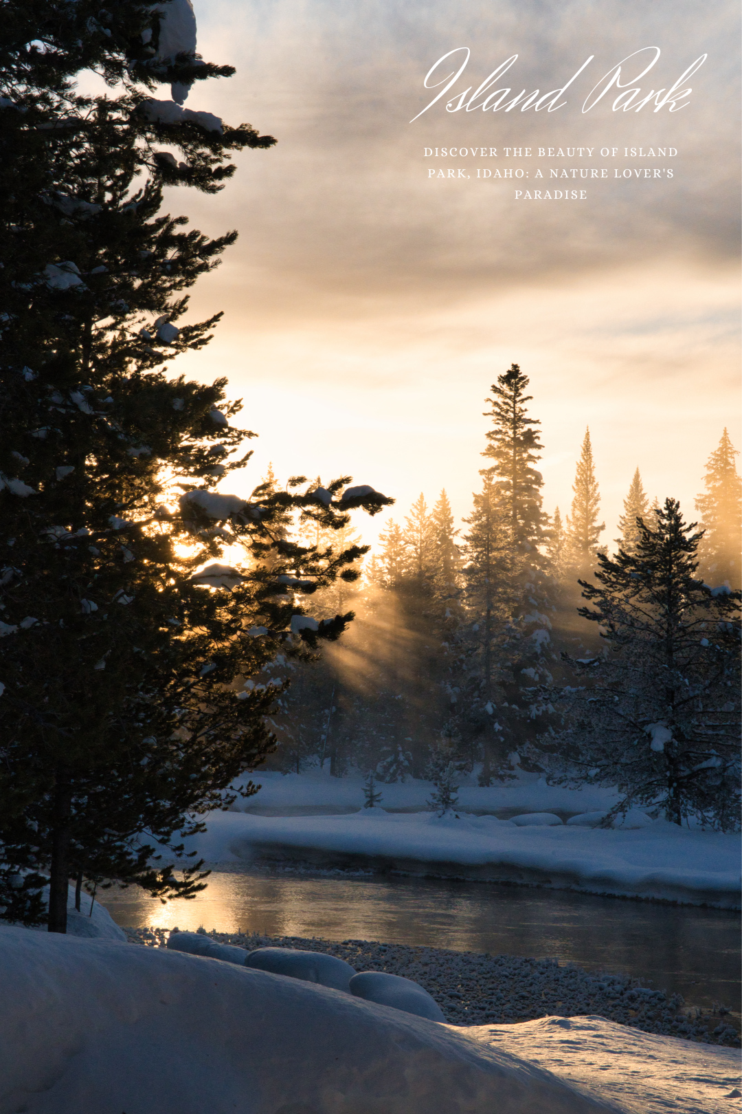
Winter is a magical time of year, and for a photographer, it’s a chance to capture the world in a way that’s totally unique. If you’re looking for a winter photography adventure, you won’t want to miss the stunning landscapes of Island Park, Idaho. This charming town is a hidden gem, boasting snow-covered trees, frozen lakes, and towering mountains that create the perfect backdrop for capturing breathtaking images.
In this blog post, we’ll take a closer look at some of the best spots in Island Park for winter photography, as well as some insider tips and tricks for capturing stunning shots.
So bundle up, and get ready to discover the magic of winter photography in Island Park, Idaho!
Discover the hidden gem of Island Park, Idaho, where nature takes center stage in my latest photoshoot. Situated amidst the breathtaking Teton Mountain Range and the vast expanse of Yellowstone National Park, Island Park offers a breathtaking escape from the hustle and bustle of everyday life.
From the majestic peaks of the surrounding mountains to the rolling hills and crystal-clear streams, every aspect of this idyllic destination is a feast for the eyes.
Whether you’re a seasoned outdoor enthusiast or just looking for a peaceful getaway, Island Park offers something for everyone. With its diverse range of landscapes, including forests, meadows, and lakes, there is no shortage of stunning vistas to admire.
Join me as we take a journey through Island Park, Idaho, and experience the breathtaking beauty of this stunning destination. From stunning panoramic views to intimate landscapes, each shot captures a unique perspective of the region’s unparalleled beauty.
So sit back, relax, and let my images transport you to the heart of Island Park. I hope that you’ll be inspired by the stunning scenery and will consider visiting this breathtaking destination for yourself
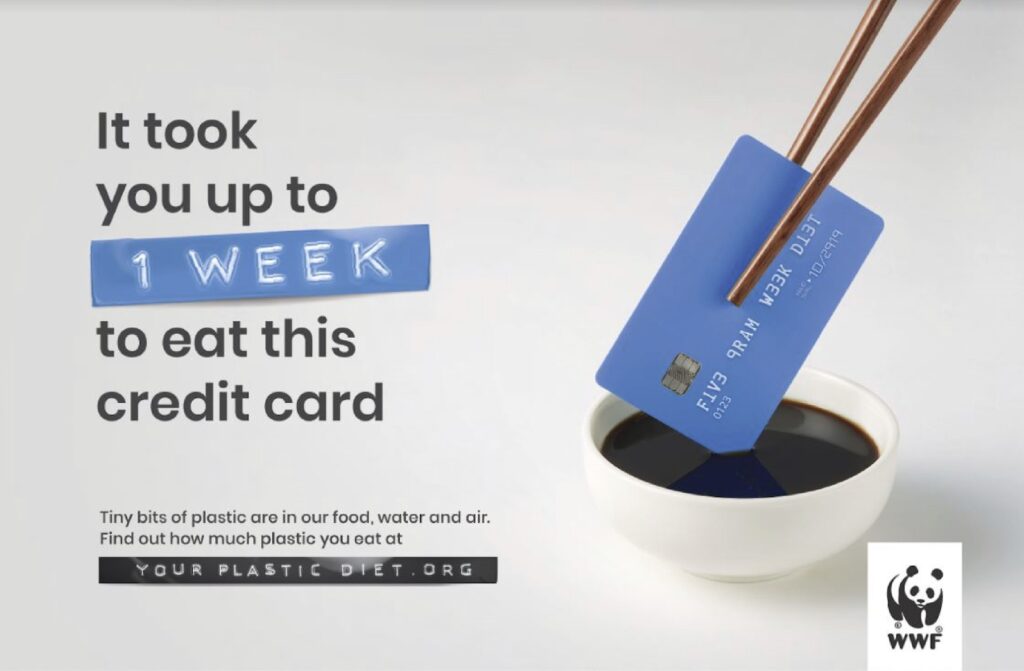
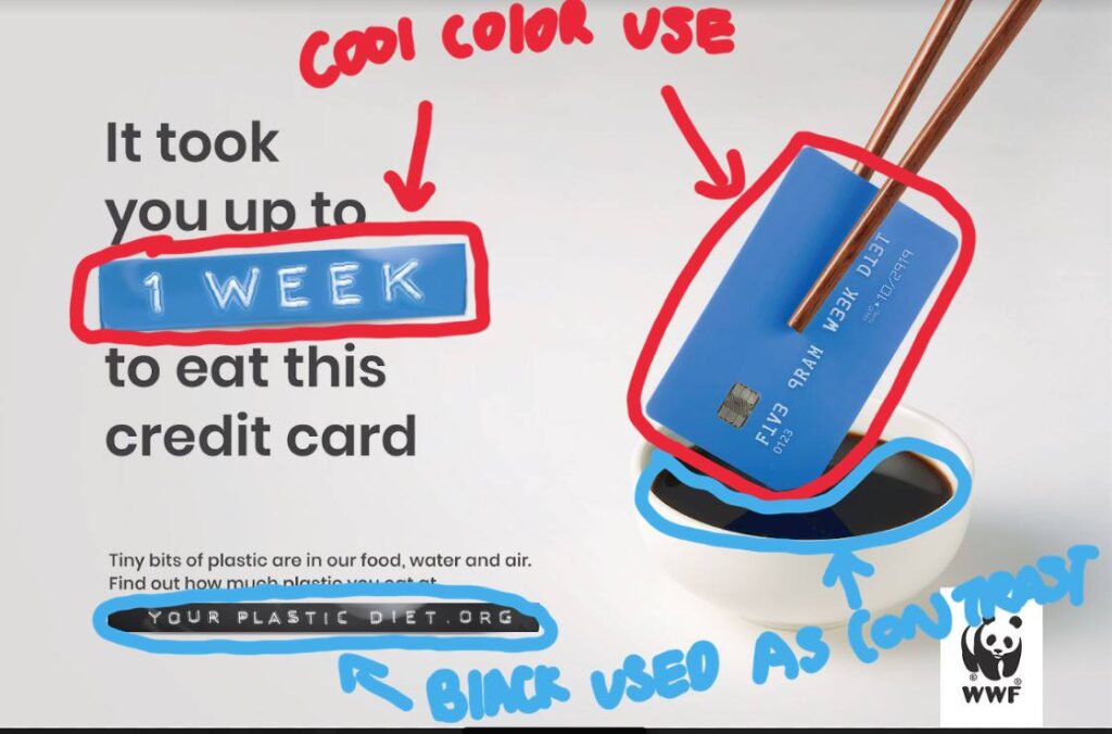
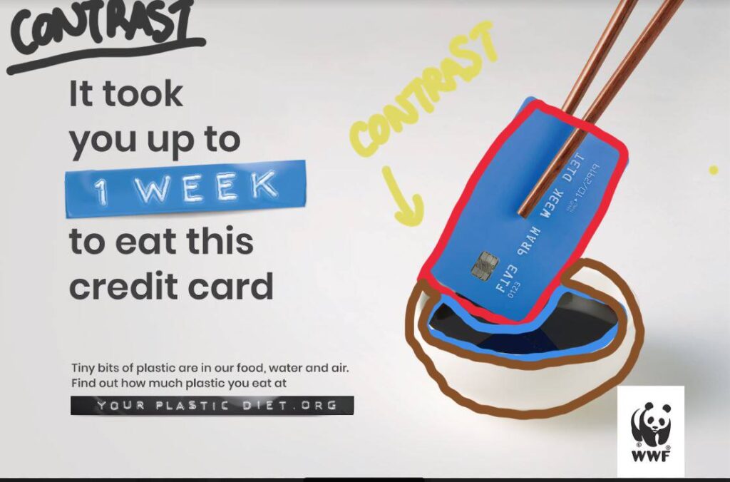
The Ad I decided to reverse engineer is WWF ( World Wildlife Fund) Ad on the Plastic diet. The Ad was launched in 2019 for Australian and South-East Asian audiences to educate the public on plastics pollution in wildlife, water consumption, and air. The Ad hoped to prevent the use of single-use plastics and the over-reliance on plastics in our society. The Ad was created by Grey Graham Drew and Andrew Fong.
Credits: Client: WWF Campaign: Your plastic diet Advertising agency: Grey Graham Drew, Executive Creative Director Andrew Fong, Creative Director Heng Thang Wei, Creative Director Selva Ganapathy, Copywriter Kevin Wong, Art Director Ralve Khor, Art Director Suzy Chiang, Producer Jo Yau, General Manager Marcus SK, Brand Director Vivian Khoo, Account Executive Huma Qureshi, Regional Director PR & Corp Comms AMEA Production Team: MFX Sdn. Bhd. Post Production: Glass Fin (KL) Sound Production: Maverick AV Sdn. Bhd.
Original Ad
Design Analysis (Color)
The use of colors can be seen here with the blue elements found in the card that is being eaten and the “1 week” sign. The use of black can be seen on the color of the logo , soy sauce and “Your plastic diet”
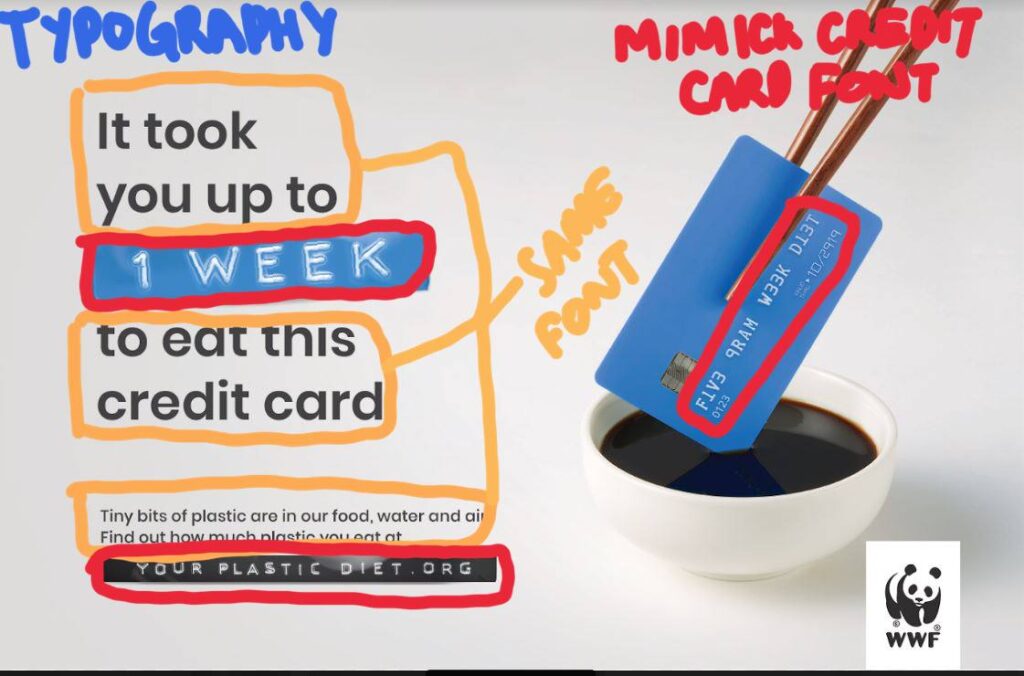
Design Analysis (Typography)
The use of typography can be seen here with the use of 2 different types of fonts. The first is the decorative font used on the credit card. Its fonts are mimicked in the 2 signs reading “1 week” and “Your Plastic Diet.org”. The other font used in the ad is a sans serif font.
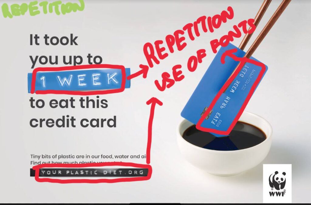
Design Analysis (Repetition)
The use of repetition can be seen with the use of colors and typography. The colors are repeated with blue elements while the use of typography can be seen with the “1 week” and “your plastic diet.org” replicating the font on the blue credit card.
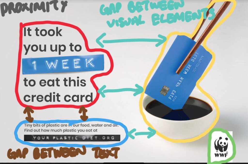
Design Analysis (Proximity)
The use of proximity can be seen as white space created by separating the visual elements from the body of the texts and the logo. By doing so it allows the reader a place for their eyes to rest as they read the ad.
Design Analysis (Contrast)
The use of contrast can be identified with the use of the separation of colors like a blue credit card on black soy sauce. The visual elements are then contrasted on the white sauce bowl and the white background that further contrasts with the black logo and text.
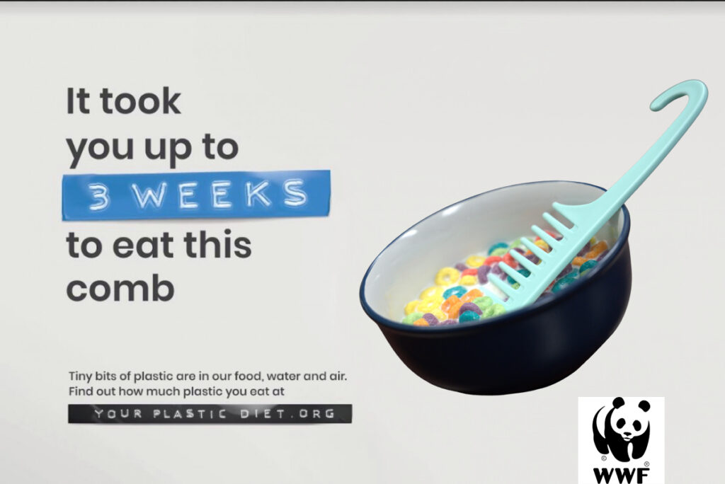
New Ad
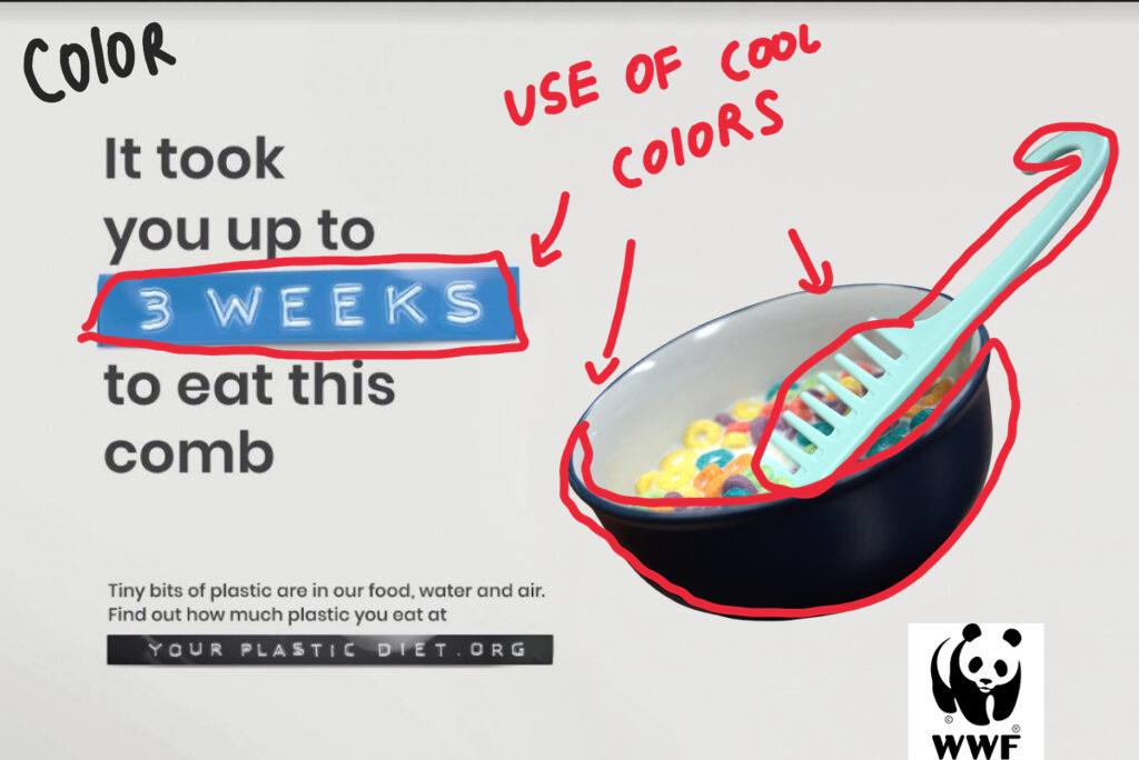
Design Analysis (Color)
I choose to use a blue bowl and a blue comb to mimic the color scheme used in the text. I kept the design to have a cool color aesthetic.
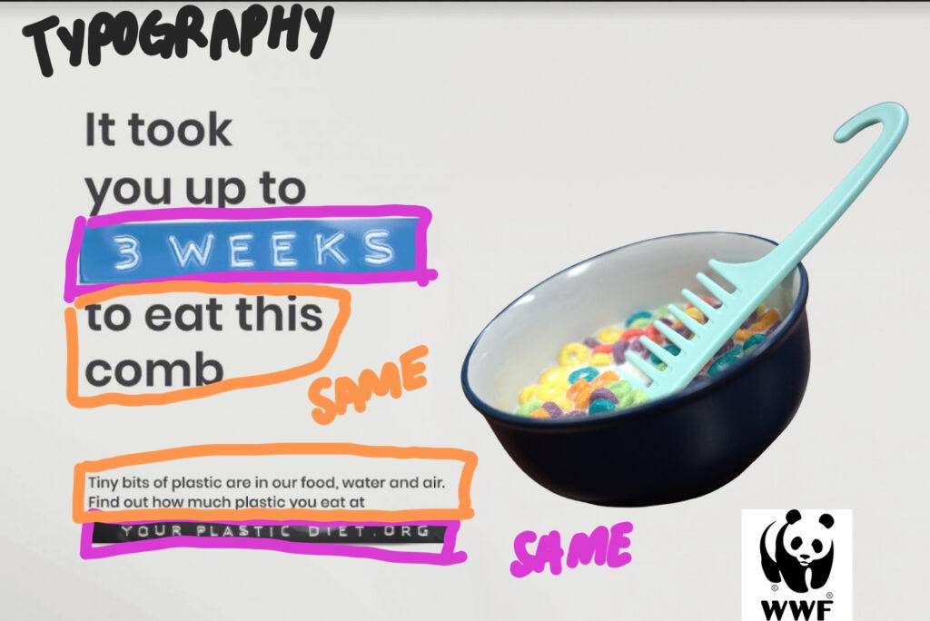
Design Analysis (Typography)
I used the same typography from the original design. I choose not to alter it as I felt that my updated design is very well suited to the existing typography.
Design Analysis (Repetition)
Elements of repetition can be seen with the repeated use of fonts in “3 weeks” and “your plastic diet.org” and the repetition in the use of colors like the blue color scheme used in the bowl and the “3 weeks” text.
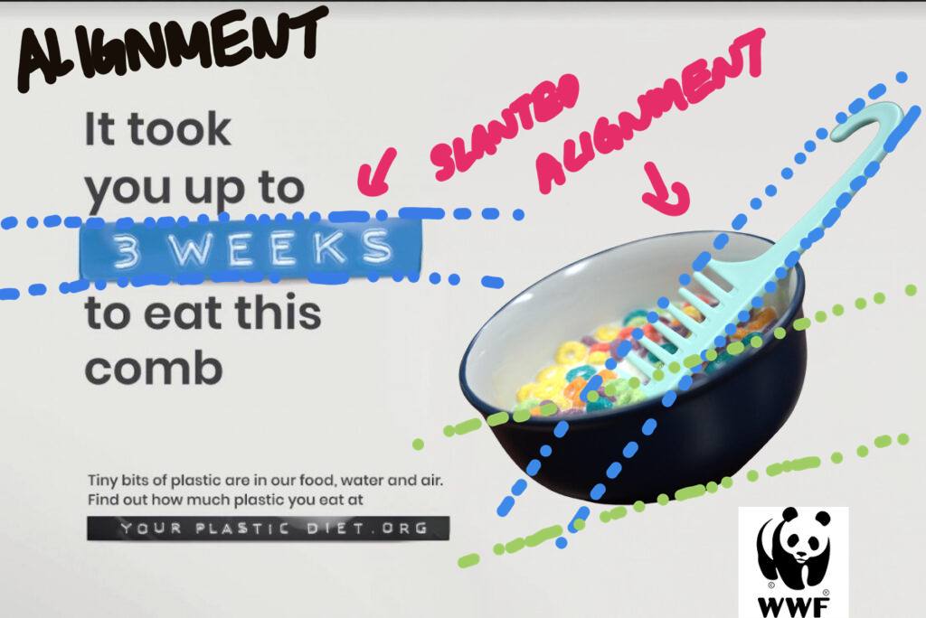
Design Analysis (Alignment)
Elements of Alignment can be seen throughout the design. With the slanted alignment of the text, I choose to mimic it with the slanted bowl. I used the align the comb to be tilted on the bowl similar to the chopstick being slanted to the credit card found on the original design.
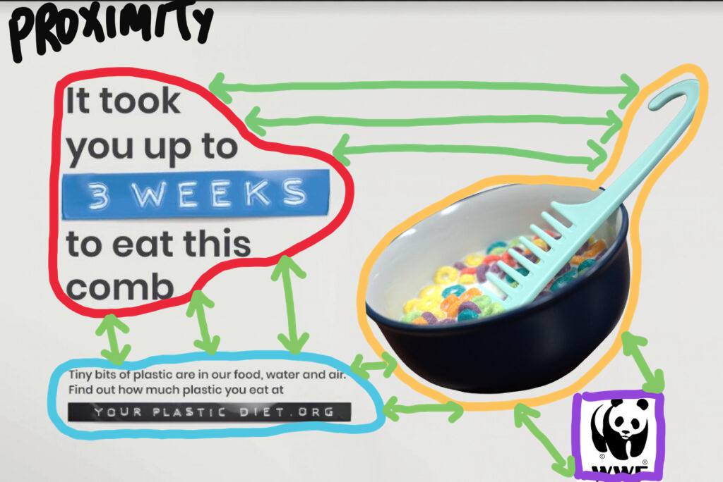
Design Analysis (Proximity)
The elements of proximity can be found in this design with the visual elements and the text being spaced apart making room for white space. With the white space, my viewer is able to rest their eyes while reading the advertisement.
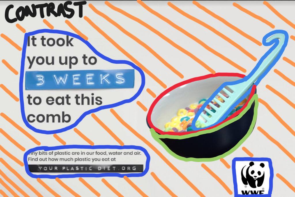
Design Analysis (Contrast)
The elements of contrast can be seen as the dark blue bowl contrasts with the bright blue comb. The visual contrast with the white background with the use of dark colors , similar to the black logo of the panda contrasting with the white background.
other relevant information about the designer, design, or general appeal.
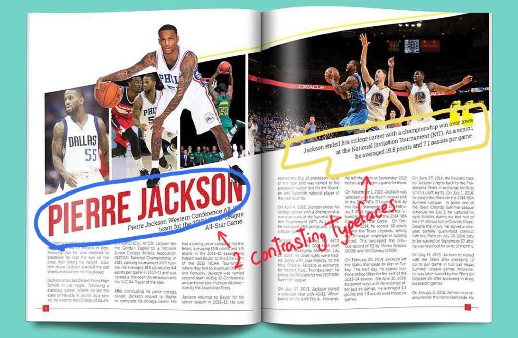
Contrasting Typefaces
The 2 types of typeface used here are Morden (Blue circle) and slab serif (yellow circle). The modern serif was identified due to the font having thin, long horizontal serifs, and clear-cut thick/thin transitions in the strokes. The slab serif font on the other hand was identified due to the presence of y the “feet” or “stubs” on each character.
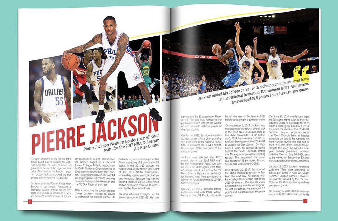
Leading Lines
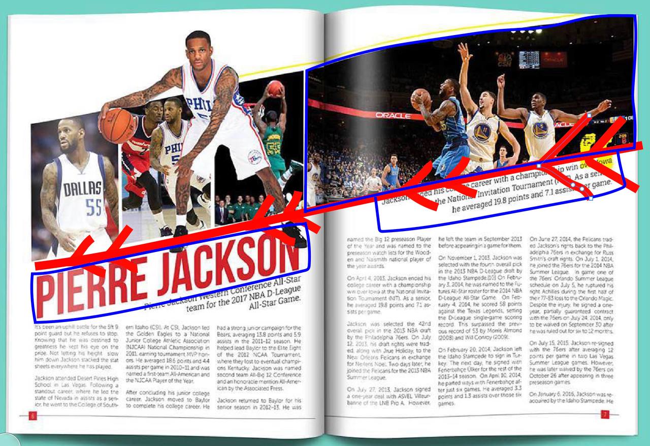
Leading lines can be seen here by the photographer because the 4 images direct the attention to the title “Pierre Jackson” and the focal attention to the photograph of him. The use of leading lines in the photograph also shapes the text boxes around it.
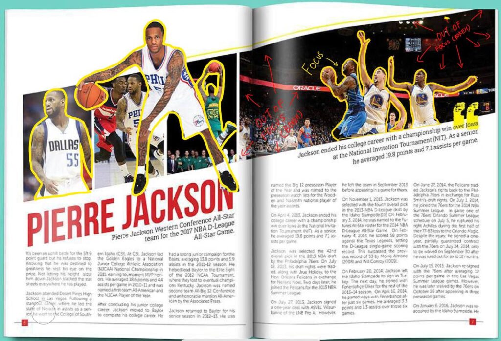
Depth of Field
Depth of field can be seen here as highlighted by the yellow outlines as it focuses the focal attention of the photograph[ph on the players. This is an excellent use of contrast as the background blur (bokeh) further moves the attention towards the players instead of the ground and other elements in the background.
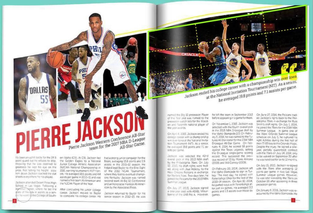
Rule of Thirds
The rule of thirds can be seen clearly in the photograph with the green outline and identified with the yellow dotted lines. This clear use of the rule of thirds hilights guides the viewer’s visual attention to the 3 players in the photograph.
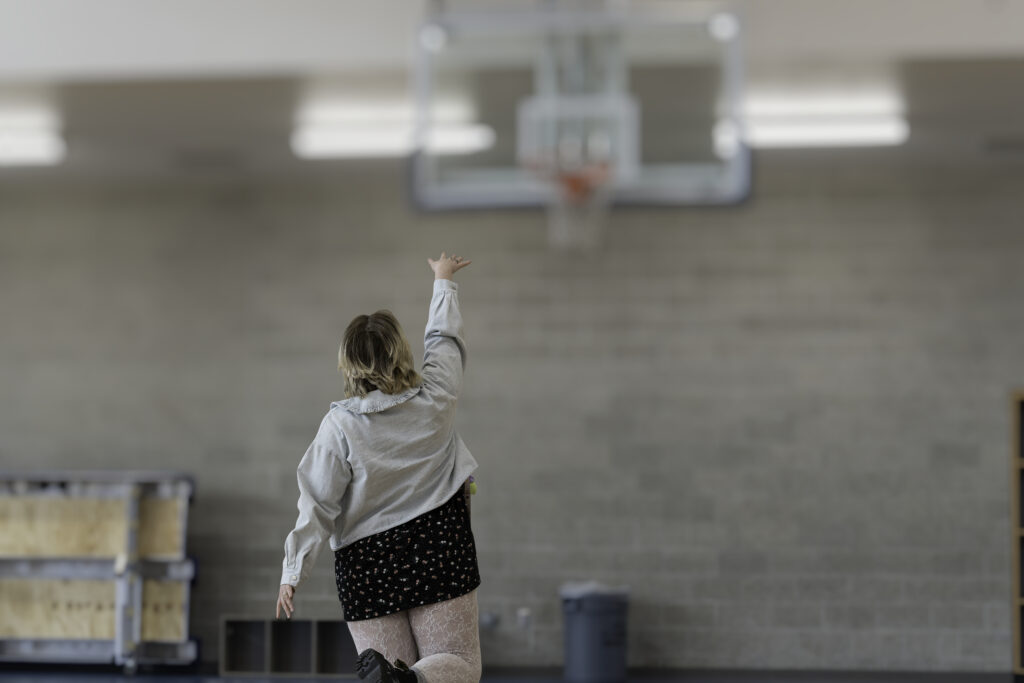
Depth of Field
I mimicked the NBA player shooting the basketball with the photo of a normal pedestrian looking girl with everyday clothes shooting a basket. This signifies that basketball is for everyone and it is a very inclusive sport. My photograph’s focus is on the girl shooting , therefore I choose to use depth of field by focusing on her while the background is blurred. I did this by using a 70-200mm lens so there was a lot of background compression. I later edited the background bokeh asm well.
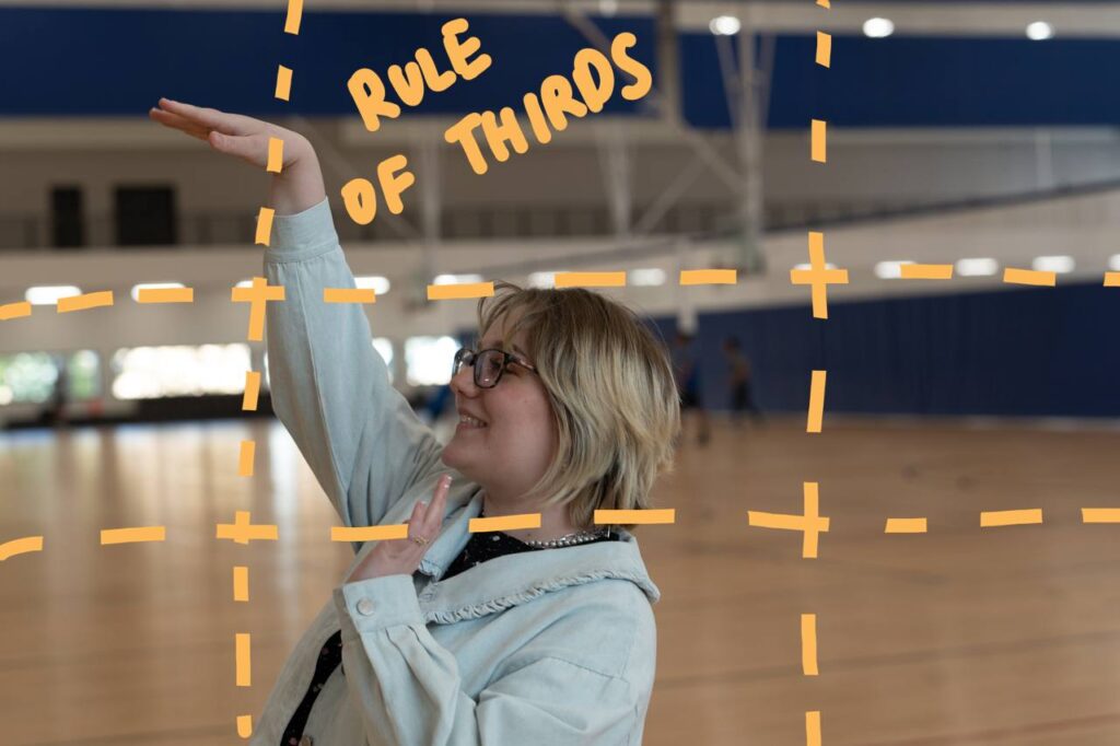
Rule of Thirds
I mimicked the NBA player shooting the basketball with the photo of a normal pedestrian looking girl with everyday clothes shooting a basket. This signifies that basketball is for everyone and it is a very inclusive sport. My photograph’s focus is on the girl shooting , therefore I choose to use rule of thirds by keeping her head and ger shooting hand on the lines. To create this shot I use the rule of thirds mode on the camera and a 24-70mm lens so I can get closer to her.
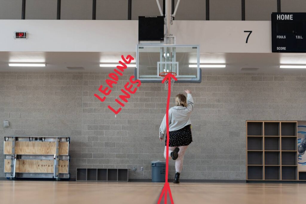
Leading Lines
I mimicked the NBA player shooting the basketball with the photo of a normal pedestrian looking girl with everyday clothes shooting a basket. This signifies that basketball is for everyone and it is a very inclusive sport. My photograph’s focus is on the girl shooting , therefore I choose to use leading lines by focusing on her while she is standing on the markings on the floor leading up to the basket as she attempts to shoot a basket. The lines lead the visual attention to her and the basket in front of her. I did this by using a 70-200m lens so that I can be far away while showing her on the leading line on the floor.
Conclusion
Overall these 3 rules (Rule of thirds,leading lines,depth of field) are very good principals of design as they add contrast to the visual storytelling of a deign/photograph.
In a photograph there can be a lot of elements , by relying on these rules of design it helps lead the viewer’s eye to the story we are trying to tell by contrasting the important elements with the background ones.
In a photograph , just like design we need white space to get the viewer’s eye’s a place to rest and the use of these 3 rules help do that.