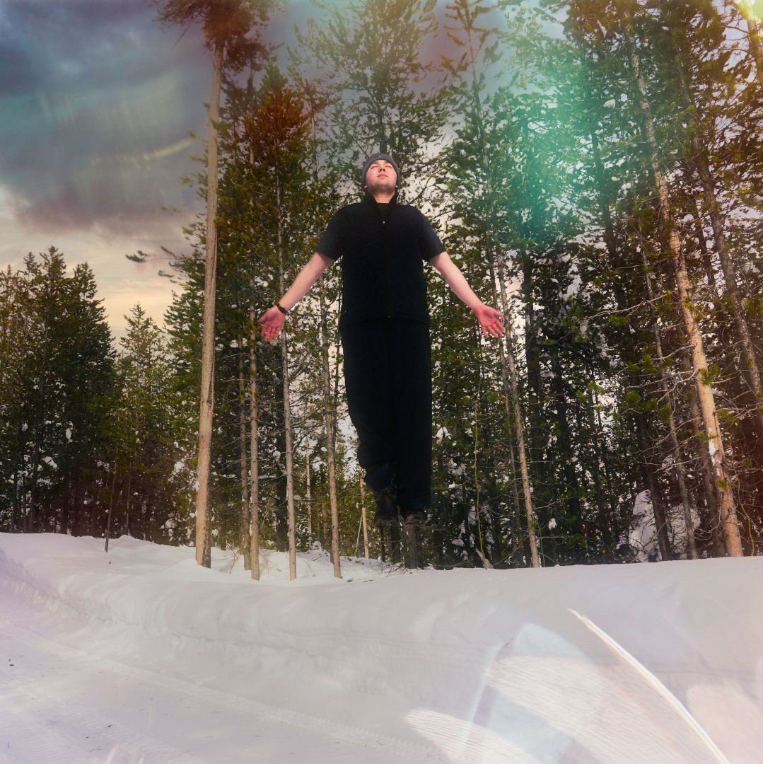
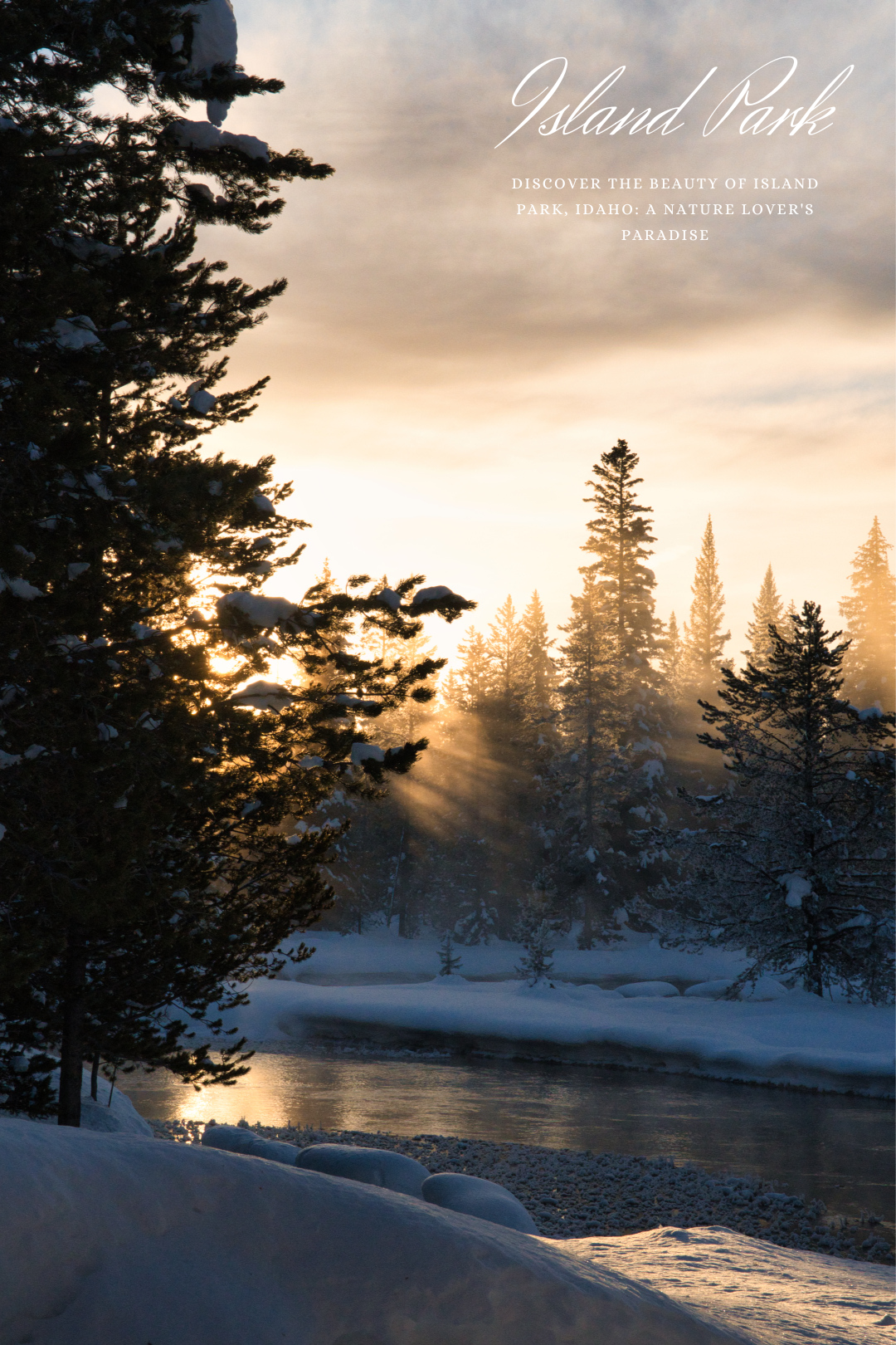
Discover the hidden gem of Island Park, Idaho, where nature takes center stage in my latest photoshoot. Situated amidst the breathtaking Teton Mountain Range and the vast expanse of Yellowstone National Park, Island Park offers a breathtaking escape from the hustle and bustle of everyday life.
From the majestic peaks of the surrounding mountains to the rolling hills and crystal-clear streams, every aspect of this idyllic destination is a feast for the eyes.
Whether you’re a seasoned outdoor enthusiast or just looking for a peaceful getaway, Island Park offers something for everyone. With its diverse range of landscapes, including forests, meadows, and lakes, there is no shortage of stunning vistas to admire.
Join me as we take a journey through Island Park, Idaho, and experience the breathtaking beauty of this stunning destination. From stunning panoramic views to intimate landscapes, each shot captures a unique perspective of the region’s unparalleled beauty.
So sit back, relax, and let my images transport you to the heart of Island Park. I hope that you’ll be inspired by the stunning scenery and will consider visiting this breathtaking destination for yourself
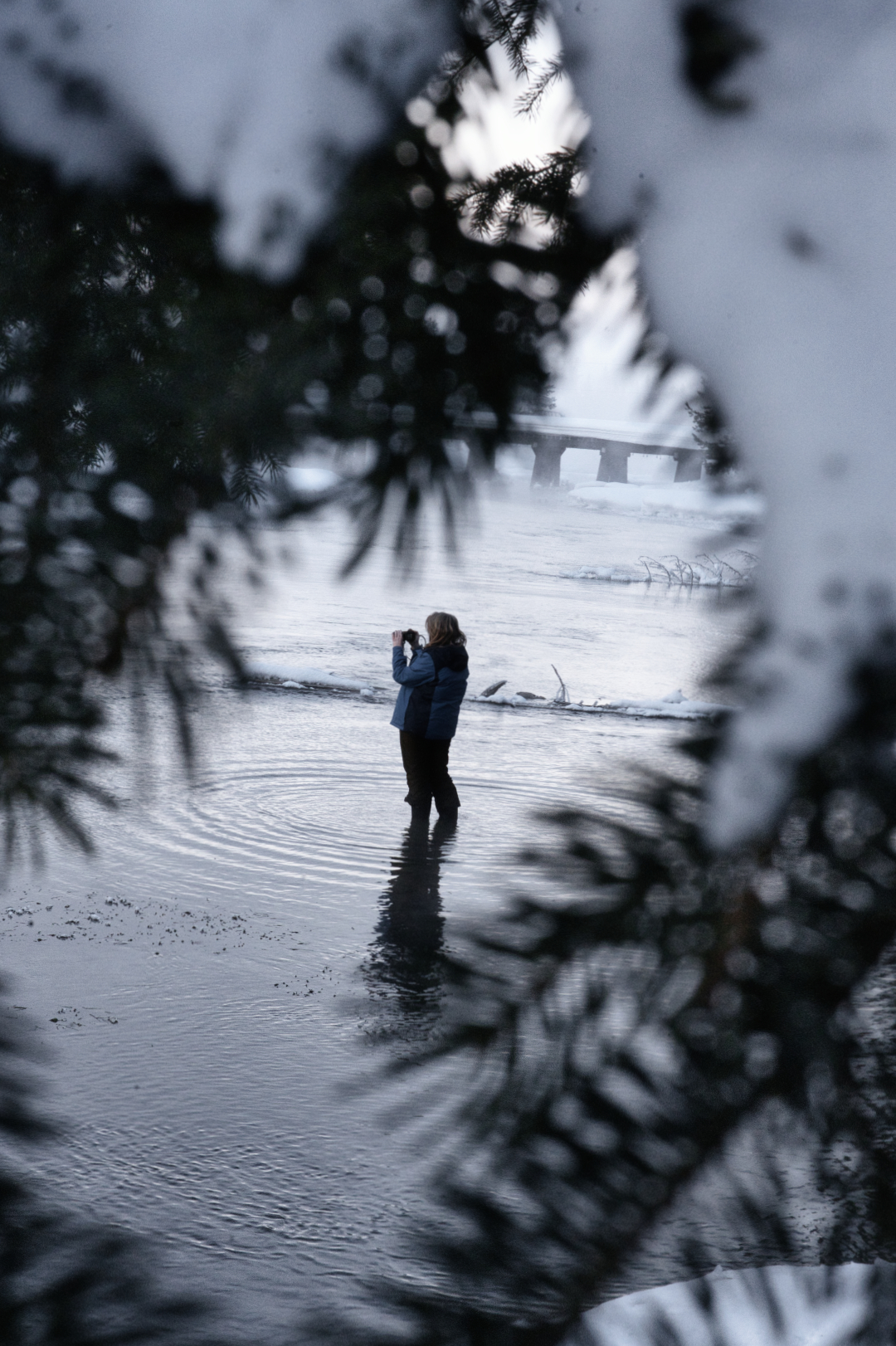
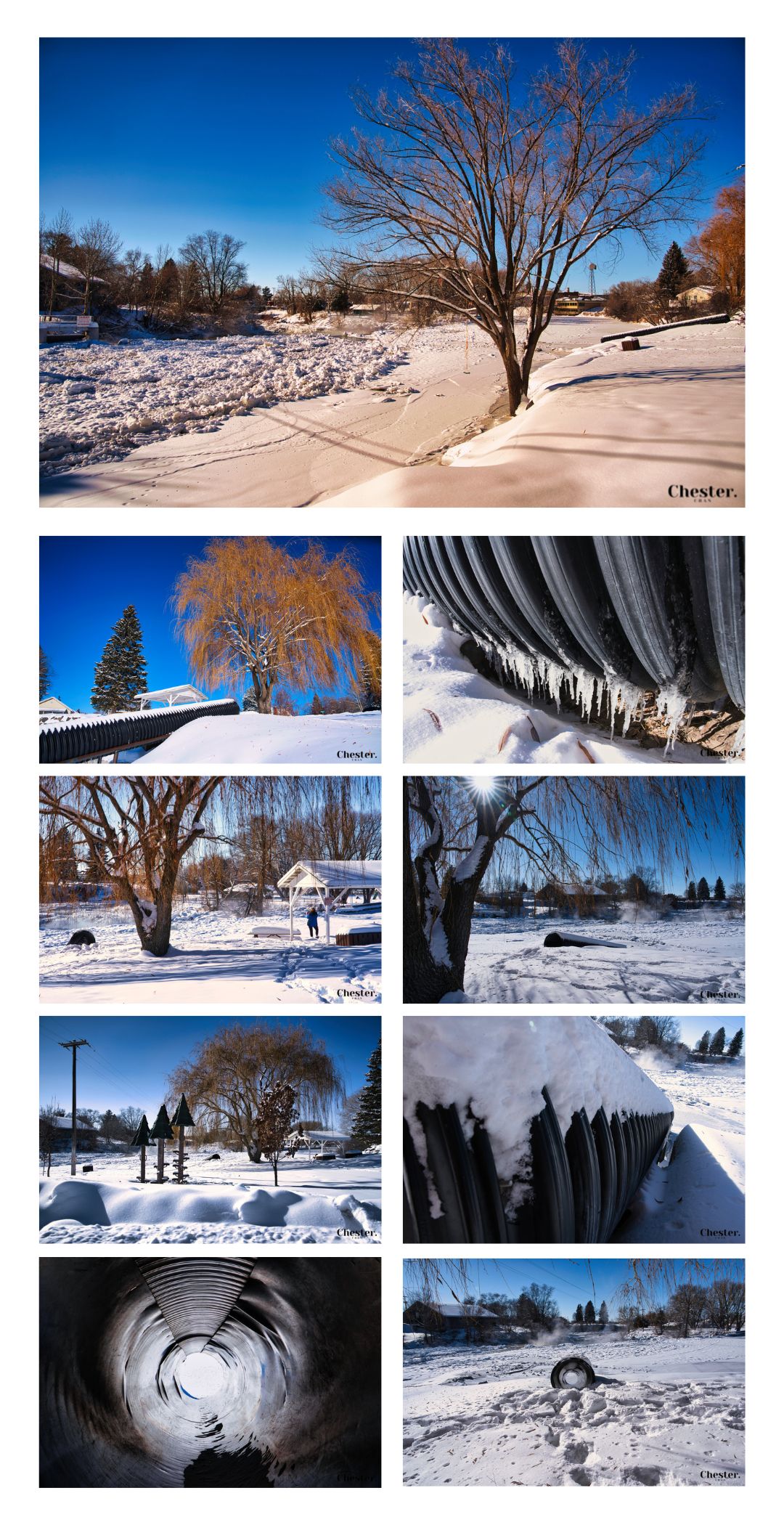
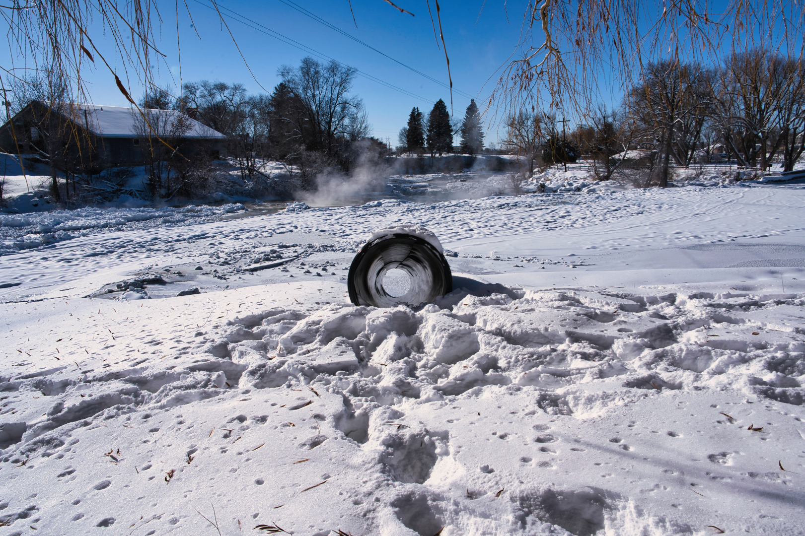
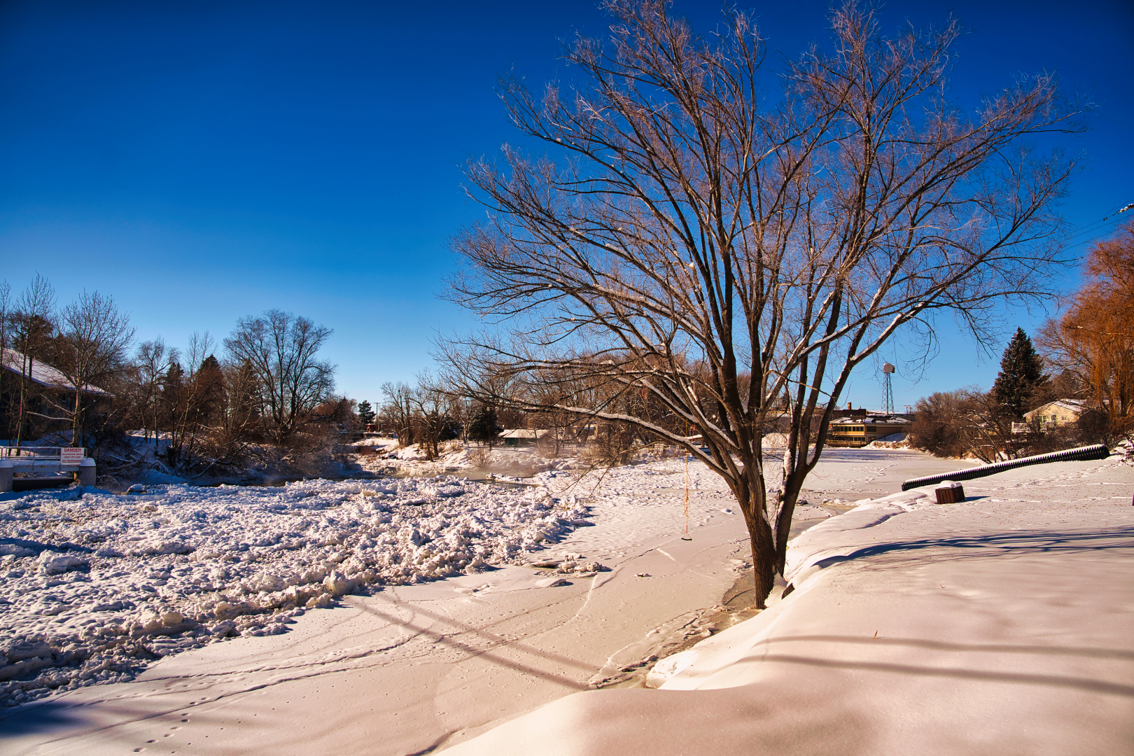
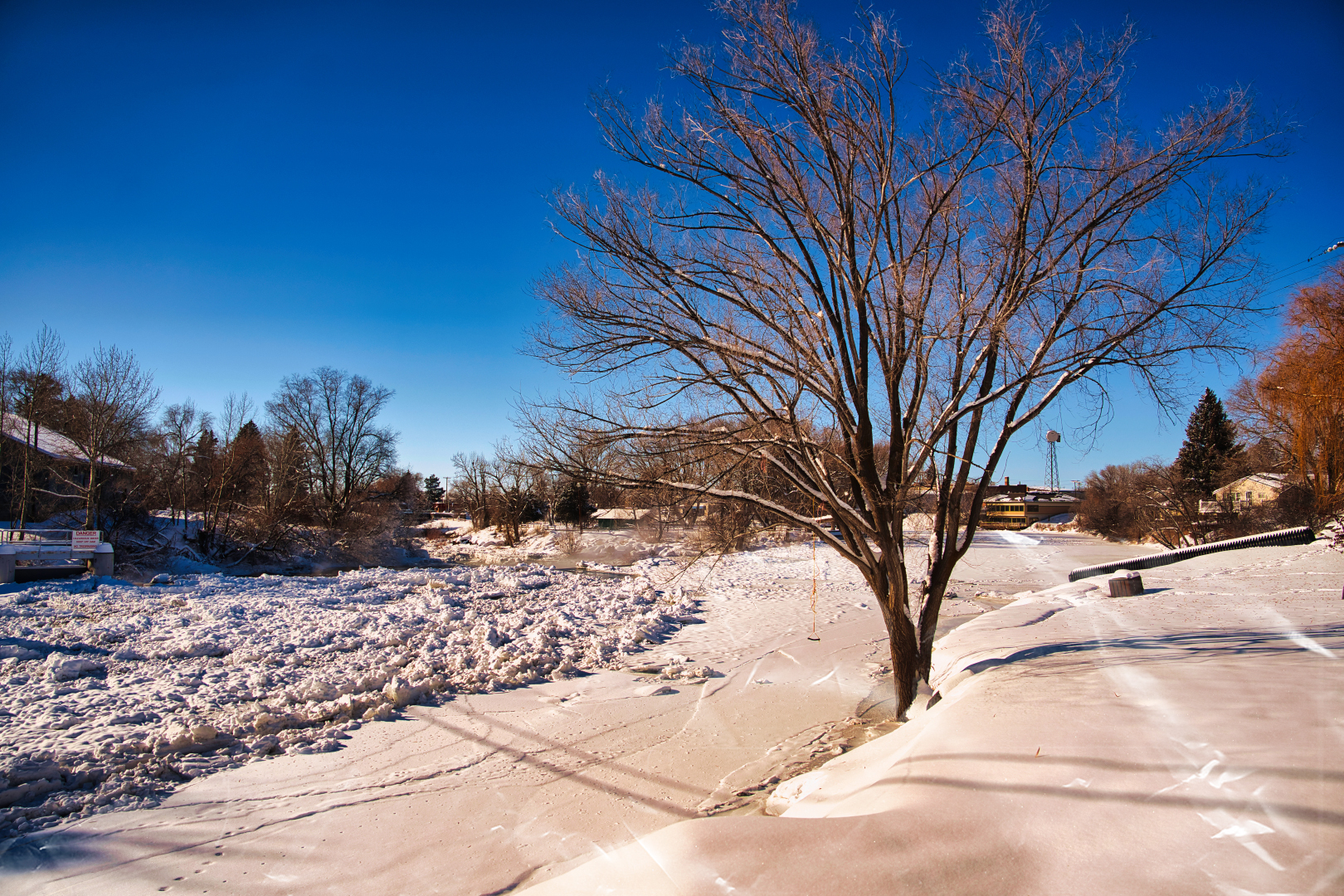
Ever wondered why we’re called the Snake River Plane? Well, this week I decided to find out! For this week’s photography journey, I went to explore the St Anthony Sandbar.
Despite it being called the sandbar I found nothing but snow and ice. We had -21 degree weather earlier in the day and had snow so high it was at my thighs, but perhaps photography is about the ✨friends✨ we made along the way??
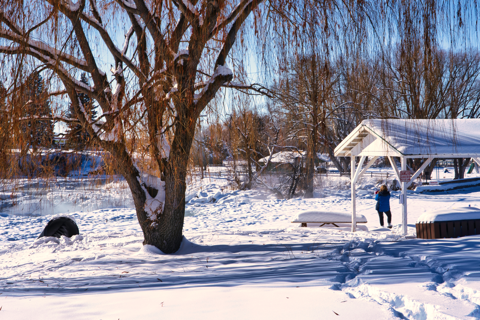
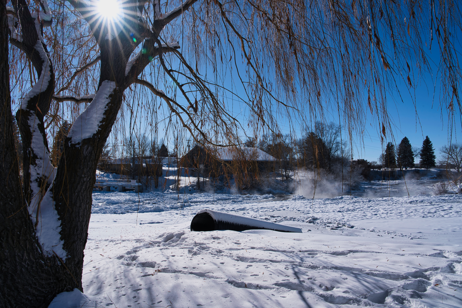
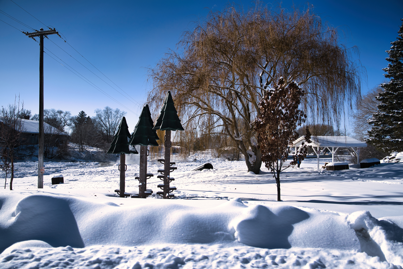
I choose my subject to be the black pipe/drain.
Welcome to St Anthony Sandbar!
Photo Collage Of all 9 perspectives
Humanizing the harsh winter scenery
Sunrays glisten on the snow, and steam can be seen rising from the unfrozen parts of the snake river
A wide landscape view of what used to be a fitness corner, now flooded with snow
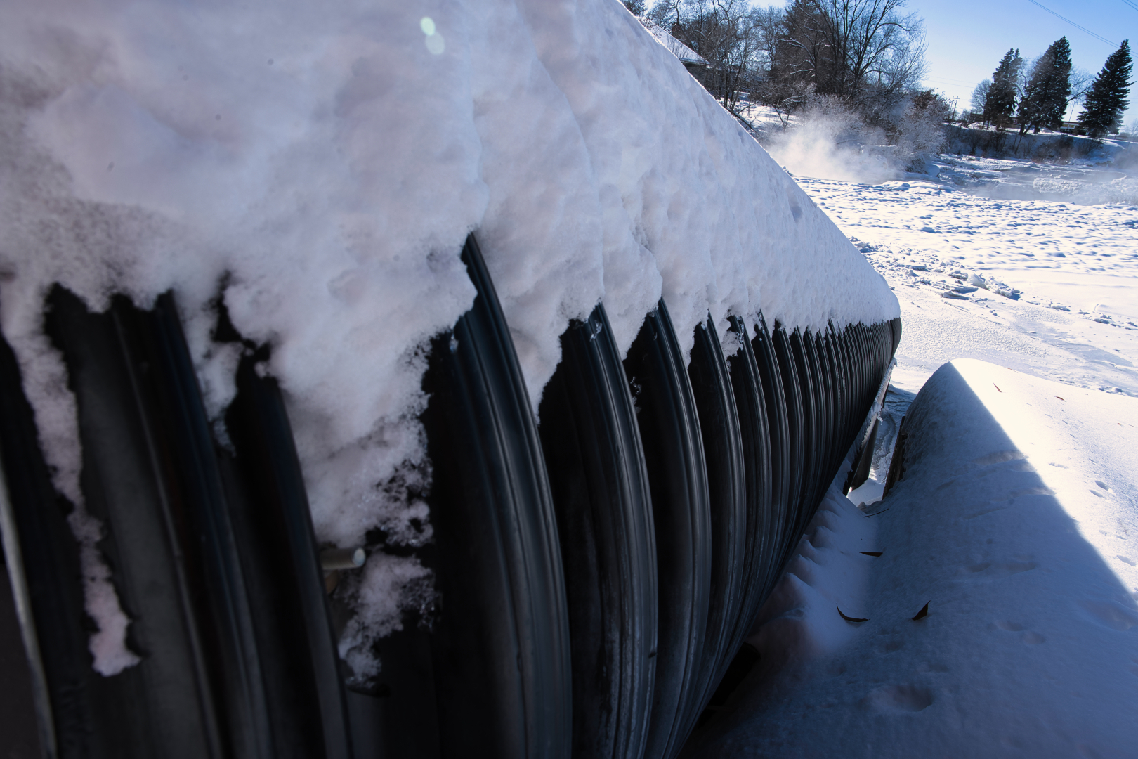
Icicles are found forming on the bottom of the pipe
Footsteps walking toward the pipe show how much snow has piled up
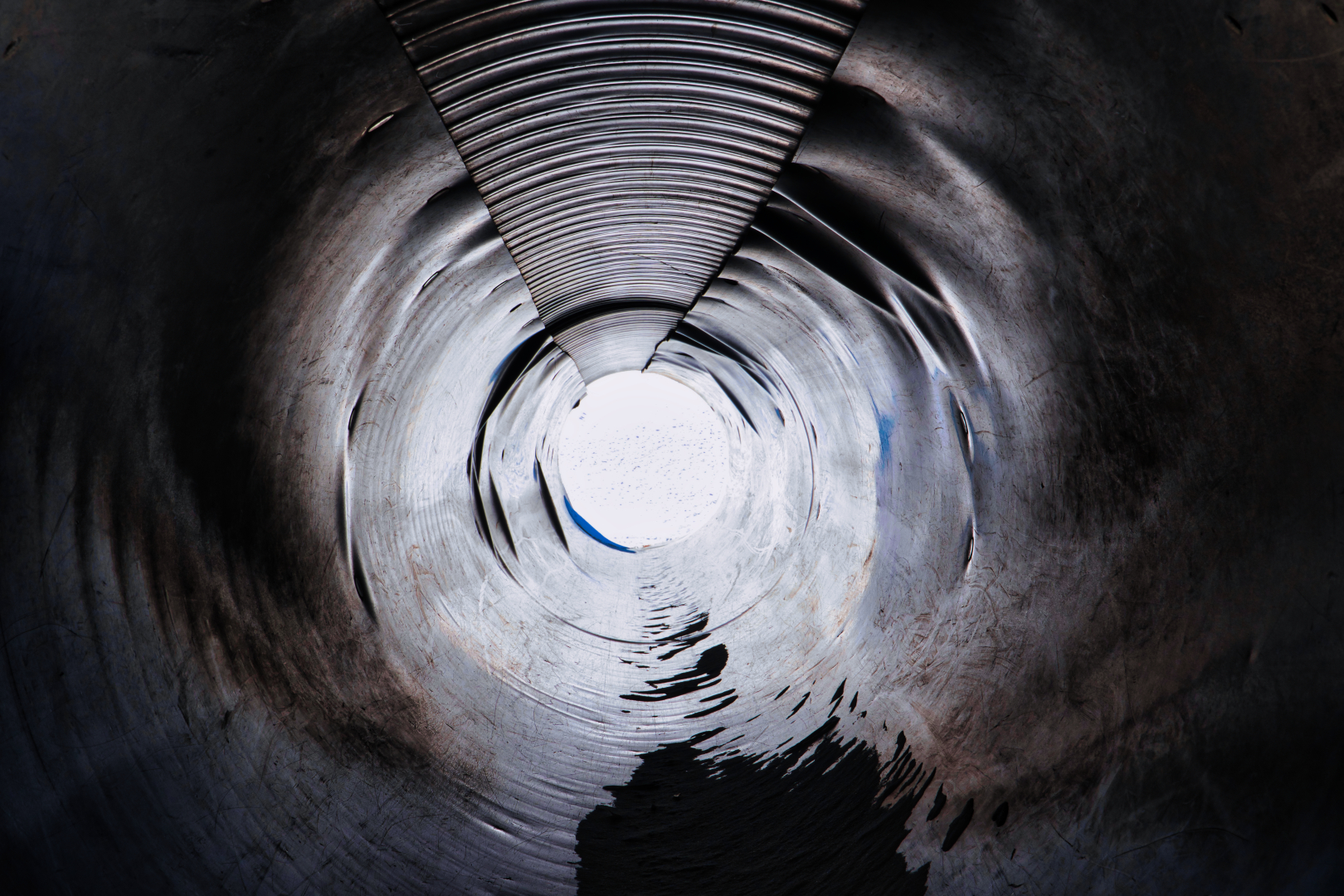
I crawled into the pipe to get an inside view, and nearly tumbled down
A side view, showing the ridges found on the pipe
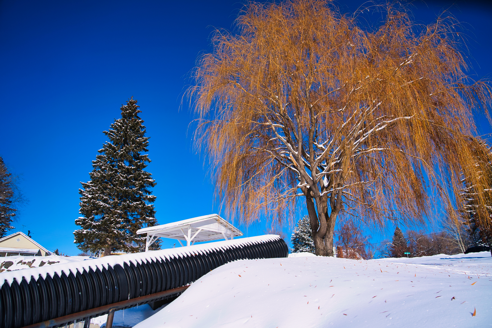
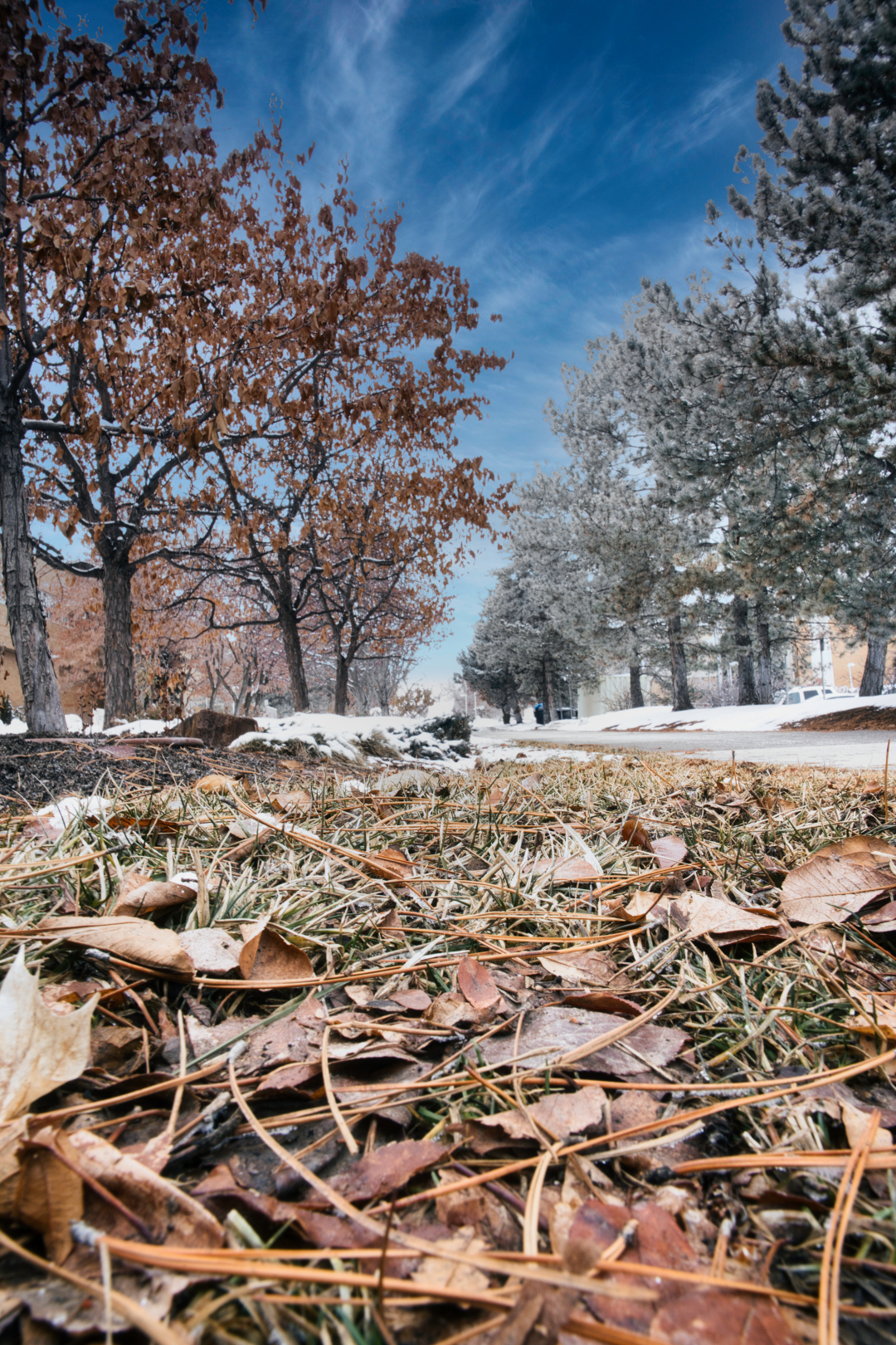
The warm leaves contrast very vividly with the blue skies
A view of the frozen snake river
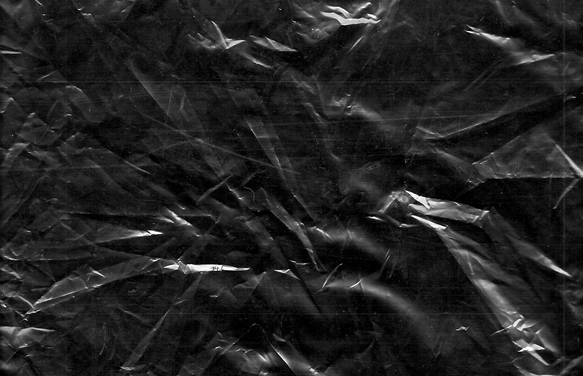
The Texture that was used was old crinkled paper to simulate the harsh weather not seen visually but felt physically
This week we explore APERTURE! High aperture vs low aperture, creamy shallow dept bokeh vs tack sharp photos. “Dept of field” can be easily manipulated with the use of the camera’s F/. Shallow depth ranges from f/2.8 – 5.6 while deep depth ranges from f/16 – f/22.
This week I was blessed to have my cat as my primary model to capture shallow depth of field. Her name is Alakazam and she’s still a little baby so go easy on her. I got her from the Idaho Falls pound and as you can see she is not camera shy at all.
This week has been terribly cold! To avoid going out, I focused my shallow-depth shots indoors as the lower aperture allows me to have less light for my shots.
A high aperture requires more light so I had tobegrudgingly leave the comforts of an A/C and shoot some crispy shots.
This project has been a blast! I spent the week working with high/low shutter speed photography. Shutter speed not only has the ability to stop time and capture all the action but it is able to slow time as well, telling a strong through the blurs and flickers of light. The exposure triangle really taught me a lesson or two this week! Shutter speed not only influences motion but light as well. In each photo, I hope to delineate to you the story I captured and how the shot was taken
Blurry
Devoted to devotional: 1/17/23, 12:11pm, BYU-I Center, 35mm, f/22, 0.4 sec, ISO 100, Camera: Indoor Lighting (SONY A7IV, 24-70GMii)
I left a few minutes before the devotional ended and dashed to the top floor to capture this photograph of all the students leaving the devotional. This story tells a tale of the experience of being a faithful student at BYU-I, making time for our heavenly father while conquering the rigors of higher education.
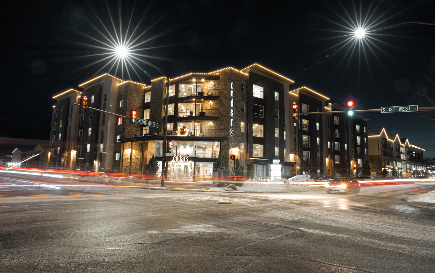
The City Lights: 1/15/23,8:14pm, S 1st West St, 24mm,f/16, 25sec, ISO 80, Camera Lighting: Moonlight/Lampost (SONY A7IV, 24-70GMii)
The night before a holiday means the city is embracing the holiday weather. This is commonly the busiest street in Rexburg. In this photograph you can see how busy and bustling this intersection is, It took me a while to get this photograph as it took multiple trial-and-error shots to get the exposure right.
Tact Sharp
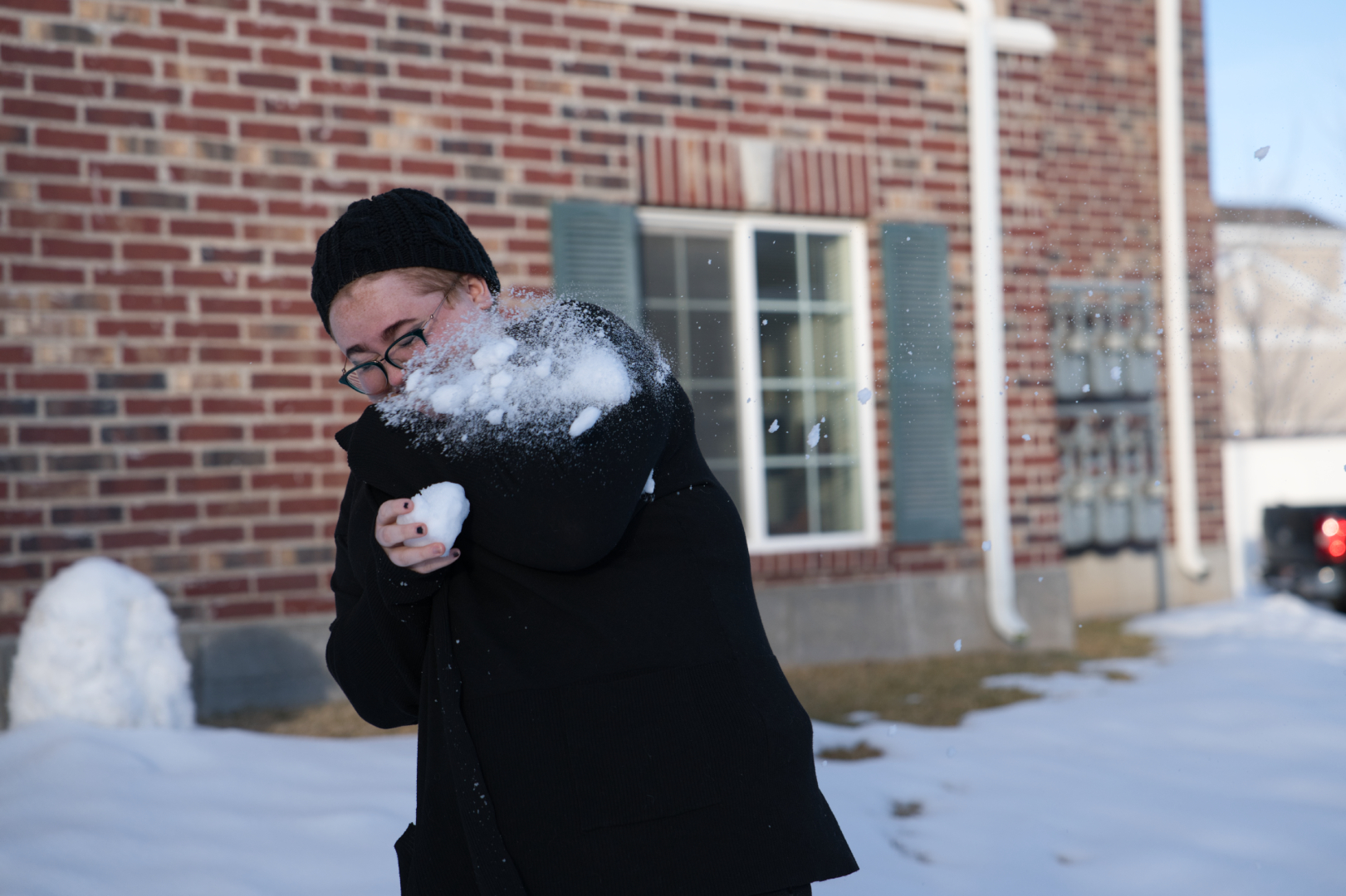
Snow Fight: 1/16/23, 3:19pm, Stone Brook Apartments,70mm, f/2.8, 1/2500 Sec, ISO 320, Camera Lighting: Natural Light (SONY A7iv, 24-70GMii)
High shutter speed captures every particle of snow as it hits its target. The high shutter speed not only captures the snow but also all the embarrassing facial expressions found in a snowball fight. High shutter speed results in less light being captured, to avoid dark photos shot with optimal lighting. To combat the light I decided to shoot at 3pm when the sun is at its peak.
Snow Blast: 1/16/23, 3:13pm, Stone Brook Apartments,70mm, f/2.8, 1/2500 Sec, ISO 320, Camera Lighting: Natural Light (SONY A7iv, 24-70GMii)
High shutter speed shooting requires the shot to be precise to help this I enabled drive mode so that I am able to capture multiple frames of the snowball exploding on my friend’s hand and pick and choose the most optimal one. Framing is also very difficult as during a snowball fight there is a lot of movement.
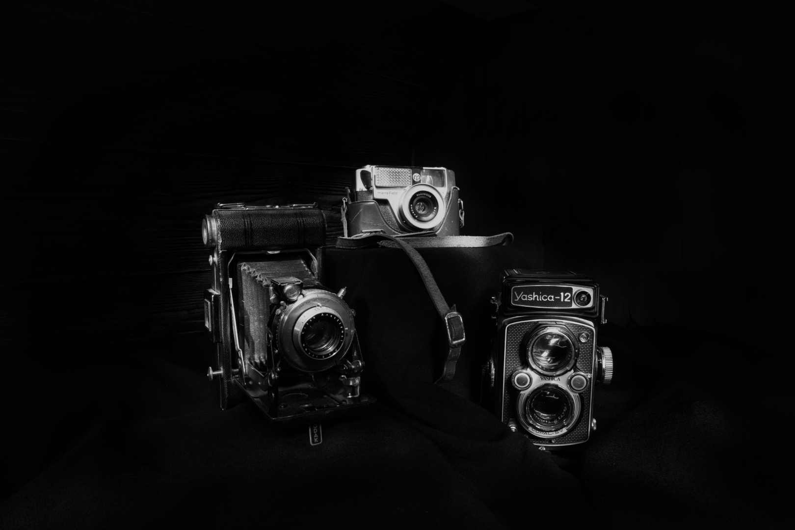
To learn more about the different modes of a camera and the diverse artistry that is photography, I scoured the internet to find different examples of photographs. The photographs found are royalty-free images from https://www.pexels.com/. They serve to illustrate the different principles of aperture, shutter speed, and bracket shooting modes.
Chester Chan Wide Aperture
The photo above is an example of a wide-aperture photograph. You can tell it has a wide aperture photograph because of the shallow depth of field, this results in the presence of bokeh in between the flowers. Wide aperture photography requires a lower f/. Typically the range would be f/1.9 – f/5.6. This means that the camera is shooting at a wider opening and will allow more light as the photograph is taken.
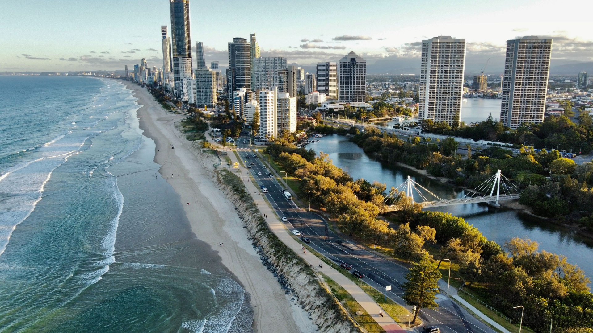
Chester Chan Narrow Aperture
The photograph above is an example of a narrow aperture photograph. Narrow aperture photographs are created with a higher f/. A typical F/ for a high aperture photograph is f/22. With a higher aperture, the lens has a smaller opening, which results in a deeper depth of field and less light entering the lens. This creates a very sharp photo with everything in focus and the absence of any bokeh. (assuming sufficient light is captured). This can be seen in the image above, the shoreline, the skyscrapers, and the road is all crisp and in focus.
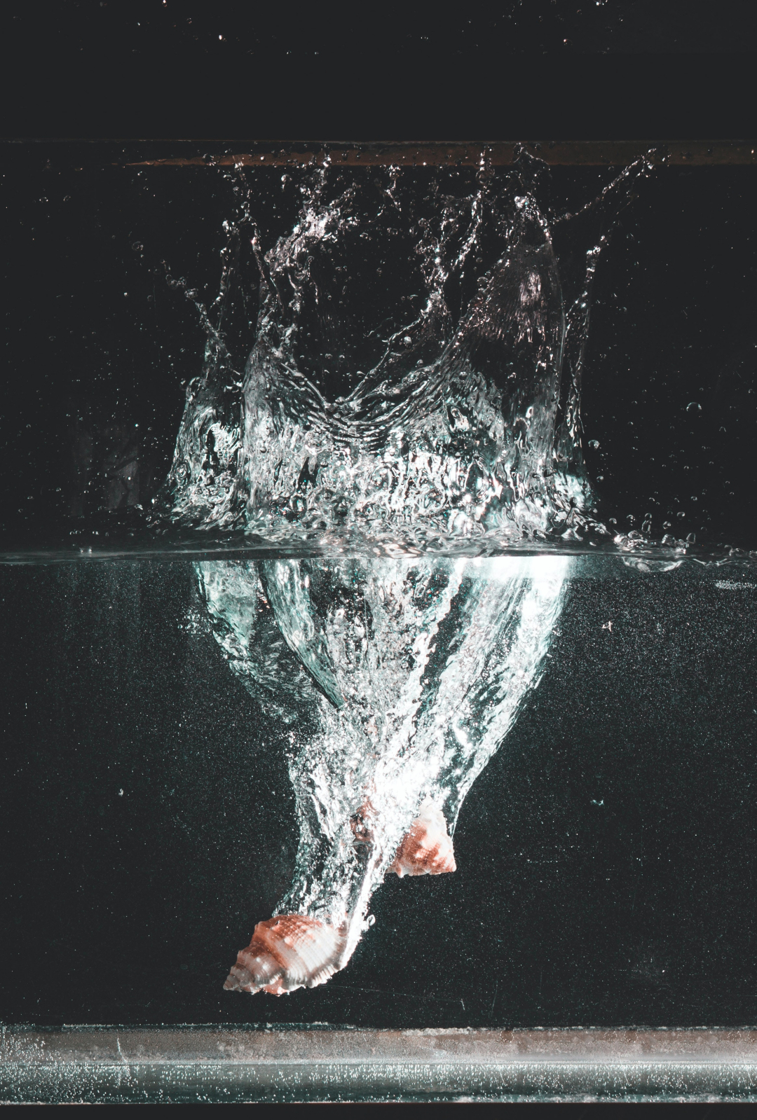
Chester Chan Fast Shutter
The photo above is an example of a fast shutter speed photograph. The water and the ripples in the water are in focus and hard distinct water droplets can be seen. With a faster shutter speed, the camera’s ability to absorb light is limited, the outcome is a very sharp and detailed shot even when the subject is moving at high speeds. ( this requires the camera to receive adequate amounts of light)
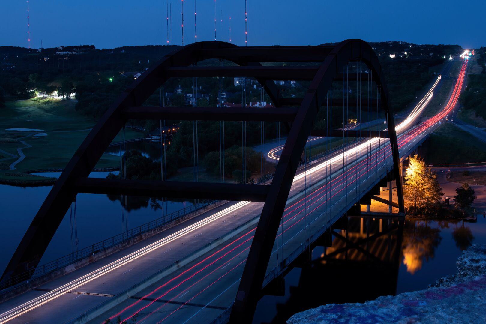
Chester Chan Slow Shutter
The photograph shown above shows a shot taken with a slow shutter speed. A slow shutter speed is the opposite of a fast shutter speed, the characteristics of a photo taken with a slower shutter speed would be the blurring of any subjects in motion, motion is illustrated as very blurred and soft as opposed to tact sharp. The camera is able to do this because the camera is slow enough to capture more motion due to the speed of the shutters closing. A slow shutter speed is good for capturing smooth photos of the movement.
Chester Chan Bracket shooting
Bracket shooting technique of taking several shots of the same subject using different camera settings. Bracketing is useful and often recommended in situations that make it difficult to obtain a satisfactory image with a single shot, especially when a small variation in exposure parameters has a comparatively large effect on the resulting image. Bracketing is helpful as it can blend multiple frames of an image into one photograph. Bracketing is also helpful when taking images with very trickly lighting as it would help the photographer effectively blend different exposures from different frames together.
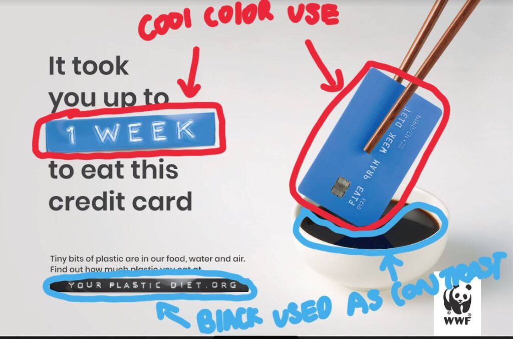
The Ad I decided to reverse engineer is WWF ( World Wildlife Fund) Ad on the Plastic diet. The Ad was launched in 2019 for Australian and South-East Asian audiences to educate the public on plastics pollution in wildlife, water consumption, and air. The Ad hoped to prevent the use of single-use plastics and the over-reliance on plastics in our society. The Ad was created by Grey Graham Drew and Andrew Fong.
Credits: Client: WWF Campaign: Your plastic diet Advertising agency: Grey Graham Drew, Executive Creative Director Andrew Fong, Creative Director Heng Thang Wei, Creative Director Selva Ganapathy, Copywriter Kevin Wong, Art Director Ralve Khor, Art Director Suzy Chiang, Producer Jo Yau, General Manager Marcus SK, Brand Director Vivian Khoo, Account Executive Huma Qureshi, Regional Director PR & Corp Comms AMEA Production Team: MFX Sdn. Bhd. Post Production: Glass Fin (KL) Sound Production: Maverick AV Sdn. Bhd.
Original Ad
Design Analysis (Color)
The use of colors can be seen here with the blue elements found in the card that is being eaten and the “1 week” sign. The use of black can be seen on the color of the logo , soy sauce and “Your plastic diet”
Design Analysis (Typography)
The use of typography can be seen here with the use of 2 different types of fonts. The first is the decorative font used on the credit card. Its fonts are mimicked in the 2 signs reading “1 week” and “Your Plastic Diet.org”. The other font used in the ad is a sans serif font.
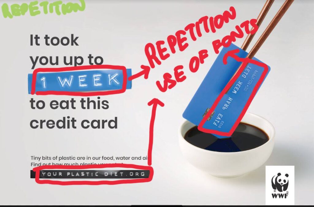
Design Analysis (Repetition)
The use of repetition can be seen with the use of colors and typography. The colors are repeated with blue elements while the use of typography can be seen with the “1 week” and “your plastic diet.org” replicating the font on the blue credit card.
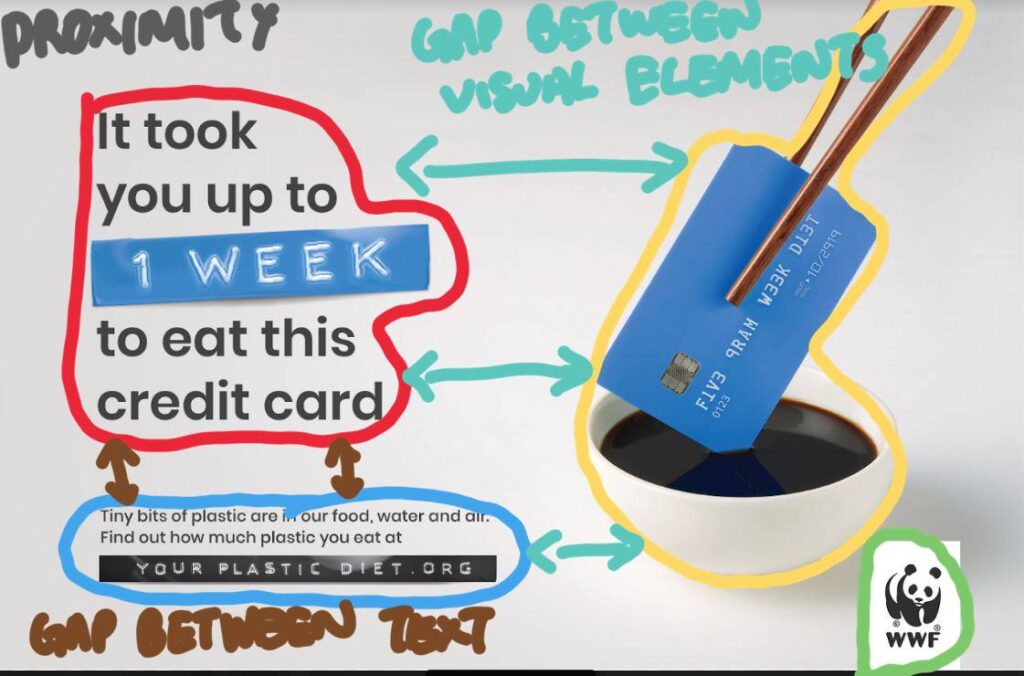
Design Analysis (Proximity)
The use of proximity can be seen as white space created by separating the visual elements from the body of the texts and the logo. By doing so it allows the reader a place for their eyes to rest as they read the ad.
Design Analysis (Contrast)
The use of contrast can be identified with the use of the separation of colors like a blue credit card on black soy sauce. The visual elements are then contrasted on the white sauce bowl and the white background that further contrasts with the black logo and text.
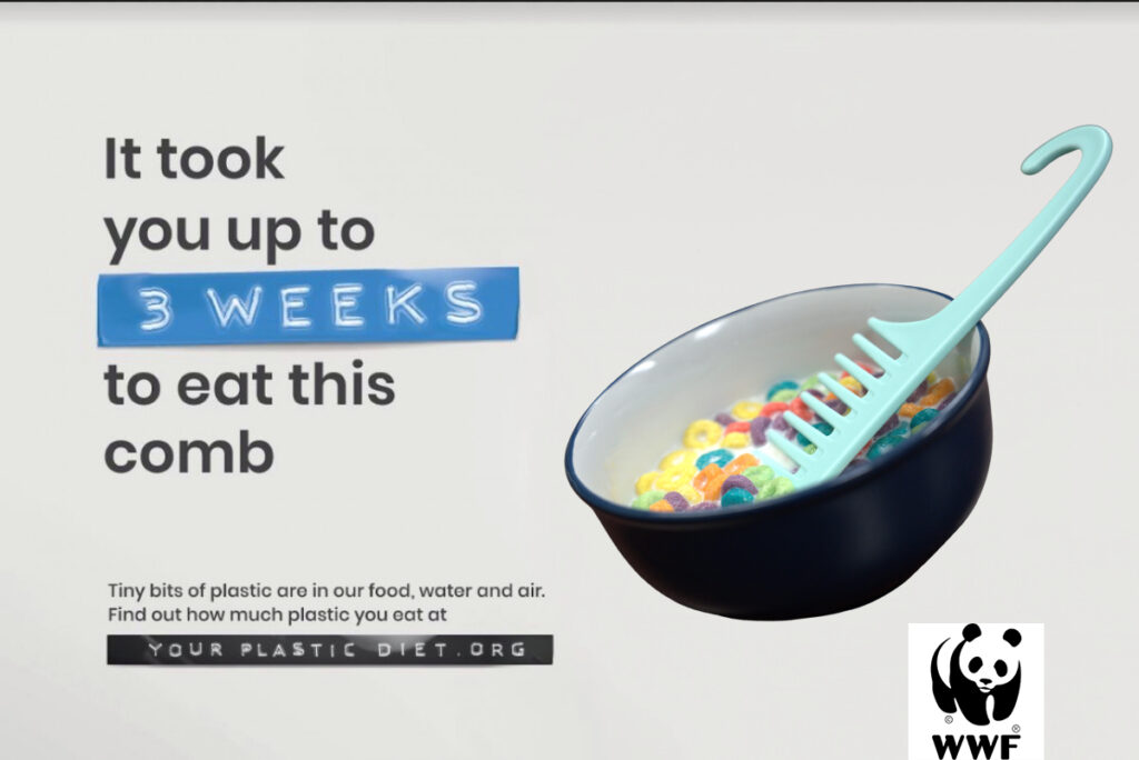
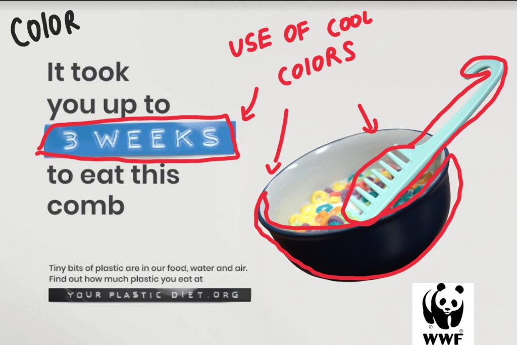
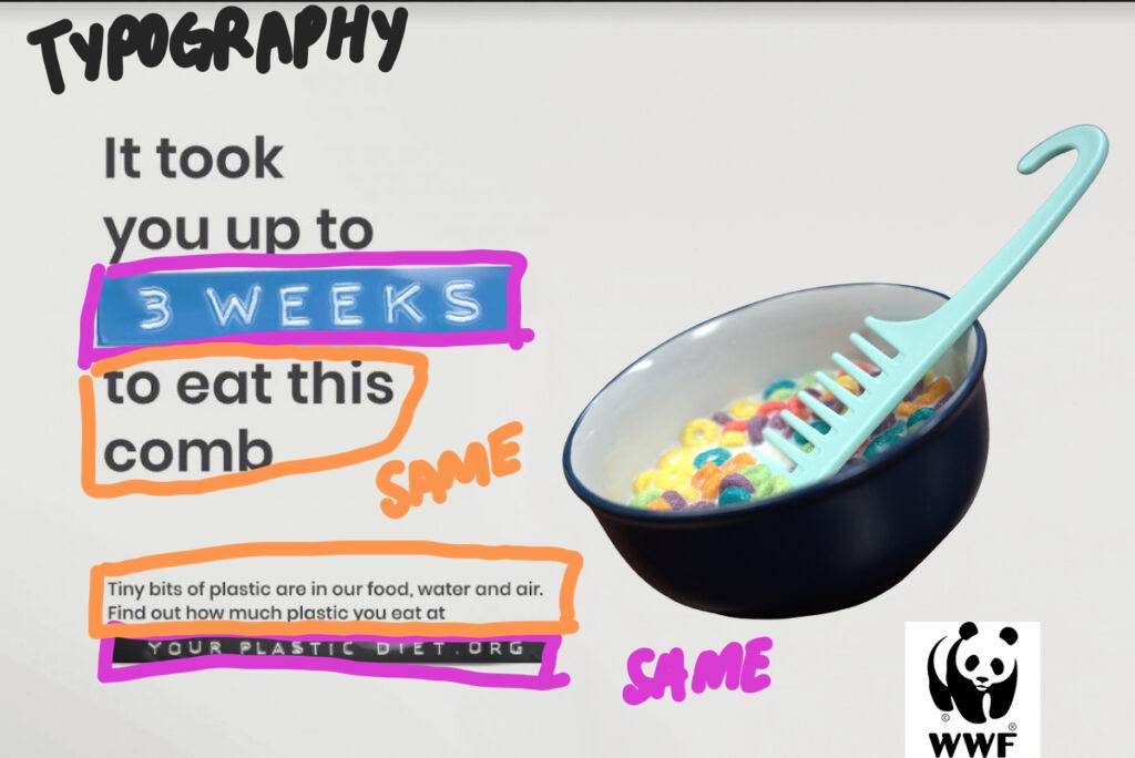
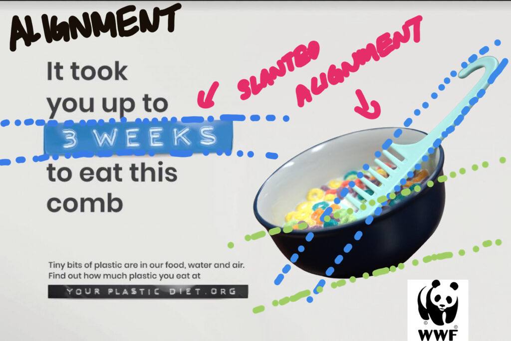
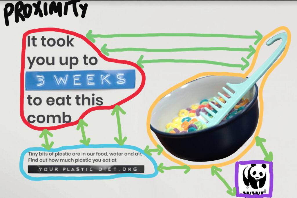
New Ad
Design Analysis (Color)
I choose to use a blue bowl and a blue comb to mimic the color scheme used in the text. I kept the design to have a cool color aesthetic.
Design Analysis (Typography)
I used the same typography from the original design. I choose not to alter it as I felt that my updated design is very well suited to the existing typography.
Design Analysis (Repetition)
Elements of repetition can be seen with the repeated use of fonts in “3 weeks” and “your plastic diet.org” and the repetition in the use of colors like the blue color scheme used in the bowl and the “3 weeks” text.
Design Analysis (Alignment)
Elements of Alignment can be seen throughout the design. With the slanted alignment of the text, I choose to mimic it with the slanted bowl. I used the align the comb to be tilted on the bowl similar to the chopstick being slanted to the credit card found on the original design.
Design Analysis (Proximity)
The elements of proximity can be found in this design with the visual elements and the text being spaced apart making room for white space. With the white space, my viewer is able to rest their eyes while reading the advertisement.
Design Analysis (Contrast)
The elements of contrast can be seen as the dark blue bowl contrasts with the bright blue comb. The visual contrast with the white background with the use of dark colors , similar to the black logo of the panda contrasting with the white background.
other relevant information about the designer, design, or general appeal.
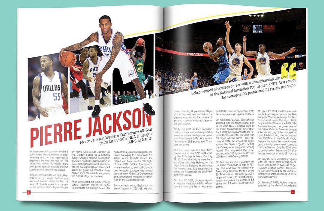
Contrasting Typefaces
The 2 types of typeface used here are Morden (Blue circle) and slab serif (yellow circle). The modern serif was identified due to the font having thin, long horizontal serifs, and clear-cut thick/thin transitions in the strokes. The slab serif font on the other hand was identified due to the presence of y the “feet” or “stubs” on each character.
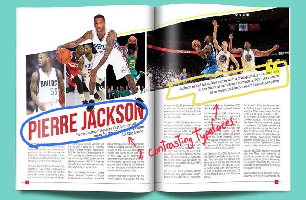
Leading Lines
Leading lines can be seen here by the photographer because the 4 images direct the attention to the title “Pierre Jackson” and the focal attention to the photograph of him. The use of leading lines in the photograph also shapes the text boxes around it.
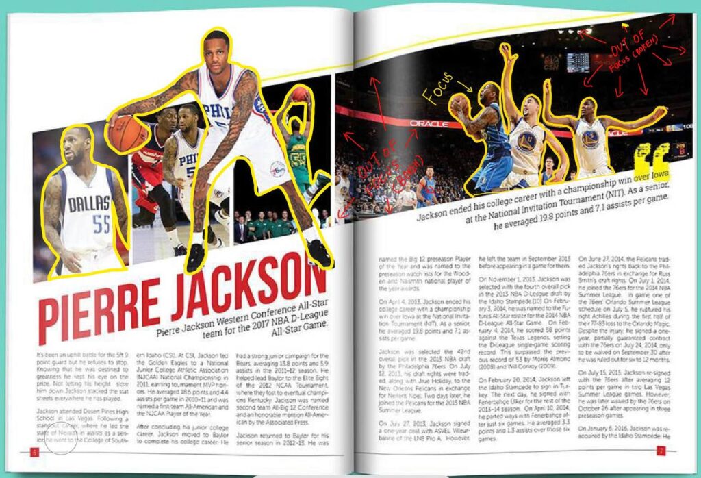
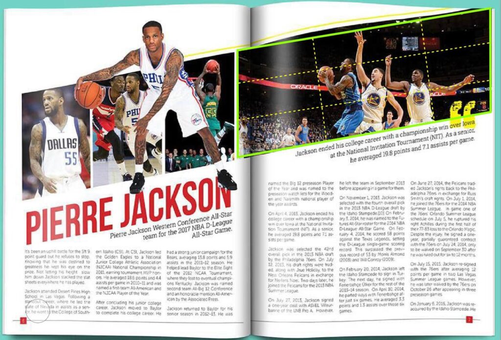
Depth of Field
Depth of field can be seen here as highlighted by the yellow outlines as it focuses the focal attention of the photograph[ph on the players. This is an excellent use of contrast as the background blur (bokeh) further moves the attention towards the players instead of the ground and other elements in the background.
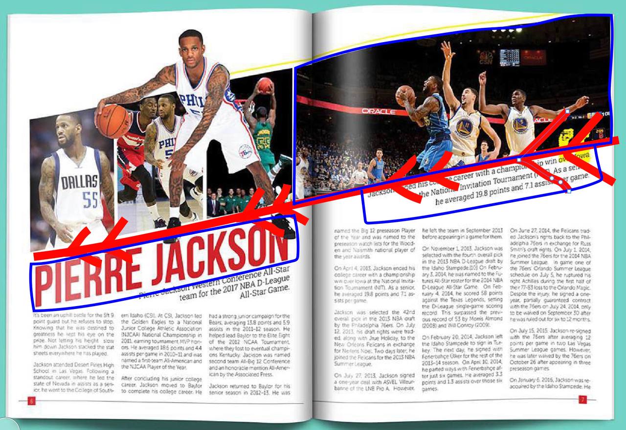
Rule of Thirds
The rule of thirds can be seen clearly in the photograph with the green outline and identified with the yellow dotted lines. This clear use of the rule of thirds hilights guides the viewer’s visual attention to the 3 players in the photograph.
Depth of Field
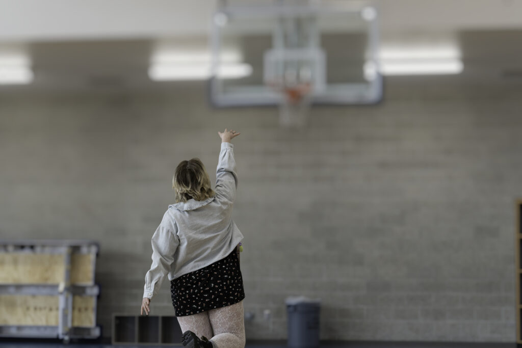
I mimicked the NBA player shooting the basketball with the photo of a normal pedestrian looking girl with everyday clothes shooting a basket. This signifies that basketball is for everyone and it is a very inclusive sport. My photograph’s focus is on the girl shooting , therefore I choose to use depth of field by focusing on her while the background is blurred. I did this by using a 70-200mm lens so there was a lot of background compression. I later edited the background bokeh asm well.
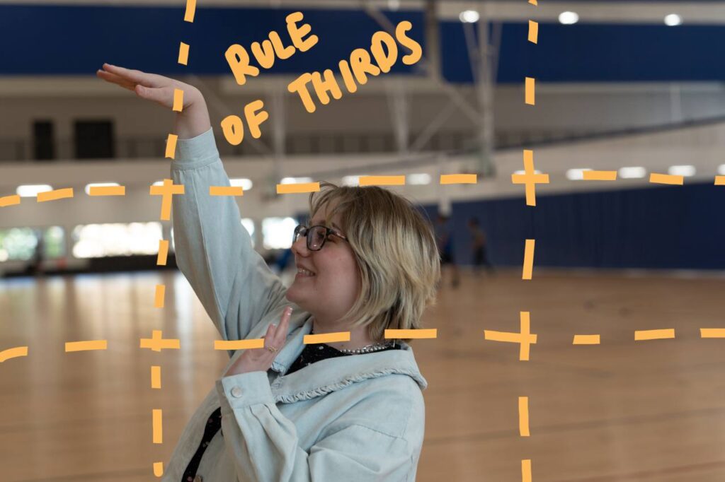
Rule of Thirds
I mimicked the NBA player shooting the basketball with the photo of a normal pedestrian looking girl with everyday clothes shooting a basket. This signifies that basketball is for everyone and it is a very inclusive sport. My photograph’s focus is on the girl shooting , therefore I choose to use rule of thirds by keeping her head and ger shooting hand on the lines. To create this shot I use the rule of thirds mode on the camera and a 24-70mm lens so I can get closer to her.
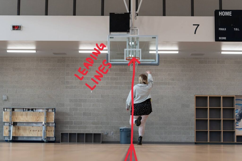
Leading Lines
I mimicked the NBA player shooting the basketball with the photo of a normal pedestrian looking girl with everyday clothes shooting a basket. This signifies that basketball is for everyone and it is a very inclusive sport. My photograph’s focus is on the girl shooting , therefore I choose to use leading lines by focusing on her while she is standing on the markings on the floor leading up to the basket as she attempts to shoot a basket. The lines lead the visual attention to her and the basket in front of her. I did this by using a 70-200m lens so that I can be far away while showing her on the leading line on the floor.
Conclusion
Overall these 3 rules (Rule of thirds,leading lines,depth of field) are very good principals of design as they add contrast to the visual storytelling of a deign/photograph.
In a photograph there can be a lot of elements , by relying on these rules of design it helps lead the viewer’s eye to the story we are trying to tell by contrasting the important elements with the background ones.
In a photograph , just like design we need white space to get the viewer’s eye’s a place to rest and the use of these 3 rules help do that.